Commit graph

388 commits

Author SHA1 Message Date
yp05327
3aed8ae034
Fix default avatar image size in PR diff page (#28971)
Fix #28941

ps: didn't test. The repo is too big to migrate.
2024-02-02 10:01:11 +00:00
Yarden Shoham
3e8414179c
Introduce htmx and use it to avoid full page load on Subscribe and Follow (#28908)
- Closes https://github.com/go-gitea/gitea/issues/28880

This change introduces htmx with the hope we could use it to make Gitea
more reactive while keeping our "HTML rendered on the server" approach.

- Add `htmx.js` that imports `htmx.org` and initializes error toasts
- Place `hx-headers='{"x-csrf-token": "{{.CsrfToken}}"}'` on the
`<body>` tag so every request that htmx sends is authenticated
- Place `hx-swap="outerHTML"` on the `<body>` tag so the response of
each htmx request replaces the tag it targets (as opposed to its inner
content)
- Place `hx-push-url="false"` on the `<body>` tag so no changes to the
URL happen in `<form>` tags
- Add the `is-loading` class during request

### Error toasts in action


![errors](https://github.com/go-gitea/gitea/assets/20454870/181a1beb-1cb8-4858-abe8-fa1fc3f5b8f3)

## Don't do a full page load when clicking the subscribe button
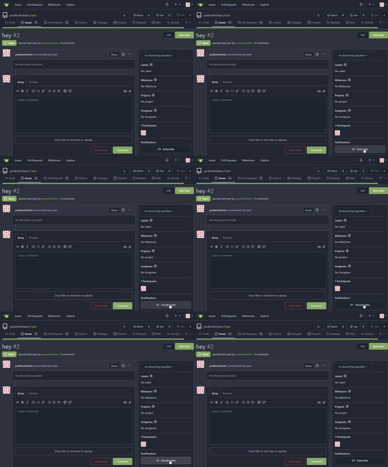
- Refactor the form around the subscribe button into its own template
- Use htmx to perform the form submission
- `hx-boost="true"` to prevent the default form submission behavior of a
full page load
- `hx-sync="this:replace"` to replace the current request (in case the
button is clicked again before the response is returned)
  - `hx-target="this"` to replace the form tag with the new form tag
- Change the backend response to return a `<form>` tag instead of a
redirect to the issue page

### Before

![subscribe_before](https://github.com/go-gitea/gitea/assets/20454870/cb2439a2-c3c0-425c-8d3c-5d646b1cdc28)

### After


![subscribe_after](https://github.com/go-gitea/gitea/assets/20454870/6fcd77d8-7b11-40b0-af4f-b152aaad787c)

## Don't do a full page load when clicking the follow button
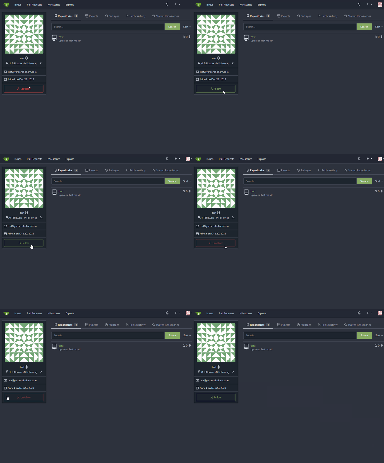
- Use htmx to perform the button request
- `hx-post="{{.ContextUser.HomeLink}}?action=follow"` to send a POST
request to follow the user
- `hx-target="#profile-avatar-card"` to target the card div for
replacement
- `hx-indicator="#profile-avatar-card"` to place the loading indicator
on the card
- Change the backend response to return a `<div>` tag (the card) instead
of a redirect to the user page

### Before

![follow_before](https://github.com/go-gitea/gitea/assets/20454870/a210b643-6e74-4ff9-8e61-d658c62edf1f)

### After


![follow_after](https://github.com/go-gitea/gitea/assets/20454870/5bb19ae9-0d59-4ae3-b538-4c83334e4722)

---------

Signed-off-by: Yarden Shoham <git@yardenshoham.com>
Co-authored-by: 6543 <m.huber@kithara.com>
Co-authored-by: Giteabot <teabot@gitea.io>
2024-01-30 15:45:54 +01:00
Jimmy Praet
ee3e83eec1
Don't reload timeline page when (un)resolving or replying conversation (#28654)
Fixes #15981
2024-01-24 03:26:28 +00:00
6543
49d7663929
Revert adding htmx until we finaly decide to add it (#28879) 2024-01-21 21:42:35 +08:00
Yarden Shoham
14f6fcf448
Don't do a full page load when clicking the subscribe button (#28871)
- Refactor the form around the subscribe button into its own template
- Use htmx to perform the form submission
- `hx-boost="true"` to prevent the default form submission behavior of a
full page load
- `hx-sync="this:replace"` to replace the current request (in case the
button is clicked again before the response is returned)
  - `hx-target="this"` to replace the form tag with the new form tag
  - `hx-push-url="false"` to disable a change to the URL
  - `hx-swap="show:no-scroll"` to preserve the scroll position
- Change the backend response to return a `<form>` tag instead of a
redirect to the issue page
- Include `htmx.org` in javascript imports

This change introduces htmx with the hope we could use it to make Gitea
more reactive while keeping our "HTML rendered on the server" approach.

# Before


![before](https://github.com/go-gitea/gitea/assets/20454870/4ec3e81e-4dbf-4338-9968-b0655c276d4c)

# After


![after](https://github.com/go-gitea/gitea/assets/20454870/8c8841af-9bfe-40b2-b1cd-cd1f3c90ba4d)

---------

Signed-off-by: Yarden Shoham <git@yardenshoham.com>
2024-01-20 20:44:51 +01:00
Gwyneth Morgan
e5313248a8
Add non-JS fallback for reaction tooltips (#28785)
When JavaScript is not loaded, fall back to displaying reaction tooltips
with the default browser `title` attribute. An element with a present
but empty `data-tooltip-content` will use the `title` attribute for its
tippy.js tooltip content, so when JavaScript is enabled, this functions
the same as the current behavior.
2024-01-15 09:42:59 +08:00
wxiaoguang
e743570f65
Refactor timeutil package (#28623)
1. make names more readable
2. remove unused FormatLong/FormatShort
3. use `FormatDate` instead of `Format "2006-01-02"`
2023-12-28 10:09:57 +00:00
KN4CK3R
b3c258828f
Refactor template empty checks (#28351) 2023-12-04 15:48:42 -06:00
Sebastian Brückner
e80f446d3a
Fix rendering assignee changed comments without assignee (#27927)
When an assignee changed event comment is rendered, most of it is
guarded behind the assignee ID not being 0. However, if it is 0, that
results in quite broken rendering for that comment and the next one.
This can happen, for example, when repository data imported from outside
of Gitea is incomplete.

This PR makes sure comments with an assignee ID of 0 are not rendered at
all.

---

Screenshot before:
<img width="272" alt="Bildschirm­foto 2023-11-05 um 20 12 18"
src="https://github.com/go-gitea/gitea/assets/42910/7d629d76-fee4-4fe5-9e3a-bf524050cead">
The comments in this screenshot are:
1. A regular text comment
2. A user being unassigned
3. A user being assigned
4. The title of the PR being changed

Comments 2 and 3 are rendered without any text, which indents the next
comment and does not leave enough vertical space.

Co-authored-by: Giteabot <teabot@gitea.io>
2023-11-07 19:45:06 +01:00
yp05327
dcb648ee71
Add Hide/Show all checks button to commit status check (#26284)
Step one for a GitHub like commit status check ui:

![image](https://github.com/go-gitea/gitea/assets/18380374/22953b88-1f91-4d19-bc57-ad92d33fa11f)

![image](https://github.com/go-gitea/gitea/assets/18380374/78572a49-c9b0-472b-86a8-8293197e807b)

![image](https://github.com/go-gitea/gitea/assets/18380374/bc5c8d1c-2ab5-4b03-b8c6-20c34b86d856)

Step two:

![image](https://github.com/go-gitea/gitea/assets/18380374/938b359e-8823-4192-b82d-55fa40b986fd)

![image](https://github.com/go-gitea/gitea/assets/18380374/2de5bb8f-40f5-462a-8d6d-bac13a32bc2a)

The design now will list all commit status checks which takes too much
space.
This is a pre-improve for #26247

---------

Co-authored-by: delvh <dev.lh@web.de>
Co-authored-by: silverwind <me@silverwind.io>
Co-authored-by: wxiaoguang <wxiaoguang@gmail.com>
2023-11-02 14:49:02 +00:00
Brecht Van Lommel
1756e30e10
Allow pull requests Manually Merged option to be used by non-admins (#27780)
Currently this feature is only available to admins, but there is no
clear reason why. If a user can actually merge pull requests, then this
seems fine as well.

This is useful in situations where direct pushes to the repository are
commonly done by developers.

---------

Co-authored-by: delvh <dev.lh@web.de>
2023-10-30 11:13:06 +08:00
Brecht Van Lommel
7a286e4753
Improve pull request command line instructions (#27778)
* Show checkout instructions also when there is no permission to push,
for anyone who wants to locally test the changes.
* First checkout the branch exactly as is, without immediately having to
solve merge conflicts. Leave this to the merge step, since it's often
convenient to test a change without worrying about this.
* Use `git fetch -u`, so an existing local branch is updated when
re-testing the same pull request. But not the more risky `git fetch -f`
in to handle force pushes, as we don't want to accidentally overwrite
important local changes.
* Show different merge command depending on the chosen merge style,
interactively updated.
2023-10-25 15:01:31 +00:00
Earl Warren
89c9a498fd
Add anchor to review types (#26894)
- The review type '22' is a general comment type that is attached to
single codecomments, reviews with multiple comments or to simple approve
and request changes comment. This comment can be used to create a link
towards this action on an pull request.
- Adds an anchor to the review comment type, so that when its getting
linked to it, it actually jumps towards that event.
- This also now fixes the behavior that after you created a review you
will be redirected to that review and because this is an general comment
type other mails will also be 'fixed' such as the approved or request
changes.
- Resolves https://codeberg.org/forgejo/forgejo/issues/1248

(cherry picked from commit 1741a5f1fe)

---------

Co-authored-by: Gusted <postmaster@gusted.xyz>
Co-authored-by: Caesar Schinas <caesar@caesarschinas.com>
2023-10-14 16:13:59 -05:00
JakobDev
ebe803e514
Penultimate round of db.DefaultContext refactor (#27414)
Part of #27065

---------

Co-authored-by: Lunny Xiao <xiaolunwen@gmail.com>
2023-10-11 04:24:07 +00:00
Kyle D
ac4ae35542
Remove max-width and add hide text overflow (#27359)
Closes https://github.com/go-gitea/gitea/issues/27358
2023-10-09 19:04:31 -04:00
silverwind
5bf367f904
Restore warning commit status (#27504)
Partial revert of https://github.com/go-gitea/gitea/pull/25839. This
commit status is used by a number of external integrations, so I think
we should not remove it (See
https://github.com/go-gitea/gitea/pull/25839#issuecomment-1729002077).
This is a rare case where an existing migration needed to be alterted to
avoid data loss.

---------

Co-authored-by: delvh <dev.lh@web.de>
Co-authored-by: Giteabot <teabot@gitea.io>
2023-10-08 22:16:06 +00:00
Lunny Xiao
dd221b9aec
Fix pr template (#27436)
Fix #27431
2023-10-04 12:28:25 +00:00
JakobDev
cf0df023be
More db.DefaultContext refactor (#27265)
Part of #27065

This PR touches functions used in templates. As templates are not static
typed, errors are harder to find, but I hope I catch it all. I think
some tests from other persons do not hurt.
2023-09-29 12:12:54 +00:00
wxiaoguang
93bd4351bf
Fix more "locale" usages (#27259) 2023-09-25 20:42:40 +08:00
delvh
7960ba7e2b
Always use ctx.Locale.Tr inside templates (#27231) 2023-09-25 08:56:50 +00:00
Denys Konovalov
2325fe777d
cleanup locale function usage (#27227) 2023-09-24 20:31:58 +00:00
JakobDev
5f7388e586
Allow copying issue comment link on archived repos and when not logged in (#27193)
Fixes https://codeberg.org/Codeberg/Community/issues/1303
2023-09-23 11:31:54 +00:00
silverwind
8099238618
Change green buttons to primary color (#27099)
I think it's better if the primary actions have primary color instead of
green which fits better into the overall single-color UI design. This PR
currently replaces every green button with primary:

<img width="141" alt="Screenshot 2023-09-16 at 14 07 59"
src="https://github.com/go-gitea/gitea/assets/115237/843c1e50-4fb2-4ec6-84ba-0efb9472dcbe">
<img width="161" alt="Screenshot 2023-09-16 at 14 07 51"
src="https://github.com/go-gitea/gitea/assets/115237/9442195a-a3b2-4a42-b262-8377d6f5c0d1">

Modal actions now use uncolored/primary instead of previous green/red
colors. I also removed the box-shadow on all basic buttons:

<img width="259" alt="Screenshot 2023-09-16 at 14 16 39"
src="https://github.com/go-gitea/gitea/assets/115237/5beea529-127a-44b0-8d4c-afa7b034a490">
<img width="261" alt="Screenshot 2023-09-16 at 14 17 42"
src="https://github.com/go-gitea/gitea/assets/115237/4757f7b2-4d46-49bc-a797-38bb28437b88">

The change currently includes the "Merge PR" button, for which we might
want to make an exception to match the icon color there:

<img width="442" alt="Screenshot 2023-09-16 at 14 33 53"
src="https://github.com/go-gitea/gitea/assets/115237/993ac1a5-c94d-4895-b76c-0d872181a70b">
2023-09-18 22:05:31 +00:00
wxiaoguang
1875362383
Fix "delete" modal dialog for issue/PR (#27015)
Close #27012

By the way, rename the single-word ID to a long ID.


![image](https://github.com/go-gitea/gitea/assets/2114189/9f05ecc3-0a3d-4612-85e0-da60f7a45d2e)


![image](https://github.com/go-gitea/gitea/assets/2114189/9133808c-bd89-4265-99c5-83b986bd266f)
2023-09-11 17:06:05 +00:00
silverwind
a625f3a761
Enable djlint H008 and fix issues (#26869)
Enable `H008 | Attributes should be double quoted` and fix issues.
2023-09-01 17:32:39 +00:00
wxiaoguang
d5703d4a1b
Remove "TODO" tasks from CSS file (#26835)
1. Use `gt-invisible` instead of `invisible`.
2. Use `gt-word-break` instead of `dont-break-out` (there is a slight
different "hyphens", but I think it won't affect too much since it is
only used for the "full name").
3. Remove `.small.button:has(svg)` , now our buttons could layout SVG
correctly, and actually I didn't see this CSS class is used in code.
2023-08-31 10:49:53 +00:00
wxiaoguang
19a1e1b20e
Remove polluted .ui.right (#26825)
Each change is tested manually line by line. There are too many changes
so I can't share dozens of screenshots.

In short:

1. `ui right` could be still used in `ui top attached header`, because
there is a special case.
2. A lot of `ui right` are just no-op, so they can be removed safely.
3. Some of the `ui right` should be replaced by `gt-float-right` (to
avoid breaking, leave them to the future).
4. A few of the `ui right` could be rewritten by flex.
2023-08-31 02:29:59 +00:00
wxiaoguang
4fdb09de58
Fix incorrect "tabindex" attributes (#26733)
Fix #26731

Almost all "tabindex" in code are incorrect.

1. All "input/button" by default are focusable, so no need to use "tabindex=0"
2. All "div/span" by default are not focusable, so no need to use "tabindex=-1"
3. All "dropdown" are focusable by framework, so no need to use "tabindex"
4. Some tabindex values are incorrect (eg: `new_form.tmpl`), so remove them

Co-authored-by: Giteabot <teabot@gitea.io>
2023-08-26 10:44:00 +08:00
wxiaoguang
576644d815
Simplify helper CSS classes and avoid abuse (#26728)
Removed CSS helper classes (some of them are not useful while some of
them are abused often)

* `gt-db`: in most cases it could be replaced by `gt-df` and the flex
layout should be encouraged. Other cases: either it does need the
`gt-df` (eg: by using `div` directly) or it is an abuse (eg: the warning
message in a form)
* `gt-di`: it doesn't seem useful, or it could be replaced by `gt-dib`
in most cases.
* `gt-dif`: not useful, it could be replaced by `flex-text-inline` or
`gt-df`
* `gt-js`: never used
* All `<i class="icon gt-df gt-ac gt-jc">` could be written as `<i
class="icon">`


## Some UI samples

### Admin Notice


![image](https://github.com/go-gitea/gitea/assets/2114189/d02010d4-dc7d-463f-bc99-dcc9b6e2e2ac)

### Admin Stacktrace


![image](https://github.com/go-gitea/gitea/assets/2114189/4045695c-a8c4-4e37-b720-e77a61b1e965)

### Org Home


![image](https://github.com/go-gitea/gitea/assets/2114189/069f02d0-76ad-4052-8a80-700d7e501d40)

### Org Team Repo


![image](https://github.com/go-gitea/gitea/assets/2114189/dc8d6106-bb6b-4f60-83ac-06cb28df3ab5)

### Release List


![image](https://github.com/go-gitea/gitea/assets/2114189/0845e8a5-d1a9-487a-9d25-3c200ad54c17)


### User Setting Application Token Scope


![image](https://github.com/go-gitea/gitea/assets/2114189/fffbde27-432b-49c6-827e-17b8cd3457ff)

Co-authored-by: Giteabot <teabot@gitea.io>
2023-08-26 01:35:10 +02:00
yp05327
d2e4039def
Add member, collaborator, contributor, and first-time contributor roles and tooltips (#26658)
GitHub like role descriptor

![image](https://github.com/go-gitea/gitea/assets/18380374/ceaed92c-6749-47b3-89e8-0e0e7ae65321)

![image](https://github.com/go-gitea/gitea/assets/18380374/8193ec34-cbf0-47f9-b0de-10dbddd66970)

![image](https://github.com/go-gitea/gitea/assets/18380374/56c7ed85-6177-425e-9f2f-926e99770782)

---------

Co-authored-by: delvh <dev.lh@web.de>
Co-authored-by: wxiaoguang <wxiaoguang@gmail.com>
Co-authored-by: Lunny Xiao <xiaolunwen@gmail.com>
2023-08-24 13:06:17 +08:00
yp05327
bd8a253220
Improve show role (#26621)
Add a general show role template.
2023-08-22 05:30:33 +00:00
CaiCandong
7a69d71733
Fix incorrect redirection in new issue using references (#26440)
fix #26427
related https://github.com/go-gitea/gitea/pull/25258

---

Before:

![gitea](https://github.com/go-gitea/gitea/assets/50507092/ed8d3a17-1f63-42f2-a698-3b684e70dc91)

--- 

After:

![After](https://github.com/go-gitea/gitea/assets/50507092/b8e1338f-c520-4abc-b0df-b812c021ac7e)
2023-08-10 20:04:08 +00:00
wxiaoguang
a370efc13f
Use template context function for avatar rendering (#26385)
Introduce `AvatarUtils`, no need to pass `$.Context` to every
sub-template, and simplify the template helper functions.
2023-08-10 11:19:39 +08:00
yp05327
d74c2228e3
Remove nonsense <a> for commit status check icon (#26287)
We are using `<a>` for commit status check icon with no link. So it is
clickable but this is no sense.
I think we can convert this to `div`.

![image](https://github.com/go-gitea/gitea/assets/18380374/23db1a11-b0c7-4444-bfa6-fe68aeb1c682)

Co-authored-by: Giteabot <teabot@gitea.io>
2023-08-03 19:58:41 +02:00
Yarden Shoham
edd93fcfbc
Fix due date rendering the wrong date in issue (#26268)
Closes #26263

We have to pass the date without the time.

# Before

![image](https://github.com/go-gitea/gitea/assets/20454870/6b6cb43d-2b1c-4679-951d-20f48c94bfdd)

# After

![image](https://github.com/go-gitea/gitea/assets/20454870/50441baf-2c52-452b-bb0d-6034a407abde)

Signed-off-by: Yarden Shoham <git@yardenshoham.com>
2023-08-01 16:21:04 +02:00
silverwind
04d7ced063
De-emphasize issue sidebar buttons (#26171)
I find the colored buttons in the issue sidebar distracting, given that
they are not primary actions, I think we can de-colorize them.

Before:
<img width="285" alt="Screenshot 2023-07-26 at 19 42 22"
src="https://github.com/go-gitea/gitea/assets/115237/7e784805-4e01-4199-94bb-0538a0130264">
<img width="288" alt="Screenshot 2023-07-26 at 19 43 06"
src="https://github.com/go-gitea/gitea/assets/115237/3a89c661-e24a-4ebf-a585-d404d0a6a78a">
<img width="285" alt="Screenshot 2023-07-26 at 19 44 36"
src="https://github.com/go-gitea/gitea/assets/115237/c1aa8c13-6f41-4763-8149-d1c07cb4be5c">:

After:
<img width="286" alt="Screenshot 2023-07-26 at 19 42 04"
src="https://github.com/go-gitea/gitea/assets/115237/74d640c2-e0ab-4fef-87aa-9e788e9010e2">
<img width="285" alt="Screenshot 2023-07-26 at 19 42 51"
src="https://github.com/go-gitea/gitea/assets/115237/3b69976a-9aa4-4e1c-8df3-4168f4a9fcf9">
<img width="286" alt="Screenshot 2023-07-26 at 19 45 15"
src="https://github.com/go-gitea/gitea/assets/115237/897222fd-4df2-4d99-98eb-e5f8fb77c4d6">
2023-07-30 22:46:53 +00:00
caicandong
ab72f7ee4a
remove IsWarning in tmpl (#26120)
This problem occurs because in #25839, the warning status has been
removed, but there is something in the tmpl that hasn't been changed.
related #25839
close #26118
2023-07-25 12:09:01 +00:00
Lunny Xiao
a12a5f3652
Fix duplicated url prefix on issue context menu (#26066)
Fix #26060
2023-07-23 11:56:43 +02:00
Denys Konovalov
00dbba7f42
Several fixes for mobile UI (#25634)
Resolves #25622 

<details>
<summary>Screenshots</summary>

![Bildschirmfoto vom 2023-07-02
20-47-34](https://github.com/go-gitea/gitea/assets/47871822/a8a0bff6-9ae3-48f3-b008-00c196a3f8fd)
![Bildschirmfoto vom 2023-07-02
20-47-45](https://github.com/go-gitea/gitea/assets/47871822/172a0021-af74-4690-aa67-0e66688ce733)
![Bildschirmfoto vom 2023-07-02
20-48-37](https://github.com/go-gitea/gitea/assets/47871822/14572ebd-0106-4c8a-ba27-b6b631375ee6)
![Bildschirmfoto vom 2023-07-02
20-49-08](https://github.com/go-gitea/gitea/assets/47871822/7c0ba3aa-1712-482c-aae9-13394dbdaf8a)
![Bildschirmfoto vom 2023-07-02
20-50-28](https://github.com/go-gitea/gitea/assets/47871822/8bd68e26-099a-4abd-8817-16d52af13167)
![Bildschirmfoto vom 2023-07-02
20-51-46](https://github.com/go-gitea/gitea/assets/47871822/3beab8c6-3747-4829-be50-bafaed11000c)
![Bildschirmfoto vom 2023-07-02
20-54-12](https://github.com/go-gitea/gitea/assets/47871822/51f82ef3-a32c-4c27-9056-e8711ed469cc)


</details>

---------

Co-authored-by: wxiaoguang <wxiaoguang@gmail.com>
Co-authored-by: silverwind <me@silverwind.io>
2023-07-04 17:45:45 +00:00
silverwind
64f2d70262
Replace fomantic divider module with our own (#25539)
Should look exactly like before for normal dividers. "Horizontal" ones
look better because they no longer use image backgrounds.

<img width="917" alt="Screenshot 2023-06-27 at 19 07 56"
src="https://github.com/go-gitea/gitea/assets/115237/d97d8dec-6859-44a8-85ba-e4549b4dd9df">

<img width="914" alt="Screenshot 2023-06-27 at 19 05 58"
src="https://github.com/go-gitea/gitea/assets/115237/8bf98544-2d82-4ebf-ac68-d6dc237bd6b2">

<img width="1246" alt="Screenshot 2023-06-27 at 19 00 42"
src="https://github.com/go-gitea/gitea/assets/115237/36a6bb21-6029-4f53-8bee-535f55c66fed">

<img width="344" alt="Screenshot 2023-06-27 at 18 58 15"
src="https://github.com/go-gitea/gitea/assets/115237/a9e70aee-8e6b-4ea1-9e93-19c9f96aec6e">
<img width="823" alt="Screenshot 2023-06-27 at 18 56 22"
src="https://github.com/go-gitea/gitea/assets/115237/e7a497cd-f262-4683-8872-23c3c8cce32f">

<img width="330" alt="Screenshot 2023-06-27 at 19 21 11"
src="https://github.com/go-gitea/gitea/assets/115237/42f24149-a655-4c7e-bd26-8ab52db6446b">
2023-06-29 20:24:22 +08:00
HesterG
c6f1fb1c6d
Use fetch form action for lock/unlock/pin/unpin on sidebar (#25380)
Before:

<img width="364" alt="Screen Shot 2023-06-20 at 11 59 11"
src="https://github.com/go-gitea/gitea/assets/17645053/ad284b7e-8d21-43be-b178-bbcfd37cb5bd">

Might trigger many posts when keep clicking the buttons above.

<img width="448" alt="Screen Shot 2023-06-20 at 11 52 28"
src="https://github.com/go-gitea/gitea/assets/17645053/a60aa6ac-af74-45e4-b13a-512b436b81b0">
<img width="678" alt="Screen Shot 2023-06-20 at 11 52 37"
src="https://github.com/go-gitea/gitea/assets/17645053/d6662700-3643-4cc7-a2ec-64e1c0f5fbdb">

After (PR sidebar, Same for issue):


https://github.com/go-gitea/gitea/assets/17645053/9df3ad1f-e29c-439b-8bde-e6b917d63cc6

For delete, it is using `base/modal_actions_confirm` subtemplate, and we
might need another general solution for this (maybe add another
attribute to the subtemplate or something)

---------

Co-authored-by: silverwind <me@silverwind.io>
Co-authored-by: Giteabot <teabot@gitea.io>
Co-authored-by: wxiaoguang <wxiaoguang@gmail.com>
2023-06-29 04:16:04 +00:00
Lunny Xiao
083818cb85
Improve loadprojects for issue list (#25468) 2023-06-24 15:31:28 +00:00
6543
b0215c40cd
Store and use seconds for timeline time comments (#25392)
this will allow us to fully localize it later

PS: we can not migrate back as the old value was a one-way conversion


prepare for  #25213

---
*Sponsored by Kithara Software GmbH*
2023-06-23 12:12:39 +00:00
wxiaoguang
17965c8e79
Make "dismiss" content shown correctly (#25461)
Close #25127


![image](https://github.com/go-gitea/gitea/assets/2114189/7d6be811-8e4a-4982-a5e4-857d171758d4)

Co-authored-by: Giteabot <teabot@gitea.io>
2023-06-23 12:33:20 +02:00
sebastian-sauer
25455bc670
Show outdated comments in files changed tab (#24936)
If enabled show a clickable label in the comment. A click on the label
opens the Conversation tab with the comment focussed - there you're able
to view the old diff (or original diff the comment was created on).

**Screenshots**


![image](https://github.com/go-gitea/gitea/assets/1135157/63ab9571-a9ee-4900-9f02-94ab0095f9e7)

![image](https://github.com/go-gitea/gitea/assets/1135157/78f7c225-8d76-46f5-acfd-9b8aab988a6c)


When resolved and outdated:

![image](https://github.com/go-gitea/gitea/assets/1135157/6ece9ebd-c792-4aa5-9c35-628694e9d093)

Option to enable/disable this (stored in user settings - default is
disabled):

![image](https://github.com/go-gitea/gitea/assets/1135157/ed99dfe4-76dc-4c12-bd96-e7e62da50ab5)

![image](https://github.com/go-gitea/gitea/assets/1135157/e837a052-e92e-4a28-906d-9db5bacf93a6)


fixes #24913

---------

Co-authored-by: silverwind <me@silverwind.io>
2023-06-21 16:08:12 +00:00
6543
749802c922
Refactor: TotalTimest return seconds (#25370)
so template/browser can deal with string format

---
*Sponsored by Kithara Software GmbH*
2023-06-19 18:40:06 +02:00
silverwind
e24f651c86
Add template linting via djlint (#25212)
So I found this [linter](https://github.com/Riverside-Healthcare/djlint)
which features a mode for go templates, so I gave it a try and it did
find a number of valid issue, like unbalanced tags etc. It also has a
number of bugs, I had to disable/workaround many issues.

Given that this linter is written in python, this does add a dependency
on `python` >= 3.8 and `poetry` to the development environment to be
able to run this linter locally.

- `e.g.` prefixes on placeholders are removed because the linter had a
false-positive on `placeholder="e.g. cn=Search"` for the `attr=value`
syntax and it's not ideal anyways to write `e.g.` into a placeholder
because a placeholder is meant to hold a sample value.
- In `templates/repo/settings/options.tmpl` I simplified the logic to
not conditionally create opening tags without closing tags because this
stuff confuses the linter (and possibly the reader as well).
2023-06-14 18:17:58 +00:00
wxiaoguang
46c17c8029
Use flex to align SVG and text (#25163)
The code can be as simple as:

```html
<div class="flex-text-block">{{svg "octicon-alert"}} {{svg "octicon-x"}} text (block)</div>
<div><div class="flex-text-inline">{{svg "octicon-alert"}} {{svg "octicon-x"}} text</div> (inline)</div>
<div><button class="ui red button">{{svg "octicon-alert" 24}} {{svg "octicon-x" 24}} text</button></div>
```


![image](https://github.com/go-gitea/gitea/assets/2114189/1d3c10f1-0bc7-4c26-b236-bad537d5c465)

---------

Co-authored-by: Giteabot <teabot@gitea.io>
2023-06-14 16:40:15 +00:00
yp05327
81211db077
Fix #25133 (#25162)
Fix #25133

Thanks @wxiaoguang @silverwind.
I'm sorry I made a mistake, it will be fixed in this PR.

---------

Co-authored-by: Giteabot <teabot@gitea.io>
Co-authored-by: silverwind <me@silverwind.io>
2023-06-09 10:27:10 +00:00
yp05327
b5a2bb9ab3
Fix strange UI behavior of cancelling dismiss review modal (#25133)
Fixes https://github.com/go-gitea/gitea/issues/25130

The old code uses `$(this).next()` to get `dismiss-review-modal`.
At first, it will get `$(#dismiss-review-modal)`, but the next time it
will get `$(#dismiss-review-modal).next();`
and then `$(#dismiss-review-modal).next().next();`.
Because div `dismiss-review-modal` will be removed when
`dismiss-review-btn` clicked.

Maybe the right usage is adding `show-modal` class and `data-modal`
attribute.
2023-06-08 08:52:35 +00:00