mirror of
https://codeberg.org/forgejo/forgejo.git
synced 2024-11-13 21:31:15 +01:00
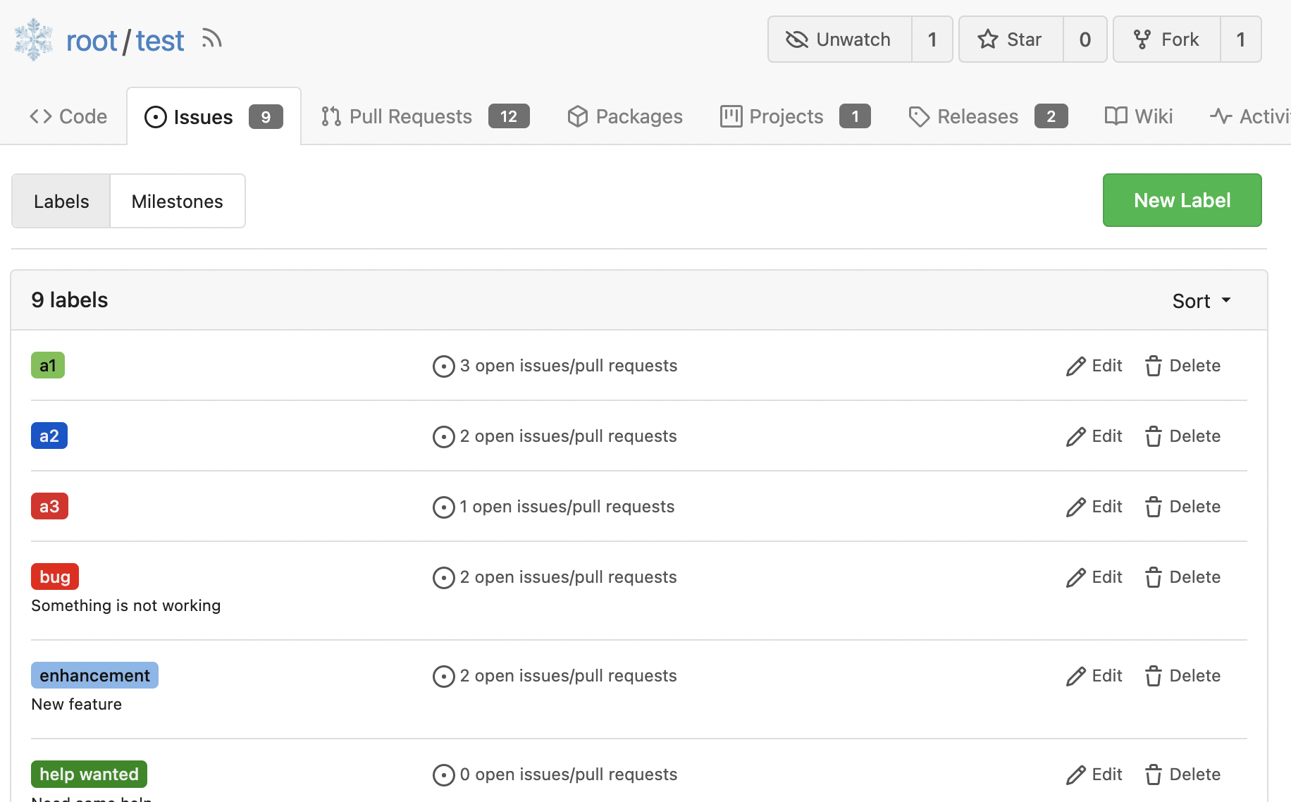
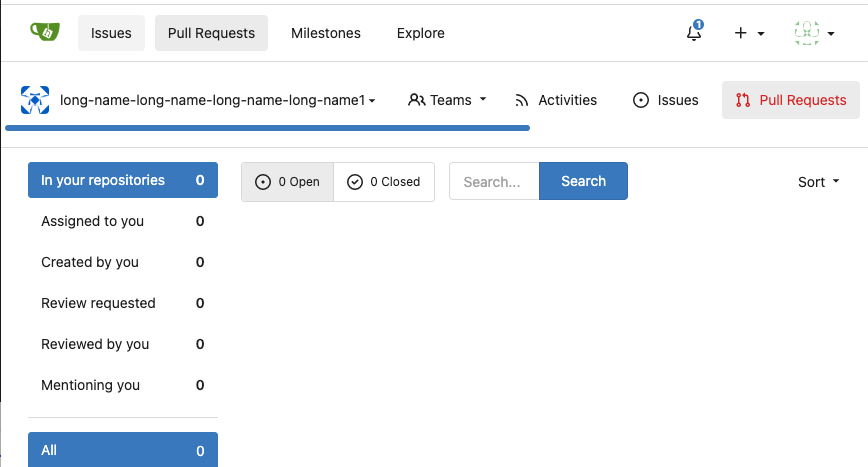
Since 2015/2016, there is a global pollution: ".ui.left" / ".ui.right". Fomantic UI doesn't work this way, it just conflicts with many Fomantic definitions. This PR starts the cleaning work of such techinical debts. And, the "label list" page has been quite messy for long time, for example, why "li" appears in "div" ...... And fix #24296 <details>      </details> |
||
|---|---|---|
| .. | ||
| blob_excerpt.tmpl | ||
| box.tmpl | ||
| comment_form.tmpl | ||
| comment_form_datahandler.tmpl | ||
| comments.tmpl | ||
| compare.tmpl | ||
| conversation.tmpl | ||
| csv_diff.tmpl | ||
| escape_title.tmpl | ||
| image_diff.tmpl | ||
| new_comment.tmpl | ||
| new_review.tmpl | ||
| options_dropdown.tmpl | ||
| section_code.tmpl | ||
| section_split.tmpl | ||
| section_unified.tmpl | ||
| stats.tmpl | ||
| whitespace_dropdown.tmpl | ||