silverwind
04d7ced063
De-emphasize issue sidebar buttons ( #26171 )
...
I find the colored buttons in the issue sidebar distracting, given that
they are not primary actions, I think we can de-colorize them.
Before:
<img width="285" alt="Screenshot 2023-07-26 at 19 42 22"
src="https://github.com/go-gitea/gitea/assets/115237/7e784805-4e01-4199-94bb-0538a0130264 ">
<img width="288" alt="Screenshot 2023-07-26 at 19 43 06"
src="https://github.com/go-gitea/gitea/assets/115237/3a89c661-e24a-4ebf-a585-d404d0a6a78a ">
<img width="285" alt="Screenshot 2023-07-26 at 19 44 36"
src="https://github.com/go-gitea/gitea/assets/115237/c1aa8c13-6f41-4763-8149-d1c07cb4be5c ">:
After:
<img width="286" alt="Screenshot 2023-07-26 at 19 42 04"
src="https://github.com/go-gitea/gitea/assets/115237/74d640c2-e0ab-4fef-87aa-9e788e9010e2 ">
<img width="285" alt="Screenshot 2023-07-26 at 19 42 51"
src="https://github.com/go-gitea/gitea/assets/115237/3b69976a-9aa4-4e1c-8df3-4168f4a9fcf9 ">
<img width="286" alt="Screenshot 2023-07-26 at 19 45 15"
src="https://github.com/go-gitea/gitea/assets/115237/897222fd-4df2-4d99-98eb-e5f8fb77c4d6 ">
2023-07-30 22:46:53 +00:00
silverwind
aa723dea9b
Don't autosize textarea in diff view ( #26233 )
...
Resizing the comment editor can be a very expensive operation because it
triggers page reflows, which on large PRs can take upwards of seconds to
complete. Disable this mechanism on the diff page only where we know
that the page can get large.

Fixes https://github.com/go-gitea/gitea/issues/26201 for the textarea
editor.

I don't think this can be fixed for EasyMDE because as far as I can
tell, it exposes no option to disable this resizing.

---------

Co-authored-by: Giteabot <teabot@gitea.io>
2023-07-31 00:11:15 +02:00
puni9869
11074258fc
Fix commit compare style ( #26209 )
...
as title
Fixes : #25825
Before
<img width="1334" alt="image"
src="https://github.com/go-gitea/gitea/assets/80308335/c54a41b0-39bd-4094-a956-081a8f4128f2 ">
After change
<img width="1340" alt="image"
src="https://github.com/go-gitea/gitea/assets/80308335/c112d235-6bbe-4bcb-9529-78da3ab0fa14 ">
Co-authored-by: Giteabot <teabot@gitea.io>
2023-07-29 16:19:12 +00:00
Kerwin Bryant
05d0b7ca91
Fixed incorrect locale references ( #26218 )
...
Fixed two incorrect headers for setting the page navigation bar:
* User settings page, should not use the title "`org.settings`"
* Repo settings page, should not use the title "`org.settings`"
2023-07-29 21:34:22 +08:00
Panagiotis "Ivory" Vasilopoulos
1c89f15f42
Use calendar icon for Joined on... in profiles ( #26215 )
2023-07-29 19:34:49 +08:00
sebastian-sauer
55532061c8
Add commits dropdown in PR files view and allow commit by commit review ( #25528 )
...
This PR adds a new dropdown to select a commit or a commit range
(shift-click like github) of a Pull Request.
After selection of a commit only the changes of this commit will be shown.
When selecting a range of commits the diff of this range is shown.
This allows to review a PR commit by commit or by viewing only commit ranges.
The "Show changes since your last review" mechanism github uses is implemented, too.
When reviewing a single commit or a commit range the "Viewed" functionality is disabled.
## Screenshots
### The commit dropdown

### Selecting a commit range

### Show changes of a single commit only

### Show changes of a commit range

Fixes https://github.com/go-gitea/gitea/issues/20989
Fixes https://github.com/go-gitea/gitea/issues/19263
---------
Co-authored-by: silverwind <me@silverwind.io>
Co-authored-by: KN4CK3R <admin@oldschoolhack.me>
Co-authored-by: wxiaoguang <wxiaoguang@gmail.com>
Co-authored-by: delvh <dev.lh@web.de>
2023-07-28 21:18:12 +02:00
puni9869
1d8d90fd37
Fixing the align of commit stats in commit_page template. ( #26161 )
...
Fixing the align center to row and space around for commit_page
template.
2023-07-28 13:12:44 -04:00
puni9869
16afe4f631
Add tooltip to describe LFS table column and color delete LFS file button red ( #26181 )
...
Fix: https://github.com/go-gitea/gitea/issues/26152
Thease changes are related to UX and accessibility changes in desktop
mode.
<img width="50" alt="image"
src="https://github.com/go-gitea/gitea/assets/80308335/30a75b50-4f8d-4108-9219-2c69b2a8fa6f ">
Also this is incomplete header
<img width="264" alt="image"
src="https://github.com/go-gitea/gitea/assets/80308335/87837076-dfc7-4a68-863a-795edf61eb02 ">
Lets add a tooltip if it is applicable or add `title` attribute so that
it will be clearly visible.
After


2023-07-27 13:39:09 +00:00
delvh
bd6ef71854
Show branches and tags that contain a commit ( #25180 )
...
Now, you can see for a commit which existing branches and tags contain it.
You first have to click on the `load branches and tags` button, they are not preloaded by default.
All branches and tags are ordered descending by creation date.
You can even see without much hassle if the given commit is already part of the default branch.
Closes #25152
## Screenshots
### Initial

### Loaded

---------
Co-authored-by: silverwind <me@silverwind.io>
Co-authored-by: wxiaoguang <wxiaoguang@gmail.com>
2023-07-27 12:47:41 +02:00
yp05327
1c6c38fa6e
Improve display of Labels/Projects/Assignees sort options ( #25886 )
...
Labels:
Before: (no highlights)

After:


Projects:
Before: (no highlights)

After:


Assignee:
Before: (no highlights)

After:


2023-07-26 13:00:50 +00:00
yp05327
f9e5d980bc
Fix wrong branch name in rename branch modal ( #26146 )
...
Before:

After:

2023-07-26 11:26:17 +00:00
wxiaoguang
9ed3700ad2
Fix LFS object list style ( #26133 )
...
Close #26104 . Only a quick fix, the UI is not perfect.
Before:
<details>


</details>
After:
<details>


</details>
2023-07-26 10:00:52 +08:00
puni9869
5a56f9699c
Fix UI for release tag page / wiki page / subscription page ( #25948 )
...
Agenda:
This PR contains UI fixes for release tag page / wiki page /
subscription page.
Here is the list of changes made in this PR.
1. Release tag page
a. In the New Release page the whole ui got change. Now it is covering
in full page page with mobile view port. Description about the release
the editor preview now has a min-height. and the check boxes for
`Prerelease` and option are left aligned. Couple of divider are added.
2. Subscription page:
a. In the subscription page the ui was distorted in mobile view. Now its
fix. Couple of unused styles were removed.
3. Create Wiki page:-
a. In the page the preview of markdown is now contains a fix min-height
so this it will not distorted in desktop view and a divider is added
before action buttons. Couple of unused styles were removed.
# Before
## Release page
<img width="1391" alt="image"
src="https://github.com/go-gitea/gitea/assets/80308335/319dec2e-08cf-40c5-920a-d651930ee28e ">
<img width="494" alt="image"
src="https://github.com/go-gitea/gitea/assets/80308335/03249f40-2d36-4552-bb93-43832aac2f8b ">
<img width="1390" alt="image"
src="https://github.com/go-gitea/gitea/assets/80308335/bf8b2d31-4857-480b-abd9-66a3ae6e24d8 ">
<img width="484" alt="image"
src="https://github.com/go-gitea/gitea/assets/80308335/c3a58210-a337-4c8e-89a6-edb3975986bb ">
Editor
<img width="958" alt="image"
src="https://github.com/go-gitea/gitea/assets/80308335/3bdd299d-d12b-4774-ace9-7184b1a57b18 ">
Editor preview
<img width="1293" alt="image"
src="https://github.com/go-gitea/gitea/assets/80308335/2b61c528-c018-4800-ab86-07aae56adecd ">
<img width="484" alt="image"
src="https://github.com/go-gitea/gitea/assets/80308335/ff7bc5ee-9dc0-4f78-a0b1-94277ab27700 ">
#### After
<img width="1439" alt="image"
src="https://github.com/go-gitea/gitea/assets/80308335/94f7e073-5977-40bd-98ef-0711ed0815cc ">
<img width="1384" alt="image"
src="https://github.com/go-gitea/gitea/assets/80308335/83e3105f-c1ee-4329-b90f-8bb724dac50f ">
<img width="1440" alt="image"
src="https://github.com/go-gitea/gitea/assets/80308335/05f024a5-52eb-4072-8599-d6ca12f6fad1 ">
<img width="1387" alt="image"
src="https://github.com/go-gitea/gitea/assets/80308335/c73f069b-572a-4a13-aaa9-fc5b4dd3420d ">
<img width="1440" alt="image"
src="https://github.com/go-gitea/gitea/assets/80308335/2f98f012-8e64-4a12-9595-5acdef18f85c ">
Markdown preview change
<img width="1368" alt="image"
src="https://github.com/go-gitea/gitea/assets/80308335/31e583ec-48f6-4f1a-8b56-0164fcb127a5 ">
Wiki page
Before
<img width="1393" alt="image"
src="https://github.com/go-gitea/gitea/assets/80308335/9c9cfdf6-3c2a-4f47-883b-76624d96f9a0 ">
<img width="499" alt="image"
src="https://github.com/go-gitea/gitea/assets/80308335/522ad573-1ad2-4fa2-8bf7-48a3dded14e7 ">
Preview of mark down.
<img width="488" alt="image"
src="https://github.com/go-gitea/gitea/assets/80308335/998f3c25-9fca-43c8-b1ff-648aab291727 ">
Footer
<img width="490" alt="image"
src="https://github.com/go-gitea/gitea/assets/80308335/89c6cf4e-4599-4403-bac8-285efdd9361a ">
After
<img width="1389" alt="image"
src="https://github.com/go-gitea/gitea/assets/80308335/1ee0fc72-f864-44c0-b2e4-e0e8a8470204 ">
<img width="498" alt="image"
src="https://github.com/go-gitea/gitea/assets/80308335/b35b9a5d-8e26-4869-a6ed-6cef1f4a87a6 ">
<img width="499" alt="image"
src="https://github.com/go-gitea/gitea/assets/80308335/b40bcbaa-fca6-42ab-9556-f950811b565d ">
Preview tab block has min-height
<img width="1392" alt="image"
src="https://github.com/go-gitea/gitea/assets/80308335/4a53d6c2-596c-423a-91b1-533cef734f93 ">
Mobile view
<img width="496" alt="image"
src="https://github.com/go-gitea/gitea/assets/80308335/c5ffc4c9-3c21-4cad-bc32-2ea3f0644a08 ">
<img width="497" alt="image"
src="https://github.com/go-gitea/gitea/assets/80308335/08dd560f-4333-41ec-95b9-8154910d2254 ">
<img width="496" alt="image"
src="https://github.com/go-gitea/gitea/assets/80308335/9fba8f55-727b-4756-a4a6-2070c719b15b ">
## Subscription page
### Before
<img width="1393" alt="image"
src="https://github.com/go-gitea/gitea/assets/80308335/0a7d561b-f56c-4ebe-93bd-952abecd437f ">
<img width="492" alt="image"
src="https://github.com/go-gitea/gitea/assets/80308335/4dc44d0c-ea81-4130-8afb-8f271c029e8a ">
After
<img width="1394" alt="image"
src="https://github.com/go-gitea/gitea/assets/80308335/a3567e30-2b5b-49d6-9ecb-2ab481ea4d36 ">
<img width="494" alt="image"
src="https://github.com/go-gitea/gitea/assets/80308335/024da9e2-dfc4-4672-95cc-a6ac034d9712 ">
<img width="508" alt="image"
src="https://github.com/go-gitea/gitea/assets/80308335/b748ecea-427c-4f8b-a1bf-08f82f9a42e6 ">
2023-07-25 17:53:16 +00:00
caicandong
ab72f7ee4a
remove IsWarning in tmpl ( #26120 )
...
This problem occurs because in #25839 , the warning status has been
removed, but there is something in the tmpl that hasn't been changed.
related #25839
close #26118
2023-07-25 12:09:01 +00:00
wxiaoguang
ad5ce59800
Improve commit graph alignment and truncating ( #26112 )
...
Fix #26101

2023-07-25 10:17:41 +00:00
Lunny Xiao
a12a5f3652
Fix duplicated url prefix on issue context menu ( #26066 )
...
Fix #26060
2023-07-23 11:56:43 +02:00
HesterG
2f0e79e639
Use frontend fetch for branch dropdown component ( #25719 )
...
- Send request to get branch/tag list, use loading icon when waiting for
response.
- Only fetch when the first time branch/tag list shows.
- For backend, removed assignment to `ctx.Data["Branches"]` and
`ctx.Data["Tags"]` from `context/repo.go` and passed these data wherever
needed.
- Changed some `v-if` to `v-show` and used native `svg` as mentioned in
https://github.com/go-gitea/gitea/pull/25719#issuecomment-1631712757 to
improve perfomance when there are a lot of branches.
- Places Used the dropdown component:
Repo Home Page
<img width="1429" alt="Screen Shot 2023-07-06 at 12 17 51"
src="https://github.com/go-gitea/gitea/assets/17645053/6accc7b6-8d37-4e88-ae1a-bd2b3b927ea0 ">
Commits Page
<img width="1431" alt="Screen Shot 2023-07-06 at 12 18 34"
src="https://github.com/go-gitea/gitea/assets/17645053/2d0bf306-d1e2-45a8-a784-bc424879f537 ">
Specific commit -> operations -> cherry-pick
<img width="758" alt="Screen Shot 2023-07-06 at 12 23 28"
src="https://github.com/go-gitea/gitea/assets/17645053/1e557948-3881-4e45-a625-8ef36d45ae2d ">
Release Page
<img width="1433" alt="Screen Shot 2023-07-06 at 12 25 05"
src="https://github.com/go-gitea/gitea/assets/17645053/3ec82af1-15a4-4162-a50b-04a9502161bb ">
- Demo
https://github.com/go-gitea/gitea/assets/17645053/d45d266b-3eb0-465a-82f9-57f78dc5f9f3
- Note:
UI of dropdown menu could be improved in another PR as it should apply
to more dropdown menus.
Fix #14180
---------
Co-authored-by: silverwind <me@silverwind.io>
Co-authored-by: wxiaoguang <wxiaoguang@gmail.com>
2023-07-21 11:20:04 +00:00
Yarden Shoham
dbbae67f44
Remove commit status running and warning from the dashboard repo list ( #26036 )
...
Also added comments so the next time the dashboard repo list won't be
forgotten

Follows #25839

Signed-off-by: Yarden Shoham <git@yardenshoham.com>
2023-07-21 10:32:25 +00:00
caicandong
840830b655
Remove commit status running and warning to align GitHub ( #25839 )
...
Fix #25776 . Close #25826 .
In the discussion of #25776 , @wolfogre's suggestion was to remove the
commit status of `running` and `warning` to keep it consistent with
github.
references:
-
https://docs.github.com/en/rest/commits/statuses?apiVersion=2022-11-28#about-commit-statuses
## ⚠️ BREAKING ⚠️
So the commit status of Gitea will be consistent with GitHub, only
`pending`, `success`, `error` and `failure`, while `warning` and
`running` are not supported anymore.
---------
Co-authored-by: Jason Song <i@wolfogre.com>
2023-07-21 16:24:36 +08:00
Lunny Xiao
037c9895a7
Support copy protected branch from template repository ( #25889 )
...
Fix #14303
2023-07-21 12:32:47 +08:00
silverwind
dcb607d3cf
Make pending commit status yellow again ( #25935 )
...
With the introduction of Actions, the pending commit icon has changed
from yellow to grey for Drone integrations which never set the "running"
status, so it stays in "pending" until completion.
I find it better to have this icon colored like on 1.19. Now both the
"pending" and "running" icons look the same, but I guess we could add an
animation to the "running" state similar to GitHub has to it later.
Before:
<img width="339" alt="Screenshot 2023-07-17 at 19 14 19"
src="https://github.com/go-gitea/gitea/assets/115237/2f4886e4-74fd-42ea-b59e-9af8f141bf1f ">
After:
<img width="335" alt="Screenshot 2023-07-17 at 19 14 30"
src="https://github.com/go-gitea/gitea/assets/115237/53189642-e72d-47f6-9cbe-f14eda28f730 ">
Also, it matches GH's icon:
<img width="466" alt="image"
src="https://github.com/go-gitea/gitea/assets/115237/5804ff90-d223-4a3c-8093-7a9abbaacf87 ">
---------
Co-authored-by: delvh <dev.lh@web.de>
2023-07-18 16:59:02 +00:00
sebastian-sauer
d473de0c2d
Make add line comment buttons focusable ( #25894 )
...
Use a real button and add an aria-label.
Additionally, show the button whenever it is focused.
See https://codeberg.org/forgejo/forgejo/issues/998 for explanation.

Our handling of this button is now equal to that of GitHub.
Nothing has changed visually.
2023-07-15 11:45:34 +02:00
yp05327
dc679fc9fa
Fix incorrect release count ( #25879 )
...
Release count is not correct:
https://try.gitea.io/yp05327/testrepo/tags

https://try.gitea.io/yp05327/testrepo/releases

https://try.gitea.io/yp05327/testrepo/releases/tag/testtag

We already have correct release count, no need to calculate it again.
c5e187c389/modules/context/repo.go (L547)
2023-07-14 08:47:17 +00:00
yp05327
61c9268c56
Fix wrong usage of PathEscapeSegments in branch list page ( #25864 )
...
Before:

emmm, don't know how to write a good title to describe this issue.
If you have a good idea, I can change the title.
The fix code is copied from L122. Not sure it is right or not.
@lunny
Maybe `DefaultBranchBranch` is also typo?
Two `Branch` in variable name .
2023-07-14 06:08:38 +00:00
sebastian-sauer
b81c013057
Don't stack PR tab menu on small screens ( #25789 )
...
the stacking takes up screen space - display the tabs as the navigation
bar. github uses the same layout.
Screenshots (left before, right after):


Large screen:

2023-07-14 01:54:20 +00:00
Denys Konovalov
eec45b43db
move issue filters to shared template ( #25729 )
...
Issue filters are being used on repo list page and on milestone issues
page, and the code is mostly duplicated.

This PR does the following changes:
- move issue filters into a shared template
- allow filtering milestone issues by project, so no need to hide this
filter on milestone issues page
- remove some dead code (e. g. issue actions in milestone issues
template)
- fix label filter dropdown width

---------

Co-authored-by: 6543 <6543@obermui.de>
2023-07-13 20:00:38 +00:00
puni9869
4744cb32e2
Fix margin on the new/edit milestone page ( #25801 )
...
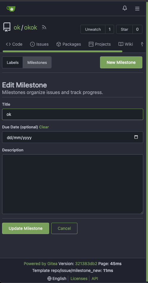
There is some distortion in desktop and mobile ui for new/edit milestone
page.
Fixing the new/edit milestone page for desktop and mobile ui
Design background
https://uxplanet.org/primary-secondary-action-buttons-c16df9b36150
https://balsamiq.com/learn/articles/button-design-best-practices/
<details>
<summary>Screen shots</summary>
Before:


After


</details>
---------
Co-authored-by: Denys Konovalov <privat@denyskon.de>
Co-authored-by: Giteabot <teabot@gitea.io>
2023-07-12 10:36:56 +00:00
silverwind
61e0d1a767
Enable H014 and H023 djlint rules ( #25786 )
...
Enable these rules:

- H014 | More than 2 blank lines.
- H023 | Do not use entity references.

There are more potential rules to enable but they are blocked by bugs in
the linter:

- https://github.com/Riverside-Healthcare/djLint/issues/711
- https://github.com/Riverside-Healthcare/djLint/issues/712
2023-07-09 20:33:25 +00:00
Denys Konovalov
be23b73e85
Restructure issue list template, styles ( #25750 )
...
This PR does various modifications on the issue list shared template:
- restructure layout to achieve better responsiveness
- fix various style issues
- restructure styles (better result with less code :)
- remove numerous `gt-*` patches and other unneeded classes -> use
existing css classes
<details>
<summary>Before:</summary>


</details>
<details>
<summary>After:</summary>


</details>
---------
Co-authored-by: silverwind <me@silverwind.io>
2023-07-09 19:38:01 +00:00
hiifong
d58096ec31
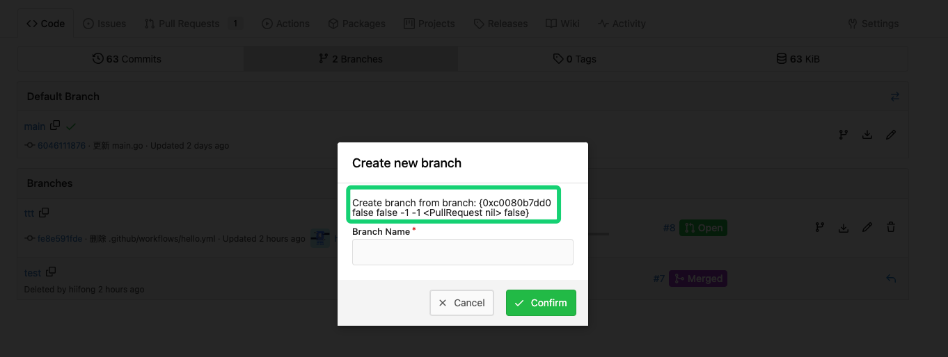
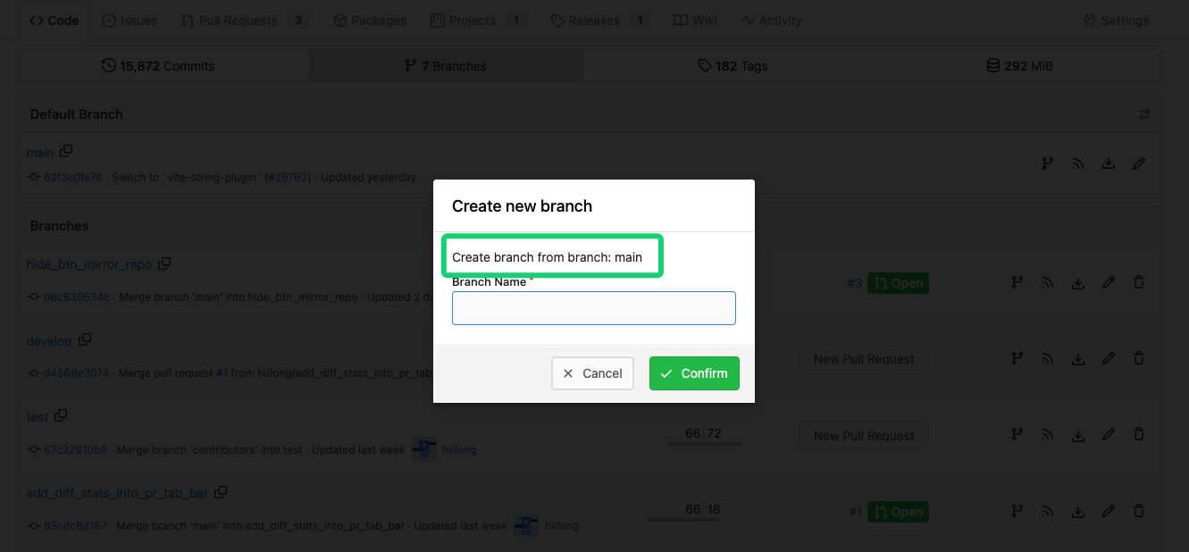
Fix the wrong default branch name displayed by checkout ( #25777 )
...
Related: #22743
Before:

After:

2023-07-09 11:09:06 +02:00
silverwind
f8bb1018ae
Tweak repo topics bar ( #25769 )
...
Minor tweaks to repo topics:
- Use gap instead of margin to align "Manage Topics" when no topics
present
- Add margin to description instead
Before:
<img width="1232" alt="Screenshot 2023-07-08 at 13 08 15"
src="https://github.com/go-gitea/gitea/assets/115237/a5d3586c-6cbf-4b74-8137-11d91f2cbb45 ">
<img width="1233" alt="Screenshot 2023-07-08 at 13 08 05"
src="https://github.com/go-gitea/gitea/assets/115237/59b18d93-e4cb-4f2b-9bc2-d6aa63f93827 ">
After:
<img width="1232" alt="Screenshot 2023-07-08 at 13 08 42"
src="https://github.com/go-gitea/gitea/assets/115237/470d42ad-3f7e-40f9-b0a1-203b4af77eb9 ">
<img width="1231" alt="Screenshot 2023-07-08 at 13 08 32"
src="https://github.com/go-gitea/gitea/assets/115237/42d18048-748c-4a3f-ab89-3403866cef34 ">
---------
2023-07-08 18:12:30 +00:00
puni9869
2ff0c12a95
Repository Archived text title center align ( #25767 )
...
Archive text title center align
<details>
<summary>Screen shots</summary>
Before

After


BTW On github

</details>
---------
Co-authored-by: Giteabot <teabot@gitea.io>
2023-07-08 10:57:17 +00:00
wxiaoguang
cc00fd50f3
Clarify "text-align" CSS helpers, fix clone button padding ( #25763 )
...
Changes:
* Rename gt-tl/gt-tc/gt-tr to gt-text-left/gt-text-center/gt-text-right
* The gt-ab and gt-br-0 are removed because they are not needed anymore
* Fix the clone dropdown button padding by ":not(.icon)"
Before:
<details>

</details>
After:
<details>

</details>
Fixes #25758
Co-authored-by: Giteabot <teabot@gitea.io>
2023-07-08 11:53:56 +02:00
Lunny Xiao
6375419468
Newly pushed branches hints on repository home page ( #25715 )
...
This PR will display a pull request creation hint on the repository home
page when there are newly created branches with no pull request. Only
the recent 6 hours and 2 updated branches will be displayed.

Inspired by #14003
Replace #14003
Resolves #311
Resolves #13196
Resolves #23743

co-authored by @kolaente
2023-07-08 05:19:00 +02:00
hiifong
a6a9389c70
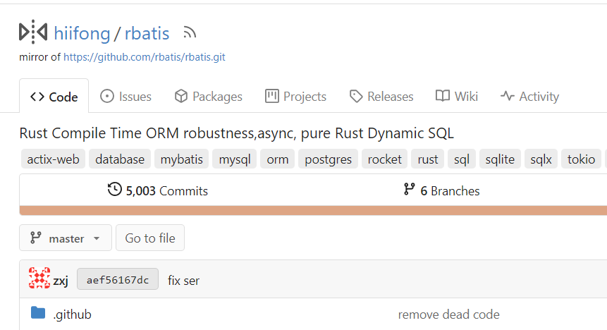
Hide add file button for pull mirrors ( #25748 )
...
I think hiding the add file button for mirror repositories that can keep the ui clean.
Before:

After:

2023-07-07 13:36:14 +00:00
puni9869
2af30f715e
Fix inconsistent user profile layout across tabs ( #25625 )
...
Fix ::User Profile Page Project Tab Have Inconsistent Layout and Style
Added the big_avator for consistency in the all header_items tabs.
Fixes : #24871
> ### Description
> in the user profile page the `Packages` and `Projects` tab have small
icons for user but other tabs have bigger profile picture with user
info:
>
> ### Screenshots
> ### **For Packages And Projects:**
>

>
> ### **For Other Tabs:**
>

>
## Before

## After changes
Project View
<img width="1394" alt="image"
src="https://github.com/go-gitea/gitea/assets/80308335/95d181d7-8e61-496d-9899-7b825c91ad56 ">
Packages View
<img width="1378" alt="image"
src="https://github.com/go-gitea/gitea/assets/80308335/7f5fd60f-6b18-4fa8-8c56-7b0d45d1a610 ">
## Org view for projects page
<img width="1385" alt="image"
src="https://github.com/go-gitea/gitea/assets/80308335/6400dc89-a5ae-4f0a-831b-5b6efa020d89 ">
## Org view for packages page
<img width="1387" alt="image"
src="https://github.com/go-gitea/gitea/assets/80308335/4e1e9ffe-1e4b-4334-8657-de11b5fd31d0 ">
---------
Co-authored-by: wxiaoguang <wxiaoguang@gmail.com>
Co-authored-by: Giteabot <teabot@gitea.io>
Co-authored-by: silverwind <me@silverwind.io>
2023-07-06 18:59:24 +00:00
sebastian-sauer
f03d95f0a9
Allow/fix review (approve/reject) of empty PRs ( #25690 )
...
gitea allows to create empty PRs.
Currently when you need approvals for a merge, you have to manually add
/files to the url to get to the files tab to approve / reject the PR.
This PR allows to open the files tab via the normal tab / link and then
fixes the layout of the files tab.
**Screenshots:**
Before:

After:

---------
Co-authored-by: silverwind <me@silverwind.io>
Co-authored-by: Giteabot <teabot@gitea.io>
2023-07-06 15:33:04 +00:00
Earl Warren
e1edd7a8e9
Show correct naming for 1 comment ( #25704 )
...
- Resolves https://codeberg.org/forgejo/forgejo/issues/948

Co-authored-by: Gusted <postmaster@gusted.xyz>
Co-authored-by: Giteabot <teabot@gitea.io>
2023-07-05 19:53:38 +00:00
Lunny Xiao
90b3b3dbf8
Fix tags header and pretty format numbers ( #25624 )
...
This caused by #23465
2023-07-05 04:11:42 +00:00
Denys Konovalov
00dbba7f42
Several fixes for mobile UI ( #25634 )
...
Resolves #25622
<details>
<summary>Screenshots</summary>


</details>
---------
Co-authored-by: wxiaoguang <wxiaoguang@gmail.com>
Co-authored-by: silverwind <me@silverwind.io>
2023-07-04 17:45:45 +00:00
silverwind
0006169f38
Actions list enhancements ( #25601 )
...
Various small enhancements to the actions list. Before and after:
<img width="1264" alt="Screenshot 2023-06-30 at 00 11 40"
src="https://github.com/go-gitea/gitea/assets/115237/bb4162ee-cdcf-4a73-b05e-f9521562edbb ">
<img width="1264" alt="Screenshot 2023-06-30 at 00 09 51"
src="https://github.com/go-gitea/gitea/assets/115237/52a70ea9-4bb3-406e-904b-0fdaafde9582 ">
---------
Co-authored-by: Giteabot <teabot@gitea.io>
2023-07-04 09:59:47 +00:00
Lunny Xiao
7735da1c66
Display branch commit status ( #25608 )
...
Fix #10388
This PR adds a status icon for every branch which has a status check for
the latest commit on branch list page.
<img width="1313" alt="图片"
src="https://github.com/go-gitea/gitea/assets/81045/727cd540-d03a-40c6-a7dd-e87c118af0ac ">
2023-07-03 03:32:21 +00:00
hiifong
36f1fa7792
Support displaying diff stats in PR tab bar ( #25387 )
...
Fix #25326

---------

Co-authored-by: silverwind <me@silverwind.io>
2023-07-03 01:00:28 +00:00
puni9869
4583cbd615
Adding branch-name copy to clipboard branches screen. ( #25596 )
...
Adding branch-name copy to clipboard and button in branches screen
Replaces #25569
Fixes #25120
New mocks:
<img width="876" alt="Screenshot 2023-06-30 at 12 01 41 AM"
src="https://github.com/go-gitea/gitea/assets/80308335/a34ab00f-5625-4529-ba17-f2bf7af58e2a ">
<img width="822" alt="Screenshot 2023-06-30 at 12 03 59 AM"
src="https://github.com/go-gitea/gitea/assets/80308335/3a32dffc-52cd-49e1-a437-6d11d58d0939 ">
<img width="476" alt="image"
src="https://github.com/go-gitea/gitea/assets/80308335/85e8f361-5cb7-45d4-aced-ad2523d54ab0 ">
2023-06-30 18:16:17 +00:00
sebastian-sauer
ed8a8af99f
Use AfterCommitId to get commit for Viewed functionality ( #25529 )
...
the PullHeadCommitID is not always available when the PR is merged.

Not sure if this is the best solution but in my simple tests it looks
like this fixes the problem - happy to get any feedback.

hopefully fixes https://github.com/go-gitea/gitea/issues/24813
2023-07-01 00:08:18 +08:00
Ed Silkworth
9fd63aaad1
read-only checkboxes don't appear and don't entirely act the way one might expect ( #25573 )
...
This pull request fades read-only checkboxes and checkmark, and it makes
the checkboxes act more read-only/disabled by not changing the
border-color when clicked.
Examples using light mode:
| Before | After |
| - | - |
| 
| 
|
| 
| 
|
| | read-only checkboxes and checkmark are faded<br>and the checkboxes
act more read-only/disabled |
Fixes/Closes/Resolves #25076
---------
Co-authored-by: silverwind <me@silverwind.io>
Co-authored-by: wxiaoguang <wxiaoguang@gmail.com>
2023-06-30 00:16:53 +02:00
silverwind
64f2d70262
Replace fomantic divider module with our own ( #25539 )
...
Should look exactly like before for normal dividers. "Horizontal" ones
look better because they no longer use image backgrounds.
<img width="917" alt="Screenshot 2023-06-27 at 19 07 56"
src="https://github.com/go-gitea/gitea/assets/115237/d97d8dec-6859-44a8-85ba-e4549b4dd9df ">
<img width="914" alt="Screenshot 2023-06-27 at 19 05 58"
src="https://github.com/go-gitea/gitea/assets/115237/8bf98544-2d82-4ebf-ac68-d6dc237bd6b2 ">
<img width="1246" alt="Screenshot 2023-06-27 at 19 00 42"
src="https://github.com/go-gitea/gitea/assets/115237/36a6bb21-6029-4f53-8bee-535f55c66fed ">
<img width="344" alt="Screenshot 2023-06-27 at 18 58 15"
src="https://github.com/go-gitea/gitea/assets/115237/a9e70aee-8e6b-4ea1-9e93-19c9f96aec6e ">
<img width="823" alt="Screenshot 2023-06-27 at 18 56 22"
src="https://github.com/go-gitea/gitea/assets/115237/e7a497cd-f262-4683-8872-23c3c8cce32f ">
<img width="330" alt="Screenshot 2023-06-27 at 19 21 11"
src="https://github.com/go-gitea/gitea/assets/115237/42f24149-a655-4c7e-bd26-8ab52db6446b ">
2023-06-29 20:24:22 +08:00
Lunny Xiao
6e19484f4d
Sync branches into databases ( #22743 )
...
Related #14180
Related #25233
Related #22639
Close #19786
Related #12763

This PR will change all the branches retrieve method from reading git
data to read database to reduce git read operations.

- [x] Sync git branches information into database when push git data
- [x] Create a new table `Branch`, merge some columns of `DeletedBranch`
into `Branch` table and drop the table `DeletedBranch`.
- [x] Read `Branch` table when visit `code` -> `branch` page
- [x] Read `Branch` table when list branch names in `code` page dropdown
- [x] Read `Branch` table when list git ref compare page
- [x] Provide a button in admin page to manually sync all branches.
- [x] Sync branches if repository is not empty but database branches are
empty when visiting pages with branches list
- [x] Use `commit_time desc` as the default FindBranch order by to keep
consistent as before and deleted branches will be always at the end.

---------

Co-authored-by: Jason Song <i@wolfogre.com>
2023-06-29 10:03:20 +00:00
HesterG
5a871932f0
Fix milestones deletion ( #25583 )
...
Close #25557
Fix regression from #25315

`data-id` is still needed for deleting milestone.
2023-06-29 10:17:18 +02:00
HesterG
c6f1fb1c6d
Use fetch form action for lock/unlock/pin/unpin on sidebar ( #25380 )
...
Before:
<img width="364" alt="Screen Shot 2023-06-20 at 11 59 11"
src="https://github.com/go-gitea/gitea/assets/17645053/ad284b7e-8d21-43be-b178-bbcfd37cb5bd ">
Might trigger many posts when keep clicking the buttons above.
<img width="448" alt="Screen Shot 2023-06-20 at 11 52 28"
src="https://github.com/go-gitea/gitea/assets/17645053/a60aa6ac-af74-45e4-b13a-512b436b81b0 ">
<img width="678" alt="Screen Shot 2023-06-20 at 11 52 37"
src="https://github.com/go-gitea/gitea/assets/17645053/d6662700-3643-4cc7-a2ec-64e1c0f5fbdb ">
After (PR sidebar, Same for issue):
https://github.com/go-gitea/gitea/assets/17645053/9df3ad1f-e29c-439b-8bde-e6b917d63cc6
For delete, it is using `base/modal_actions_confirm` subtemplate, and we
might need another general solution for this (maybe add another
attribute to the subtemplate or something)
---------
Co-authored-by: silverwind <me@silverwind.io>
Co-authored-by: Giteabot <teabot@gitea.io>
Co-authored-by: wxiaoguang <wxiaoguang@gmail.com>
2023-06-29 04:16:04 +00:00