0
0
Fork 0
mirror of https://github.com/go-gitea/gitea synced 2024-11-09 19:42:09 +01:00
Commit graph

27 commits

Author SHA1 Message Date
wxiaoguang
7a1557d2cc
Remove unnecessary "Safe" modifier from templates (#29318)
Follow #29165
2024-02-22 17:02:33 +00:00
wxiaoguang
31bb9f3247
Refactor more code in templates (#29236)
Follow #29165. 

* Introduce JSONTemplate to help to render JSON templates
* Introduce JSEscapeSafe for templates. Now only use `{{ ... |
JSEscape}}` instead of `{{ ... | JSEscape | Safe}}`
* Simplify "UserLocationMapURL" useage
2024-02-18 10:52:02 +01:00
Yarden Shoham
3e8414179c
Introduce htmx and use it to avoid full page load on Subscribe and Follow (#28908)
- Closes https://github.com/go-gitea/gitea/issues/28880

This change introduces htmx with the hope we could use it to make Gitea
more reactive while keeping our "HTML rendered on the server" approach.

- Add `htmx.js` that imports `htmx.org` and initializes error toasts
- Place `hx-headers='{"x-csrf-token": "{{.CsrfToken}}"}'` on the
`<body>` tag so every request that htmx sends is authenticated
- Place `hx-swap="outerHTML"` on the `<body>` tag so the response of
each htmx request replaces the tag it targets (as opposed to its inner
content)
- Place `hx-push-url="false"` on the `<body>` tag so no changes to the
URL happen in `<form>` tags
- Add the `is-loading` class during request

### Error toasts in action


![errors](https://github.com/go-gitea/gitea/assets/20454870/181a1beb-1cb8-4858-abe8-fa1fc3f5b8f3)

## Don't do a full page load when clicking the subscribe button
- Refactor the form around the subscribe button into its own template
- Use htmx to perform the form submission
- `hx-boost="true"` to prevent the default form submission behavior of a
full page load
- `hx-sync="this:replace"` to replace the current request (in case the
button is clicked again before the response is returned)
  - `hx-target="this"` to replace the form tag with the new form tag
- Change the backend response to return a `<form>` tag instead of a
redirect to the issue page

### Before
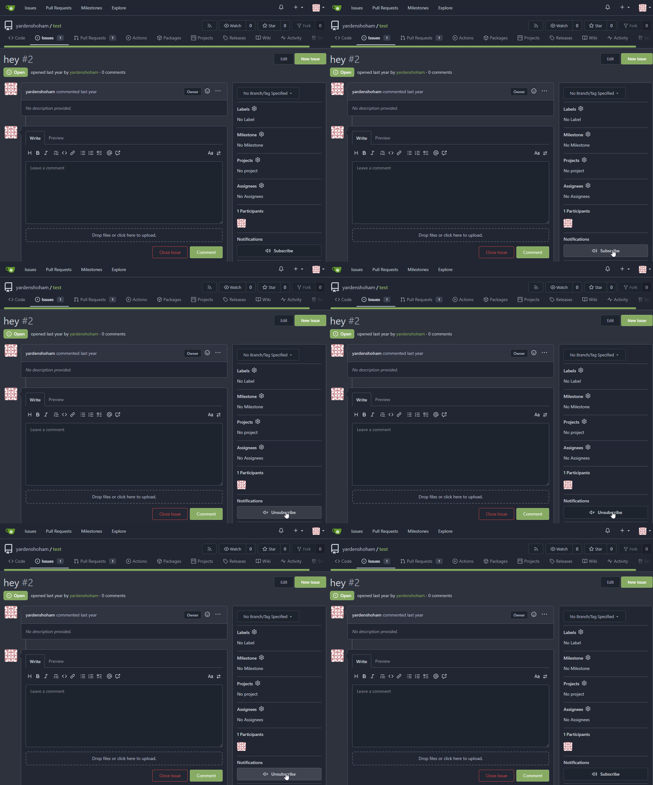

![subscribe_before](https://github.com/go-gitea/gitea/assets/20454870/cb2439a2-c3c0-425c-8d3c-5d646b1cdc28)

### After


![subscribe_after](https://github.com/go-gitea/gitea/assets/20454870/6fcd77d8-7b11-40b0-af4f-b152aaad787c)

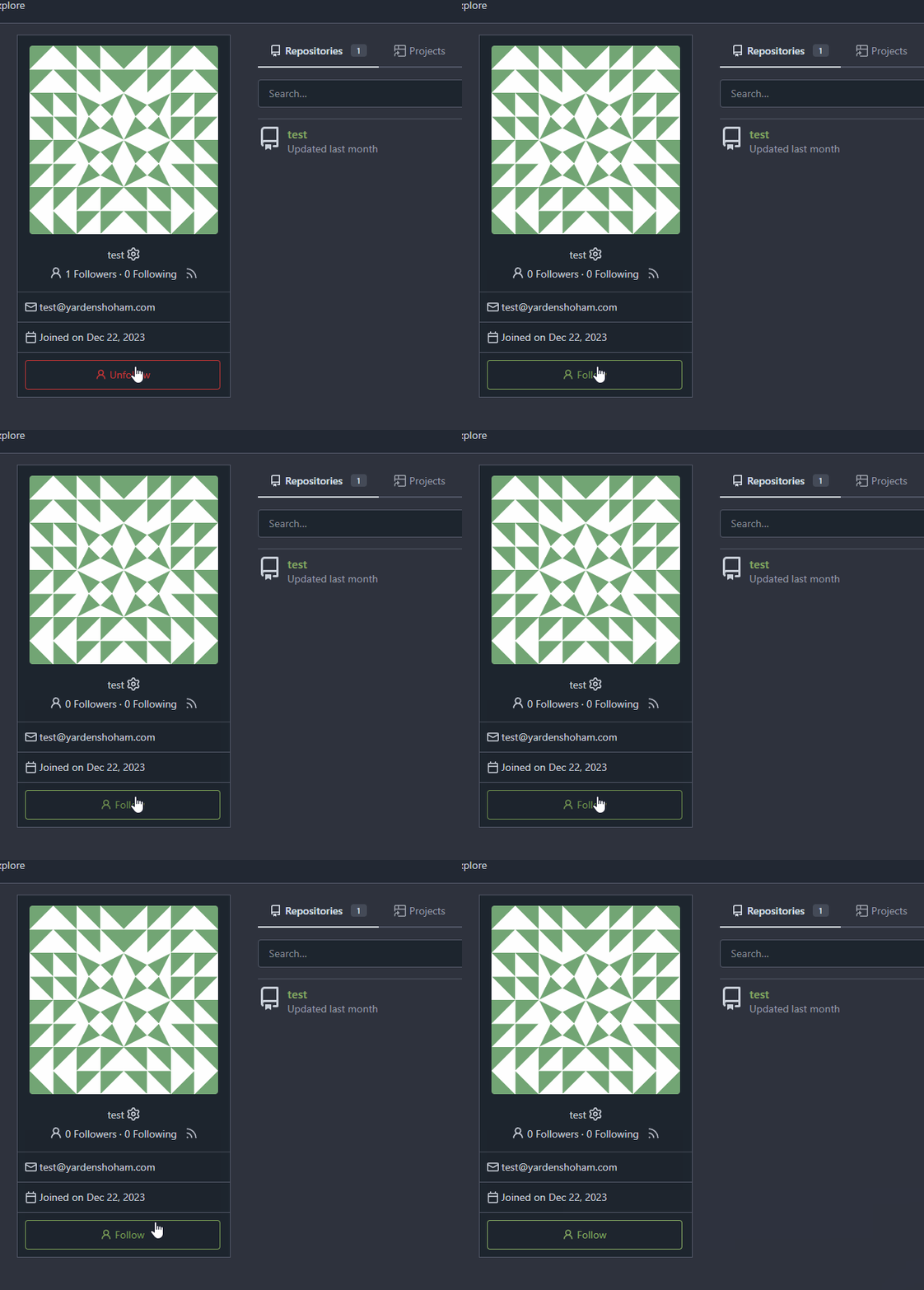
## Don't do a full page load when clicking the follow button
- Use htmx to perform the button request
- `hx-post="{{.ContextUser.HomeLink}}?action=follow"` to send a POST
request to follow the user
- `hx-target="#profile-avatar-card"` to target the card div for
replacement
- `hx-indicator="#profile-avatar-card"` to place the loading indicator
on the card
- Change the backend response to return a `<div>` tag (the card) instead
of a redirect to the user page

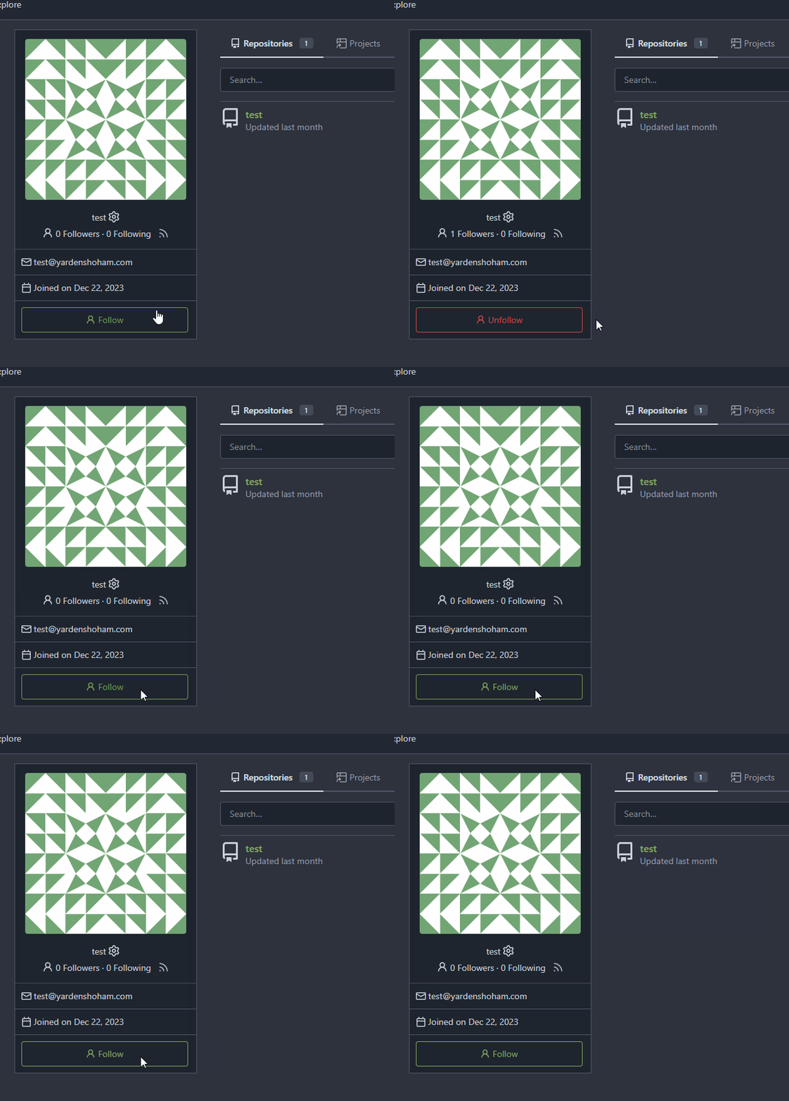
### Before

![follow_before](https://github.com/go-gitea/gitea/assets/20454870/a210b643-6e74-4ff9-8e61-d658c62edf1f)

### After


![follow_after](https://github.com/go-gitea/gitea/assets/20454870/5bb19ae9-0d59-4ae3-b538-4c83334e4722)

---------

Signed-off-by: Yarden Shoham <git@yardenshoham.com>
Co-authored-by: 6543 <m.huber@kithara.com>
Co-authored-by: Giteabot <teabot@gitea.io>
2024-01-30 15:45:54 +01:00
6543
49d7663929
Revert adding htmx until we finaly decide to add it (#28879) 2024-01-21 21:42:35 +08:00
Yarden Shoham
1df06e3f39
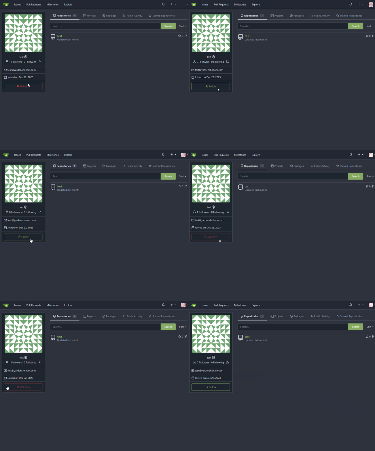
Don't do a full page load when clicking the follow button (#28872)
- Use htmx to perform the button request
- `hx-headers='{"x-csrf-token": "{{.CsrfToken}}"}'` to authenticate (we
should probably learn to reuse this)
- `hx-post="{{.ContextUser.HomeLink}}?action=follow"` to send a POST
request to follow the user
- `hx-target="#profile-avatar-card"` to target the card div for
replacement
- `hx-swap="outerHTML"` to replace the card (as opposed to its inner
content) with the new card that shows the new follower count and button
color
- Change the backend response to return a `<div>` tag (the card) instead
of a redirect to the user page

# Before
![before](https://github.com/go-gitea/gitea/assets/20454870/86899d15-41c9-42ed-bd85-253b9caac7f8)

# After

![after](https://github.com/go-gitea/gitea/assets/20454870/59455d96-548c-4a81-a5b0-fab1dc1e87ef)

Signed-off-by: Yarden Shoham <git@yardenshoham.com>
2024-01-20 23:37:22 +01:00
Denys Konovalov
e5f19dd317
Always use whole user name as link (#27815)
Starting from #25790 this shared template only linked the username of
the user if both display name and username were shown. I experienced
myself always trying to click on the display name - I think it is
annoying for others too.

After:


![grafik](https://github.com/go-gitea/gitea/assets/47871822/a0e82127-b773-4ca4-890f-d18422a7bef2)

![grafik](https://github.com/go-gitea/gitea/assets/47871822/79efcf93-2f50-4fc4-ba15-afc6174be48c)
2023-10-30 09:53:16 +00:00
yp05327
f39256f035
Add word-break to organization name and description (#26624)
Fix #24318

Before:

![image](https://github.com/go-gitea/gitea/assets/18380374/38282e5e-0b4d-4568-a853-59352798e826)

![image](https://github.com/go-gitea/gitea/assets/18380374/79d89ee6-61f6-45a7-af0b-d1c23fead25a)

![image](https://github.com/go-gitea/gitea/assets/18380374/39b45fae-52e2-4697-b83a-7cd10f76ac43)

After:

![image](https://github.com/go-gitea/gitea/assets/18380374/09e8cfcf-0150-494e-9f63-0868f529da65)

![image](https://github.com/go-gitea/gitea/assets/18380374/d2c348d3-fe03-466a-a5f4-878b7a93a318)

![image](https://github.com/go-gitea/gitea/assets/18380374/7f75b807-300c-42d5-b2c3-bae9e45e3c08)

![image](https://github.com/go-gitea/gitea/assets/18380374/06eca901-f5cf-4100-bb65-92457ad106e3)
2023-10-25 10:40:39 +00:00
techknowlogick
e96e440b8b
add a shortcut to user's profile page to admin user details (#27299) 2023-10-08 02:48:32 +00:00
delvh
112f37c546
Fix yet another ctx template bug (#27417)
Fixes #27416
2023-10-04 02:11:01 +00:00
wxiaoguang
93bd4351bf
Fix more "locale" usages (#27259) 2023-09-25 20:42:40 +08:00
delvh
7960ba7e2b
Always use ctx.Locale.Tr inside templates (#27231) 2023-09-25 08:56:50 +00:00
silverwind
8099238618
Change green buttons to primary color (#27099)
I think it's better if the primary actions have primary color instead of
green which fits better into the overall single-color UI design. This PR
currently replaces every green button with primary:

<img width="141" alt="Screenshot 2023-09-16 at 14 07 59"
src="https://github.com/go-gitea/gitea/assets/115237/843c1e50-4fb2-4ec6-84ba-0efb9472dcbe">
<img width="161" alt="Screenshot 2023-09-16 at 14 07 51"
src="https://github.com/go-gitea/gitea/assets/115237/9442195a-a3b2-4a42-b262-8377d6f5c0d1">

Modal actions now use uncolored/primary instead of previous green/red
colors. I also removed the box-shadow on all basic buttons:

<img width="259" alt="Screenshot 2023-09-16 at 14 16 39"
src="https://github.com/go-gitea/gitea/assets/115237/5beea529-127a-44b0-8d4c-afa7b034a490">
<img width="261" alt="Screenshot 2023-09-16 at 14 17 42"
src="https://github.com/go-gitea/gitea/assets/115237/4757f7b2-4d46-49bc-a797-38bb28437b88">

The change currently includes the "Merge PR" button, for which we might
want to make an exception to match the icon color there:

<img width="442" alt="Screenshot 2023-09-16 at 14 33 53"
src="https://github.com/go-gitea/gitea/assets/115237/993ac1a5-c94d-4895-b76c-0d872181a70b">
2023-09-18 22:05:31 +00:00
BeYonme
918accaafa
Relocate the RSS user feed button (#26882)
before:

![before](https://github.com/go-gitea/gitea/assets/38558065/e33e0809-91cd-451a-9c36-ab20b9296038)

after:

![after](https://github.com/go-gitea/gitea/assets/38558065/9dbfb0ce-1d0e-4bc8-8502-6b4af0fba220)

Co-authored-by: KN4CK3R <admin@oldschoolhack.me>
2023-09-03 11:06:59 +00:00
Panagiotis "Ivory" Vasilopoulos
73f6535406
Fix URL of padlock icon in profile (#26446) 2023-08-11 17:40:38 +00:00
wxiaoguang
a370efc13f
Use template context function for avatar rendering (#26385)
Introduce `AvatarUtils`, no need to pass `$.Context` to every
sub-template, and simplify the template helper functions.
2023-08-10 11:19:39 +08:00
Denys Konovalov
b9baed2c74
Introduce flex-list & flex-item elements for Gitea UI (#25790)
This PR introduces a new UI element type for Gitea called `flex-item`.
It consists of a horizontal card with a leading, main and trailing part:


![grafik](https://github.com/go-gitea/gitea/assets/47871822/395dd3f3-3906-4481-8f65-be6ac0acbe03)

The idea behind it is that in Gitea UI, we have many cases where we use
this kind of layout, but it is achieved in many different ways:
  - grid layout
  - `.ui.list` with additional hacky flexbox
- `.ui.key.list` - looks to me like a style set originally created for
ssh/gpg key list, was used in many other places
  - `.issue.list` - created for issue cards, used in many other places
  - ...

This new style is based on `.issue.list`, specifically the refactoring
of it done in #25750.

In this PR, the new element is introduced and lots of templates are
being refactored to use that style. This allows to remove a lot of
page-specific css, makes many of the elements responsive or simply
provides a cleaner/better-looking way to present information.

A devtest section with the new style is also available.

<details>
<summary>Screenshots (left: before, right: after)</summary>

![Bildschirmfoto vom 2023-07-09
21-01-21](https://github.com/go-gitea/gitea/assets/47871822/545b7da5-b300-475f-bd6d-b7d836950bb5)
![Bildschirmfoto vom 2023-07-09
21-01-56](https://github.com/go-gitea/gitea/assets/47871822/b6f70415-6795-4f71-a5ea-117d56107ea1)
![Bildschirmfoto vom 2023-07-09
21-02-45](https://github.com/go-gitea/gitea/assets/47871822/47407121-3f2a-4778-8f6d-ad2687c2e7b3)
![Bildschirmfoto vom 2023-07-09
21-03-44](https://github.com/go-gitea/gitea/assets/47871822/76167aaf-c3b2-46f6-9ffd-709f20aa6a34)
![Bildschirmfoto vom 2023-07-09
21-04-52](https://github.com/go-gitea/gitea/assets/47871822/af8fdde5-711e-4524-99cf-fb5d68af85b9)
![Bildschirmfoto vom 2023-07-09
21-05-25](https://github.com/go-gitea/gitea/assets/47871822/ae406946-e3e4-4109-abfe-b3588a07b468)
![Bildschirmfoto vom 2023-07-09
21-06-35](https://github.com/go-gitea/gitea/assets/47871822/2dbacc04-24d6-4f91-9e42-e16d6e4b5f1f)
![Bildschirmfoto vom 2023-07-09
21-09-03](https://github.com/go-gitea/gitea/assets/47871822/d3ca4e56-a72f-4179-adc8-98bfd638025b)
![Bildschirmfoto vom 2023-07-09
21-09-44](https://github.com/go-gitea/gitea/assets/47871822/df1fa689-499c-4e54-b6fb-3b81644b725f)
![Bildschirmfoto vom 2023-07-09
21-10-27](https://github.com/go-gitea/gitea/assets/47871822/b21cac71-a85a-4c8c-bb99-ab90373d8e09)
![Bildschirmfoto vom 2023-07-09
21-11-12](https://github.com/go-gitea/gitea/assets/47871822/89be39cf-0af9-4f2d-9fca-42f9eb5e7824)
![Bildschirmfoto vom 2023-07-09
21-12-01](https://github.com/go-gitea/gitea/assets/47871822/079579ea-1ecb-49c0-b32b-b59ed957caec)
![Bildschirmfoto vom 2023-07-09
21-17-44](https://github.com/go-gitea/gitea/assets/47871822/61ac6ec4-a319-4d5c-9c99-2e02a77295ba)
![Bildschirmfoto vom 2023-07-09
21-18-27](https://github.com/go-gitea/gitea/assets/47871822/5b55b73f-6244-47f7-a3e6-c5e4a7474585)
![Bildschirmfoto vom 2023-07-09
21-19-18](https://github.com/go-gitea/gitea/assets/47871822/c1b7c22e-3e5a-46d4-b8d6-5560db478c0b)
![Bildschirmfoto vom 2023-07-09
21-29-13](https://github.com/go-gitea/gitea/assets/47871822/82ffca8d-ab2e-4a18-9954-5b685bf6a422)
![Bildschirmfoto vom 2023-07-09
21-30-11](https://github.com/go-gitea/gitea/assets/47871822/ad2fdccc-2be8-41bb-bfdc-a084aa387b61)
![Bildschirmfoto vom 2023-07-09
21-32-44](https://github.com/go-gitea/gitea/assets/47871822/2d298ba7-d084-48b5-a139-f86d56262110)
![Bildschirmfoto vom 2023-07-09
21-33-28](https://github.com/go-gitea/gitea/assets/47871822/4cbd838e-9de8-4ad0-8ed9-438da5c9a5cb)


</details>

---------

Co-authored-by: Giteabot <teabot@gitea.io>
2023-08-01 00:13:42 +02:00
Panagiotis "Ivory" Vasilopoulos
d58c542579
Add 'Show on a map' button to Location in profile, fix layout (#26214)
Not too important, but I think that it'd be a pretty neat touch.

Also fixes some layout bugs introduced by a previous PR.

---------

Co-authored-by: Gusted <postmaster@gusted.xyz>
Co-authored-by: Caesar Schinas <caesar@caesarschinas.com>
Co-authored-by: wxiaoguang <wxiaoguang@gmail.com>
2023-07-31 08:44:45 +00:00
Panagiotis "Ivory" Vasilopoulos
1c89f15f42
Use calendar icon for Joined on... in profiles (#26215) 2023-07-29 19:34:49 +08:00
wxiaoguang
128d77a3a0
Following up fixes for "Fix inconsistent user profile layout across tabs" (#25739)
Follow
https://github.com/go-gitea/gitea/pull/25625#issuecomment-1621577816

1. Fix the incorrect "project view" layout
2. Fix the "follow/unfollow" link on "packages" and "projects" tab


Before:


![image](https://github.com/go-gitea/gitea/assets/2114189/3b071235-c186-4097-8a19-dd90dcb2a344)


After:


![image](https://github.com/go-gitea/gitea/assets/2114189/d1d23cd7-28d8-43e3-9f68-03e8a34a9b97)

---------

Co-authored-by: Giteabot <teabot@gitea.io>
2023-07-07 17:27:12 +02:00
puni9869
2af30f715e
Fix inconsistent user profile layout across tabs (#25625)
Fix ::User Profile Page  Project Tab Have Inconsistent Layout and Style
Added the big_avator for consistency in the all header_items tabs.
Fixes: #24871
> ### Description
> in the user profile page the `Packages` and `Projects` tab have small
icons for user but other tabs have bigger profile picture with user
info:
> 
> ### Screenshots
> ### **For Packages And Projects:**
>
![image](https://user-images.githubusercontent.com/25511175/240148601-2420d77b-ba25-4718-9ccb-c5d0d95e3079.png)
> 
> ### **For Other Tabs:**
>
![image](https://user-images.githubusercontent.com/25511175/240148461-ce9636b3-fe11-4c46-a230-30d83eee5947.png)
> 

## Before

![image](https://github.com/go-gitea/gitea/assets/80308335/975ad038-07ca-4b10-b75d-ccf259be7b9d)


 ## After changes
Project View 
<img width="1394" alt="image"
src="https://github.com/go-gitea/gitea/assets/80308335/95d181d7-8e61-496d-9899-7b825c91ad56">


Packages View
<img width="1378" alt="image"
src="https://github.com/go-gitea/gitea/assets/80308335/7f5fd60f-6b18-4fa8-8c56-7b0d45d1a610">


## Org view for projects page
<img width="1385" alt="image"
src="https://github.com/go-gitea/gitea/assets/80308335/6400dc89-a5ae-4f0a-831b-5b6efa020d89">

## Org view for packages page
<img width="1387" alt="image"
src="https://github.com/go-gitea/gitea/assets/80308335/4e1e9ffe-1e4b-4334-8657-de11b5fd31d0">

---------

Co-authored-by: wxiaoguang <wxiaoguang@gmail.com>
Co-authored-by: Giteabot <teabot@gitea.io>
Co-authored-by: silverwind <me@silverwind.io>
2023-07-06 18:59:24 +00:00
Yarden Shoham
abccb86b36
Show bot label next to username when rendering autor link if the user is a bot (#24943)
If the user is a bot, we'll add a label next to the author link that
says `bot`. I didn't localize `bot` because passing `locale` into the
`autorlink` template would require changing all calls.

# Example
`yardenshoham` is a bot.
## Before

![image](https://github.com/go-gitea/gitea/assets/20454870/77390780-b763-4f0f-b358-bbccdbf17a5d)

## After

![image](https://github.com/go-gitea/gitea/assets/20454870/72af342f-ee76-4337-95ad-4ecaba853fed)

---------

Signed-off-by: Yarden Shoham <git@yardenshoham.com>
2023-05-26 18:58:11 +02:00
silverwind
19993d8814
Change --font-weight-bold to --font-weight-semibold and 600 value, introduce new font weight variables (#24827)
There was some recent discussion about this in Discord `ui-design`
channel and the conclusion was that
https://github.com/go-gitea/gitea/issues/24305 should have fixed their
OS font installation to have semibold weights.

I have now tested this 601 weight on a Windows 10 machine on Firefox
myself, and I immediately noticed that bold was excessivly bold and
rendering as 700 because browsers are biased towards bolder fonts. So
revert this back to the previous value.
2023-05-21 23:37:32 +00:00
yp05327
d5e417a33d
Fix no user listed in org teams page (#22979)
https://github.com/go-gitea/gitea/pull/22294 introduced this bug.
Before:

![picture](https://user-images.githubusercontent.com/18380374/219916000-5b28db1a-22b5-481a-807b-49c14ac1cd35.png)
After:

![picture](https://user-images.githubusercontent.com/18380374/219916260-6b94efbb-836a-4551-b6a8-3f9cb37d822a.png)

Co-authored-by: Lunny Xiao <xiaolunwen@gmail.com>
2023-02-19 12:57:49 +08:00
Lunny Xiao
bd820aa9c5
Add context cache as a request level cache (#22294)
To avoid duplicated load of the same data in an HTTP request, we can set
a context cache to do that. i.e. Some pages may load a user from a
database with the same id in different areas on the same page. But the
code is hidden in two different deep logic. How should we share the
user? As a result of this PR, now if both entry functions accept
`context.Context` as the first parameter and we just need to refactor
`GetUserByID` to reuse the user from the context cache. Then it will not
be loaded twice on an HTTP request.

But of course, sometimes we would like to reload an object from the
database, that's why `RemoveContextData` is also exposed.

The core context cache is here. It defines a new context
```go
type cacheContext struct {
	ctx  context.Context
	data map[any]map[any]any
        lock sync.RWMutex
}

var cacheContextKey = struct{}{}

func WithCacheContext(ctx context.Context) context.Context {
	return context.WithValue(ctx, cacheContextKey, &cacheContext{
		ctx:  ctx,
		data: make(map[any]map[any]any),
	})
}
```

Then you can use the below 4 methods to read/write/del the data within
the same context.

```go
func GetContextData(ctx context.Context, tp, key any) any
func SetContextData(ctx context.Context, tp, key, value any)
func RemoveContextData(ctx context.Context, tp, key any)
func GetWithContextCache[T any](ctx context.Context, cacheGroupKey string, cacheTargetID any, f func() (T, error)) (T, error)
```

Then let's take a look at how `system.GetString` implement it.

```go
func GetSetting(ctx context.Context, key string) (string, error) {
	return cache.GetWithContextCache(ctx, contextCacheKey, key, func() (string, error) {
		return cache.GetString(genSettingCacheKey(key), func() (string, error) {
			res, err := GetSettingNoCache(ctx, key)
			if err != nil {
				return "", err
			}
			return res.SettingValue, nil
		})
	})
}
```

First, it will check if context data include the setting object with the
key. If not, it will query from the global cache which may be memory or
a Redis cache. If not, it will get the object from the database. In the
end, if the object gets from the global cache or database, it will be
set into the context cache.

An object stored in the context cache will only be destroyed after the
context disappeared.
2023-02-15 21:37:34 +08:00
zeripath
51383ec084
Move helpers to be prefixed with gt- (#22879)
As discussed in #22847 the helpers in helpers.less need to have a
separate prefix as they are causing conflicts with fomantic styles

This will allow us to have the `.gt-hidden { display:none !important; }`
style that is needed to for the reverted PR.

Of note in doing this I have noticed that there was already a conflict
with at least one chroma style which this PR now avoids.

I've also added in the `gt-hidden` style that matches the tailwind one
and switched the code that needed it to use that.

Signed-off-by: Andrew Thornton <art27@cantab.net>

---------

Signed-off-by: Andrew Thornton <art27@cantab.net>
Co-authored-by: wxiaoguang <wxiaoguang@gmail.com>
2023-02-13 17:59:59 +00:00
silverwind
fefdb7ffd1
Timeline and color tweaks (#21799)
Followup to https://github.com/go-gitea/gitea/pull/21784.

- Restore muted effect on timeline author and issuelist comment icon
- Remove whitespace inside shared user templates, fixing link hover
underline
- Use shared author link template more
- Use `bold` class instead of CSS
- Fix grey-light color being too dark on arc-green
- Add missing black-light color
- Fix issuelist progress bar color
- Fix various other cases of missing `.muted`

<img width="416" alt="Screenshot 2022-11-13 at 12 15 22"
src="https://user-images.githubusercontent.com/115237/201519497-1d4725c6-bc8b-47b5-9f68-1278ac9a8c92.png">
<img width="324" alt="Screenshot 2022-11-13 at 12 16 52"
src="https://user-images.githubusercontent.com/115237/201519501-c0d03700-f9af-4316-ab46-482f2c7c738b.png">
<img width="79" alt="Screenshot 2022-11-13 at 12 30 55"
src="https://user-images.githubusercontent.com/115237/201519502-46dc2d73-bbdf-4a2e-84d3-d2976f793163.png">
<img width="440" alt="Screenshot 2022-11-13 at 12 41 03"
src="https://user-images.githubusercontent.com/115237/201519876-ada33948-f84a-4aeb-a40d-5c873f9a49e9.png">
<img width="213" alt="Screenshot 2022-11-13 at 12 52 54"
src="https://user-images.githubusercontent.com/115237/201520291-a4d7238e-aeca-46c7-9008-8b644b1b676e.png">
<img width="208" alt="Screenshot 2022-11-13 at 12 56 16"
src="https://user-images.githubusercontent.com/115237/201520436-aa8ba109-b959-42fb-831a-021e806c7082.png">

Co-authored-by: Lauris BH <lauris@nix.lv>
Co-authored-by: techknowlogick <techknowlogick@gitea.io>
Co-authored-by: wxiaoguang <wxiaoguang@gmail.com>
2022-11-19 12:02:30 +08:00
zeripath
de7b87fbc2
Do not add links to Posters or Assignees with ID < 0 (#20577)
There are several places in templates/repo/issue/view_content/comments.tmpl where links are made to Posters or Assignees who are Ghosts or have IDs <0.

Fix #20559

Signed-off-by: Andrew Thornton <art27@cantab.net>
2022-09-03 10:33:34 +01:00