Try to improve #28949

1. Make `ctx.Data["ShowOutdatedComments"] = true` by default: it brings
consistent user experience, and sometimes the "outdated (source
changed)" comments are still valuable.
2. Show a friendly message if the comment won't show, then the end users
won't fell that "the comment disappears" (it is the special case when
`ShowOutdatedComments = false`)
- The watch/unwatch button and star/unstar get their own template
- The backend returns HTML instead of redirect

---------

Signed-off-by: Yarden Shoham <git@yardenshoham.com>
Co-authored-by: John Olheiser <john.olheiser@gmail.com>
- Closes https://github.com/go-gitea/gitea/issues/28880
This change introduces htmx with the hope we could use it to make Gitea
more reactive while keeping our "HTML rendered on the server" approach.
- Add `htmx.js` that imports `htmx.org` and initializes error toasts
- Place `hx-headers='{"x-csrf-token": "{{.CsrfToken}}"}'` on the
`<body>` tag so every request that htmx sends is authenticated
- Place `hx-swap="outerHTML"` on the `<body>` tag so the response of
each htmx request replaces the tag it targets (as opposed to its inner
content)
- Place `hx-push-url="false"` on the `<body>` tag so no changes to the
URL happen in `<form>` tags
- Add the `is-loading` class during request
### Error toasts in action

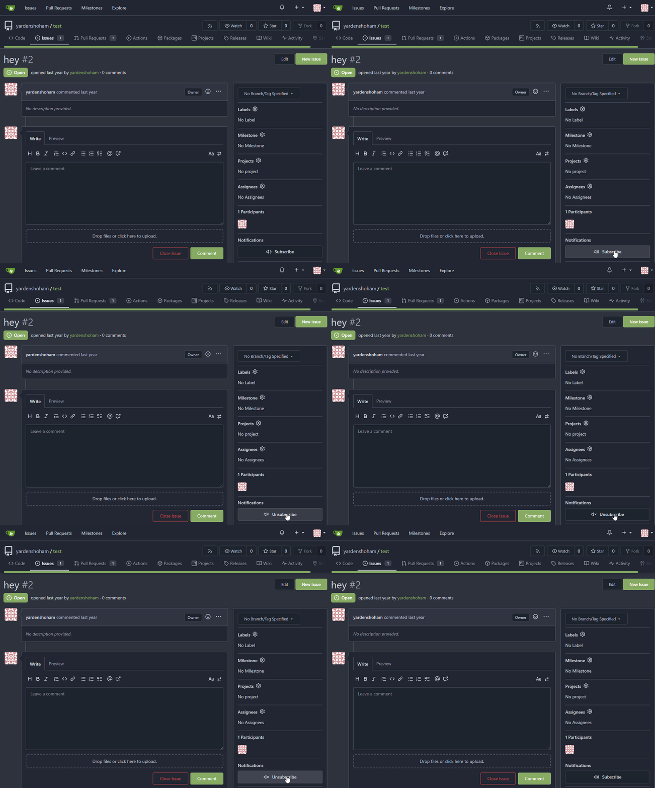
## Don't do a full page load when clicking the subscribe button
- Refactor the form around the subscribe button into its own template
- Use htmx to perform the form submission
- `hx-boost="true"` to prevent the default form submission behavior of a
full page load
- `hx-sync="this:replace"` to replace the current request (in case the
button is clicked again before the response is returned)
- `hx-target="this"` to replace the form tag with the new form tag
- Change the backend response to return a `<form>` tag instead of a
redirect to the issue page
### Before

### After

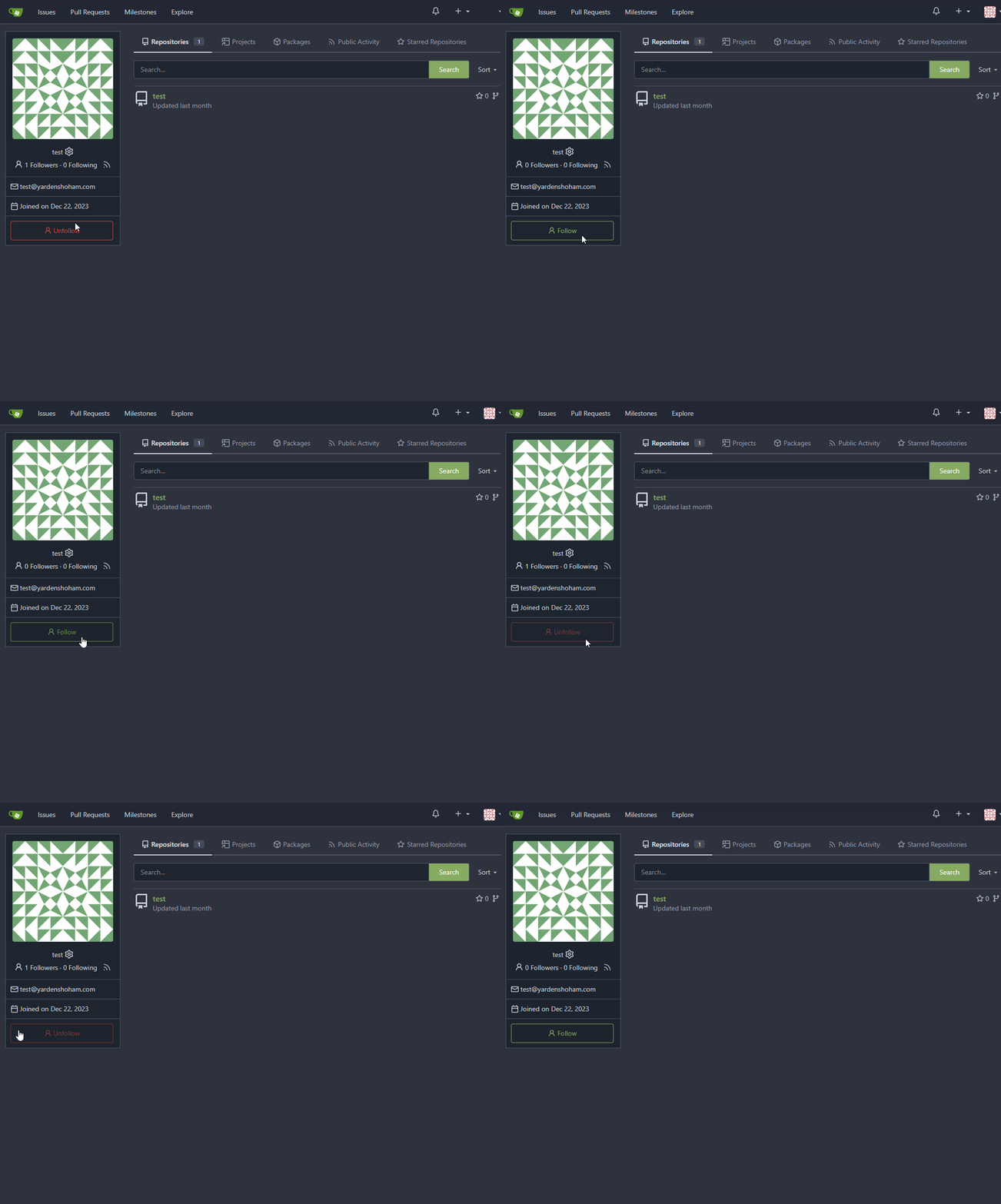
## Don't do a full page load when clicking the follow button
- Use htmx to perform the button request
- `hx-post="{{.ContextUser.HomeLink}}?action=follow"` to send a POST
request to follow the user
- `hx-target="#profile-avatar-card"` to target the card div for
replacement
- `hx-indicator="#profile-avatar-card"` to place the loading indicator
on the card
- Change the backend response to return a `<div>` tag (the card) instead
of a redirect to the user page
### Before

### After

---------
Signed-off-by: Yarden Shoham <git@yardenshoham.com>
Co-authored-by: 6543 <m.huber@kithara.com>
Co-authored-by: Giteabot <teabot@gitea.io>
The `ToUTF8*` functions were stripping BOM, while BOM is actually valid
in UTF8, so the stripping must be optional depending on use case. This
does:

- Add a options struct to all `ToUTF8*` functions, that by default will
strip BOM to preserve existing behaviour
- Remove `ToUTF8` function, it was dead code
- Rename `ToUTF8WithErr` to `ToUTF8`
- Preserve BOM in Monaco Editor
- Remove a unnecessary newline in the textarea value. Browsers did
ignore it, it seems but it's better not to rely on this behaviour.

Fixes: https://github.com/go-gitea/gitea/issues/28743
Related: https://github.com/go-gitea/gitea/issues/6716 which seems to
have once introduced a mechanism that strips and re-adds the BOM, but
from what I can tell, this mechanism was removed at some point after
that PR.
- Refactor the form around the subscribe button into its own template
- Use htmx to perform the form submission
- `hx-boost="true"` to prevent the default form submission behavior of a
full page load
- `hx-sync="this:replace"` to replace the current request (in case the
button is clicked again before the response is returned)
- `hx-target="this"` to replace the form tag with the new form tag
- `hx-push-url="false"` to disable a change to the URL
- `hx-swap="show:no-scroll"` to preserve the scroll position
- Change the backend response to return a `<form>` tag instead of a
redirect to the issue page
- Include `htmx.org` in javascript imports
This change introduces htmx with the hope we could use it to make Gitea
more reactive while keeping our "HTML rendered on the server" approach.
# Before

# After

---------
Signed-off-by: Yarden Shoham <git@yardenshoham.com>
As more and more options can be set for creating the repository, I don't
think we should put all of them into the creation web page which will
make things look complicated and confusing.

And I think we need some rules about how to decide which should/should
not be put in creating a repository page. One rule I can imagine is if
this option can be changed later and it's not a MUST on the creation,
then it can be removed on the page. So I found trust model is the first
one.

This PR removed the trust model selections on creating a repository web
page and kept others as before.
This is also a preparation for #23894 which will add a choice about SHA1
or SHA256 that cannot be changed once the repository created.
By clicking the currently active "Open" or "Closed" filter button in the
issue list, the user can toggle that filter off in order to see all
issues regardless of state. The URL "state" parameter will be set to
"all" and the "Open"/"Closed" button will not show as active.
Fixes#26548
This PR refactors the rendering of markup links. The old code uses
`strings.Replace` to change some urls while the new code uses more
context to decide which link should be generated.
The added tests should ensure the same output for the old and new
behaviour (besides the bug).
We may need to refactor the rendering a bit more to make it clear how
the different helper methods render the input string. There are lots of
options (resolve links / images / mentions / git hashes / emojis / ...)
but you don't really know what helper uses which options. For example,
we currently support images in the user description which should not be
allowed I think:
<details>
<summary>Profile</summary>
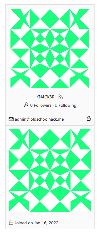
https://try.gitea.io/KN4CK3R

</details>
---------
Co-authored-by: wxiaoguang <wxiaoguang@gmail.com>
Fixes#27114.
* In Gitea 1.12 (#9532), a "dismiss stale approvals" branch protection
setting was introduced, for ignoring stale reviews when verifying the
approval count of a pull request.
* In Gitea 1.14 (#12674), the "dismiss review" feature was added.
* This caused confusion with users (#25858), as "dismiss" now means 2
different things.
* In Gitea 1.20 (#25882), the behavior of the "dismiss stale approvals"
branch protection was modified to actually dismiss the stale review.
For some users this new behavior of dismissing the stale reviews is not
desirable.
So this PR reintroduces the old behavior as a new "ignore stale
approvals" branch protection setting.
---------
Co-authored-by: delvh <dev.lh@web.de>
When JavaScript is not loaded, fall back to displaying reaction tooltips
with the default browser `title` attribute. An element with a present
but empty `data-tooltip-content` will use the `title` attribute for its
tippy.js tooltip content, so when JavaScript is enabled, this functions
the same as the current behavior.
There is an accessibility issue in the interface when attempting to
delete a repository. When I click on "Delete repository," a dialog box
appears, requiring confirmation to proceed with the repository deletion.
However, when I press the "Repo name" label, the wrong input field gains
focus. The focused field is located behind the dialog and is intended
for renaming the repository.
- The RSS Feed icons were placed in a proper button, so that it does
  not look "inconsistent". This also makes the problem of the button
  being improperly aligned go away.
- The icon that shows on user profiles has not been modified because
  of a lack of better implementation ideas.
- Where applicable, the RSS Feed icon was put directly next to the
  Follow button (right menu), as both functionalities effectively
  share the same purpose.
- Despite the attempt at achieving less inconsistency, a conscious
  decision to not add any text to those buttons was made, opting for
  tooltips instead. "Make it present, but not too annoying."
- A special exception was made for the Releases pages (which contains
  text, not a tooltip), where an RSS feed would be particularly
  beneficial to users.

The fact that the RSS functionality is explicitly optional was taken
into account, and these improvements were made with public-facing
instances (where the feature works best) in mind.
Fixes https://codeberg.org/forgejo/forgejo/issues/1759

If you are bowing another branch than the default branch and click n the
Code tab, it will take you to the root of the branch. The `BranchName`
variable is also set when viewing a Wiki commit, so we also need to
check if we are on a Wiki.