wxiaoguang
07373f1d5d
Improve issue sidebar UI ( #32587 )
...
1. remove duplicate dividers
2. align reviewer items
3. merge & remove unused CSS styles
Before:
<details>


</details>
After:
<details>


</details>
2024-11-21 03:31:54 +00:00
a1012112796
23d0f9083e
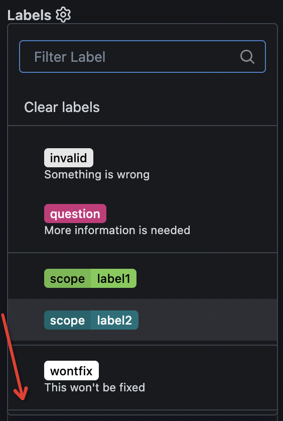
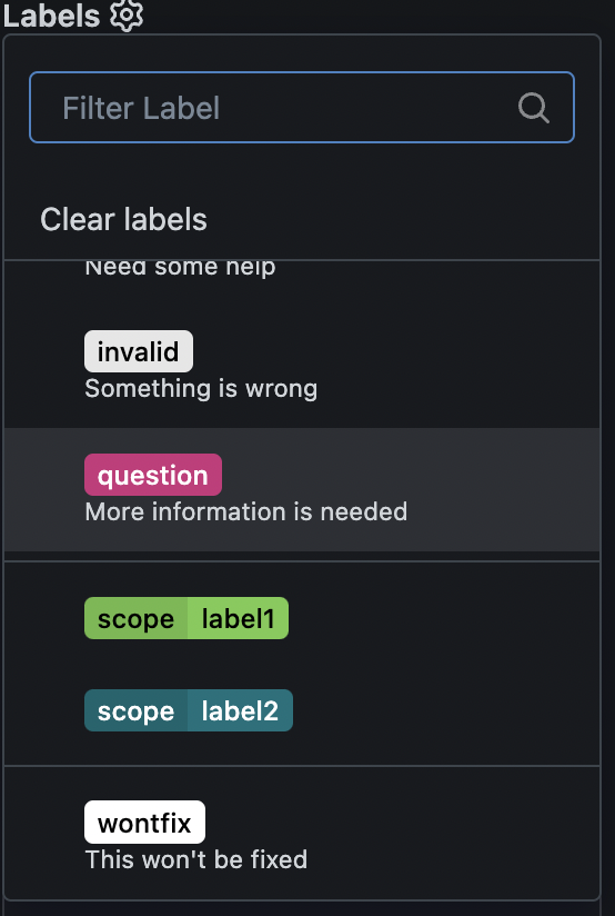
make search box in issue sidebar dropdown list always show when scrolling ( #32576 )
...
as title, replace #31597 after #32460

---------

Signed-off-by: a1012112796 <1012112796@qq.com>
2024-11-21 09:23:50 +08:00
charles
e546480d0a
Fix large image overflow in comment page ( #31740 )
...
Close #31709
52px is calculate by avatar size in
templates\repo\issue\view_content\comments.tmpl
```html
<img src="{{.Poster.AvatarLink $.Context}}" width="40" height="40">
```
+
```css
.ui.comments .comment > .avatar ~ .content {
margin-left: 12px;
}
```

---------
Co-authored-by: wxiaoguang <wxiaoguang@gmail.com>
2024-11-15 18:34:54 +00:00
wxiaoguang
a928739456
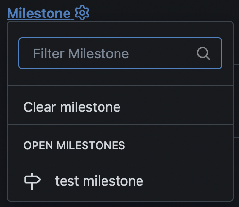
Refactor sidebar assignee&milestone&project selectors ( #32465 )
...
Follow #32460
Now the code could be much clearer than before and easier to maintain. A
lot of legacy code is removed.
Manually tested.
This PR is large enough, that fine tunes could be deferred to the future if
there is no bug found or design problem.
Screenshots:
<details>

</details>
2024-11-11 04:07:54 +08:00
wxiaoguang
58c634b854
Refactor sidebar label selector ( #32460 )
...
Introduce `issueSidebarLabelsData` to handle all sidebar labels related data.
2024-11-10 08:26:42 +00:00
Calvin K
18aeca5320
Add reviewers selection to new pull request ( #32403 )
...
Users could add reviewers when creating new PRs.

---------

Co-authored-by: splitt3r <splitt3r@users.noreply.github.com>
Co-authored-by: Sebastian Sauer <sauer.sebastian@gmail.com>
Co-authored-by: bb-ben <70356237+bboerben@users.noreply.github.com>
Co-authored-by: wxiaoguang <wxiaoguang@gmail.com>
2024-11-09 04:48:31 +00:00
wxiaoguang
d80f99ef04
Fix issue sidebar ( #32455 )
...
Fix #32453

Major changes:

* revert the `<div class="divider"></div>` in
`templates/repo/issue/branch_selector_field.tmpl` (it was removed by
mistake in ##32444)
* remove incorrect `<div class="inline field">` in
`templates/repo/issue/sidebar/allow_maintainer_edit.tmpl`
* use `gt-ellipsis` to replace the "title" class in the dependency list,
then `.repository .issue-content-right .ui.list .title` could be removed
* remove the "relaxed" from dependency list, then there is no padding,
then `.repository .issue-content-right .ui.list .dependency` could be
removed (`white-space` doesn't have effect either because there is
`gt-ellipsis`)
* remove dead code `.repository .issue-content-right #deadlineForm input
`

The fixed UI should be the same as before.
2024-11-09 01:55:32 +08:00
wxiaoguang
0f397ae09b
Refactor language menu and dom utils ( #32450 )
...
1. Make `queryElem*` functions could correctly handle TS types
2. Remove some legacy jQuery $ calls (introduce fomanticQuery for Fomantic UI only)
3. Fix some TS typing problems
2024-11-08 14:04:24 +08:00
wxiaoguang
af28ce59b8
Add some handy markdown editor features ( #32400 )
...
There were some missing features from EasyMDE:

1. H1 - H3 style
2. Auto add task list
3. Insert a table

And added some tests
2024-11-04 10:14:36 +00:00
charles
6fced33581
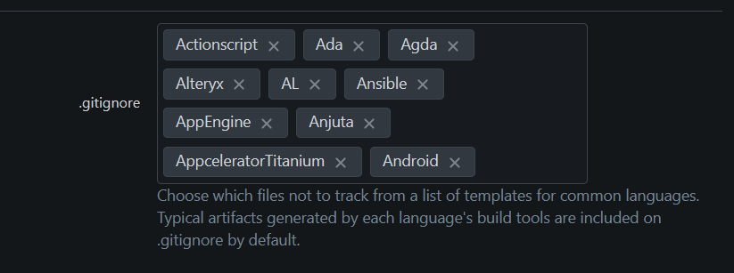
Fix dropdown content overflow ( #31610 )
...
close #31602

---------
Co-authored-by: wxiaoguang <wxiaoguang@gmail.com>
2024-10-13 02:43:43 +00:00
silverwind
aa9faf8250
Set manual tabindexes on login page ( #31689 )
...
Fixes https://github.com/go-gitea/gitea/issues/31686 .
A more elborate manual tabindex numbering could be done, but I think
it's not really worth the extra effort and such stuff could easily break
during refactors.
Includes another small tweak to un-stretch the`<a>` element so it's only
as large as it needs to be and this change also made the margin
unneeded.
2024-09-20 15:27:19 +00:00
Simon Pistache
859be09813
feat( #31666 ): Set the columns height to hug all its contents ( #31726 )
...
In Projects, columns heights are defined by the sum of all contents
height of the biggest column, rather than a fraction of the viewport
height. It default to 60vh when there is no cards to display.

Fix #31666
2024-09-16 20:41:46 +00:00
Lauris BH
4ab6fc62d2
Add option to filter board cards by labels and assignees ( #31999 )
...
Works in both organization and repository project boards
Fixes #21846
Replaces #21963
Replaces #27117

**Note** that implementation was made intentionally to work same as in
issue list so that URL can be bookmarked for quick access with
predefined filters in URL
2024-09-12 03:53:40 +00:00
Luca Söthe
f3090977c6
Add automatic light/dark option for the colorblind theme ( #31997 )
...
The normal themes already have a variant which automatically chooses
light/dark mode based on the browser.
This PR adds the same variant, but for the colorblind themes.
2024-09-07 03:09:40 +00:00
Simon Priet
fe7c941677
Scroll images in project issues separately from the remaining issue ( #31683 )
...
As discussed in #31667 & #26561 , when a card on a Project contains
images, they can overflow the card on its containing column. This aims
to fix this issue via snapping scrollbars.
---
Issue #31667 is open to discussion as there should be room for
improvement.
2024-08-13 07:36:28 +08:00
silverwind
63c5ac6cdb
Add :focus-visible style to buttons ( #31799 )
...
Buttons now show a focus style via
[`:focus-visible`](https://developer.mozilla.org/en-US/docs/Web/CSS/:focus-visible )
when the browser deems the focus to be important, like for example when
the button is focused via keyboard navigation.
<img width="492" alt="Screenshot 2024-08-07 at 22 12 51"
src="https://github.com/user-attachments/assets/060568b1-1599-4c56-bafb-b36ebb1bec35 ">
<img width="479" alt="image"
src="https://github.com/user-attachments/assets/885f4e10-f496-47f0-8ae5-45827ded09f8 ">
2024-08-12 00:40:18 +00:00
silverwind
0c1127a2fb
Remove unneccessary uses of word-break: break-all ( #31637 )
...
Fixes: https://github.com/go-gitea/gitea/issues/31636

1. Issue sidebar topic is disussed in
https://github.com/go-gitea/gitea/issues/31636
2. Org description already has `overflow-wrap: anywhere` to ensure no
overflow.

Co-authored-by: Giteabot <teabot@gitea.io>
2024-07-17 12:04:28 +02:00
silverwind
0bb4c1cde2
Code editor theme enhancements ( #31629 )
...
1. Fixed border-radius
2. Monaco ignores the alpha channel on the shadow color, introduce
`color-shadow-opaque`
3. Remove scrollbar color which follows
https://github.com/go-gitea/gitea/pull/29800
Before:
<img width="34" alt="Screenshot 2024-07-13 at 15 38 18"
src="https://github.com/user-attachments/assets/042d9bde-6db9-4467-a2a4-8f61ecc773eb ">
<img width="35" alt="Screenshot 2024-07-13 at 15 38 31"
src="https://github.com/user-attachments/assets/04146ee0-551c-4ff2-9636-bd119b33595a ">
After:
<img width="45" alt="Screenshot 2024-07-13 at 15 38 06"
src="https://github.com/user-attachments/assets/1f58fa5a-1289-4e45-83c9-18ca82a5e266 ">
<img width="39" alt="Screenshot 2024-07-13 at 21 16 56"
src="https://github.com/user-attachments/assets/e12ebe22-b29b-4798-9f0d-4c100f311562 ">
2024-07-14 23:22:48 +00:00
Anbraten
9c00dda33a
Refactor login page ( #31530 )
...
As requested in
https://github.com/go-gitea/gitea/pull/31504#issuecomment-2196196646 .
This PR refactor the login page:


# Changes
- [x] use separate box for passkey login and go to registration
- [x] move forgot passoword next to password label
- [x] fix password required label `*` and padding
- [x] remove tabs from login page
---------
Co-authored-by: silverwind <me@silverwind.io>
2024-07-05 20:10:09 +03:00
silverwind
e82f3caa6b
Always use HTML attributes for avatar size ( #31509 )
...
Many avatars were rendered in HTML with certain width/height but then
resized again in CSS. This was pointless so I removed all these cases
and made the HTML size match the previous render size.
Also did a few CSS cleanups in the tribute rendering:
<img width="648" alt="image"
src="https://github.com/go-gitea/gitea/assets/115237/cb2fafb3-5e20-46e9-814f-07df20038beb ">
2024-06-28 21:29:15 +00:00
charles
d655ff18b3
Fix avatar radius problem on the new issue page ( #31506 )
...
Close #31502
Related to #31419 .
In this PR, the avatar width is set to 3em, but the height is not set,
so the image is not squared.
When object-fit is set to contain, it can't maintain the radius of the
image.
Result:

2024-06-27 14:04:05 +00:00
wxiaoguang
c1fe6fbcc3
Make toast support preventDuplicates ( #31501 )
...
make preventDuplicates default to true, users get a clear UI feedback
and know that "a new message appears".

Fixes: https://github.com/go-gitea/gitea/issues/26651

---------

Co-authored-by: silverwind <me@silverwind.io>
2024-06-27 13:58:38 +00:00
Brecht Van Lommel
053e5829a3
Fix poor table column width due to breaking words ( #31473 )
...
Caused by #31091

---------

Co-authored-by: silverwind <me@silverwind.io>
2024-06-24 17:48:43 +00:00
wxiaoguang
f4921b9daa
Simplify 404/500 page ( #31409 )
2024-06-23 17:45:21 +00:00
Brecht Van Lommel
5afafe22a3
Fix labels and projects menu overflow on issue page ( #31435 )
...
It was correct only on the new issue page.

Resolves #31415
2024-06-20 16:54:19 +00:00
silverwind
566d87bb8e
Fix new issue/pr avatar ( #31419 )
...
The avatar on "New Issue" and "New Pull Request" pages was inconsistent.
Removed the extra margin and the new CSS rules now use common parent
`<form id="#new-issue">` because `.repository.new.issue` is not present
on pull request page.
2024-06-19 16:19:59 +00:00
wxiaoguang
47ca61d8ba
Improve detecting empty files ( #31332 )
...
Co-authored-by: silverwind <me@silverwind.io>
2024-06-13 01:06:46 +00:00
silverwind
90bcdf9829
Fix line number widths ( #31341 )
...
Fixes regression
https://github.com/go-gitea/gitea/pull/31307#issuecomment-2162554913
Table CSS is weird. A `auto` value does not work and causes the
regression while any pixel value causes another regression in diff where
the code lines do not stretch. Partially revert that PR and clean up
some related too-deep CSS selectors.
<img width="109" alt="Screenshot 2024-06-12 at 15 07 22"
src="https://github.com/go-gitea/gitea/assets/115237/756c5dea-44b8-49f9-8a08-acef68075f62 ">
<img width="119" alt="Screenshot 2024-06-12 at 15 07 43"
src="https://github.com/go-gitea/gitea/assets/115237/28ae1adc-118e-4016-8d09-033b9f1c9a6f ">
<img width="151" alt="Screenshot 2024-06-12 at 15 07 07"
src="https://github.com/go-gitea/gitea/assets/115237/08db7ed9-de4e-405e-874d-c7ebe3082557 ">
<img width="141" alt="Screenshot 2024-06-12 at 15 07 14"
src="https://github.com/go-gitea/gitea/assets/115237/c4a5492b-1bf1-4773-bc8d-64eb36d823f9 ">
2024-06-12 15:23:42 +00:00
silverwind
21ba5ca03b
Fix navbar + menu flashing on page load ( #31281 )
...
Fixes
https://github.com/go-gitea/gitea/pull/31273#issuecomment-2153771331 .
Same method as used in https://github.com/go-gitea/gitea/pull/30215 . All
left-opening dropdowns need to use it method.
---------
Co-authored-by: wxiaoguang <wxiaoguang@gmail.com>
Co-authored-by: Giteabot <teabot@gitea.io>
2024-06-12 14:58:03 +00:00
silverwind
397930d8c1
Fix line number width in code preview ( #31307 )
...
Line numbers were using some hacky CSS `width: 1%` that did nothing to
the code rendering as far as I can tell but broken the inline preview in
markup when line numbers are greater than 2 digits. Also I removed one
duplicate `font-family` rule (it is set below in the `.lines-num,
.lines-code` selector.
2024-06-11 04:54:39 +00:00
Kerwin Bryant
8e33746746
Optimize repo-list layout to enhance visual experience ( #31272 )
...
before:

***The problem was that the icon and text were not on a horizontal line,
and the horizontal was not centered;***
after:

---------
Co-authored-by: wxiaoguang <wxiaoguang@gmail.com>
Co-authored-by: Giteabot <teabot@gitea.io>
2024-06-07 01:22:03 +02:00
silverwind
138e946c3d
Replace gt-word-break with tw-break-anywhere ( #31183 )
...
`overflow-wrap: anywhere` is a superior alternative to `word-wrap:
break-word` and we were already setting it in the class. I tested a few
cases, all look good.
2024-06-04 13:57:11 +00:00
silverwind
4ca65fabda
Remove .segment from .project-column ( #31204 )
...
Using `.segment` on the project columns is a major abuse of that class,
so remove it and instead set the border-radius directly on it.

Fixes: https://github.com/go-gitea/gitea/issues/31129
2024-06-04 07:46:05 +00:00
silverwind
8c68c5e436
Move custom tw- helpers to tailwind plugin ( #31184 )
...
Move the previous custom `tw-` classes to be defined in a tailwind
plugin. I think it's cleaner that way and I also verified double-class
works as expected:
<img width="299" alt="Screenshot 2024-05-30 at 19 06 24"
src="https://github.com/go-gitea/gitea/assets/115237/003cbc76-2013-46a0-9e27-63023fa7c7a4 ">
2024-06-03 18:21:28 +00:00
silverwind
0f0db6a14f
Remove unnecessary inline style for tab-size ( #31224 )
...
Move the rule to the parent node. `tab-size` is inherited so will work
just as before.
2024-06-03 17:21:45 +00:00
silverwind
7034efc7dc
Use vertical layout for multiple code expander buttons ( #31122 )
...
Fixes: https://github.com/go-gitea/gitea/issues/31068
- Now it only does a single call to `GetExpandDirection` per line
instead of multiples.
- Exposed `data-expand-direction` to frontend so it can correctly size
the buttons (it's a pain to do in tables).
<img width="142" alt="Screenshot 2024-05-27 at 20 44 56"
src="https://github.com/go-gitea/gitea/assets/115237/8b0b45a6-8e50-4081-8822-5e0775d8d941 ">
<img width="142" alt="Screenshot 2024-05-27 at 20 44 51"
src="https://github.com/go-gitea/gitea/assets/115237/b7ba2c57-8f55-4e9f-9606-c96d16b77892 ">
<img width="132" alt="Screenshot 2024-05-27 at 20 44 46"
src="https://github.com/go-gitea/gitea/assets/115237/0e838fb8-5e8c-4250-9843-a68b88d5418b ">
<img width="80" alt="Screenshot 2024-05-27 at 20 44 33"
src="https://github.com/go-gitea/gitea/assets/115237/da6c7f83-c160-4389-8ab2-889d0568cbe8 ">
<img width="80" alt="Screenshot 2024-05-27 at 20 44 26"
src="https://github.com/go-gitea/gitea/assets/115237/cdb490b2-5040-484a-92e5-46fc5e37c199 ">
<img width="78" alt="Screenshot 2024-05-27 at 20 44 20"
src="https://github.com/go-gitea/gitea/assets/115237/d2978ab0-764e-41ff-922c-25f8fe749f28 ">
Would backport as trivial enhancement.
2024-05-29 06:08:45 +00:00
silverwind
1e3c4d8fc7
Improve mobile review ui ( #31091 )
...
Fixes: https://github.com/go-gitea/gitea/issues/31071
Not perfect but much better than before.
Before: Overflows, sticky not working, filename unreadable:
<img width="506" alt="Screenshot 2024-05-27 at 02 02 40"
src="https://github.com/go-gitea/gitea/assets/115237/a06b1edf-dece-4402-98c2-68670fca265f ">
After:
<img width="457" alt="Screenshot 2024-05-27 at 01 59 06"
src="https://github.com/go-gitea/gitea/assets/115237/2a282c96-e719-4554-b418-81963ae6269c ">
2024-05-28 13:41:37 +00:00
Lunny Xiao
98751108b1
Rename project board -> column to make the UI less confusing ( #30170 )
...
This PR split the `Board` into two parts. One is the struct has been
renamed to `Column` and the second we have a `Template Type`.

But to make it easier to review, this PR will not change the database
schemas, they are just renames. The database schema changes could be in
future PRs.

---------

Co-authored-by: silverwind <me@silverwind.io>
Co-authored-by: yp05327 <576951401@qq.com>
2024-05-27 08:59:54 +00:00
silverwind
6e140b58dd
Prevent tab shifting, remove extra margin on fluid pages ( #31090 )
...
1. Extend concept of https://github.com/go-gitea/gitea/pull/29831 to all
tabular menus, there were only three left that weren't already
`<overflow-menu>`.
<img width="634" alt="Screenshot 2024-05-27 at 00 42 16"
src="https://github.com/go-gitea/gitea/assets/115237/d9a7e219-d05e-40a1-9e93-777f9a8a90dd ">
<img width="965" alt="Screenshot 2024-05-27 at 00 29 32"
src="https://github.com/go-gitea/gitea/assets/115237/e6ed71b1-11fb-4a74-9adb-af4524286cff ">
2. Remove extra padding on `fluid padded` container like for example PR
diff view. The page margin is already correctly sized via
`.ui.container`, so this was just extraneous padding that looked ugly.
Before:
<img width="1351" alt="Screenshot 2024-05-27 at 00 45 11"
src="https://github.com/go-gitea/gitea/assets/115237/4b45fd11-b1b2-4fbb-a618-26eb22be9472 ">
After:
<img width="1344" alt="Screenshot 2024-05-27 at 00 45 22"
src="https://github.com/go-gitea/gitea/assets/115237/d09593eb-6c7f-45e7-85b6-f0050047004b ">
3. Replace `gt-word-break` with `tw-break-anywhere` in issue-title,
fixing overflow.
Before:
<img width="1333" alt="Screenshot 2024-05-27 at 00 50 14"
src="https://github.com/go-gitea/gitea/assets/115237/64d15d04-b456-401e-a972-df636965f0eb ">
After:
<img width="1316" alt="Screenshot 2024-05-27 at 00 50 26"
src="https://github.com/go-gitea/gitea/assets/115237/ed1ce830-1408-414b-8263-eeaf773f52c8 ">
2024-05-27 06:45:16 +00:00
silverwind
145baa2b3f
Fix border radius on hovered secondary menu ( #31089 )
...
Presumably a regression from
https://github.com/go-gitea/gitea/pull/30325 , these menus were showing a
border radius on hover, which is fixed with this change.
<img width="154" alt="image"
src="https://github.com/go-gitea/gitea/assets/115237/eafdc1c5-3cf5-48d1-86c4-21c58f92cfaf ">
2024-05-27 04:48:41 +00:00
silverwind
2ced31e81d
Change --border-radius-circle to --border-radius-full ( #30936 )
...
Percentage-based `border-radius` [creates undesirable
ellipse](https://jsfiddle.net/silverwind/j9ko5wnt/4/ ) on non-square
content. Instead, use pixel value and use same wording `full` like
tailwind does, but increast to 99999px over their 9999px.
2024-05-25 14:33:34 +00:00
wxiaoguang
b6574099ed
Fix project column title overflow ( #31011 )
...
By the way:
* Re-format the "color.go" to Golang code style
* Remove unused `overflow-y: scroll;` from `.project-column` because
there is `overflow: visible`
2024-05-20 05:21:01 +00:00
silverwind
ed25676a9a
Restyle release list, fix branch dropdown ( #30837 )
...
Fixes https://github.com/go-gitea/gitea/issues/30821 and restyles the
release list.
Desktop:
<img width="1199" alt="Screenshot 2024-05-02 at 20 46 10"
src="https://github.com/go-gitea/gitea/assets/115237/bee92423-d4a9-4b26-8301-3a1e09eef4cd ">
Mobile:
<img width="443" alt="Screenshot 2024-05-02 at 20 46 21"
src="https://github.com/go-gitea/gitea/assets/115237/42ecbae5-bdb6-4b16-a0ee-9c64daede68d ">
---------
Co-authored-by: Giteabot <teabot@gitea.io>
2024-05-13 23:33:51 +02:00
silverwind
301eaf60bf
Fix file path width in repo non-homepage view ( #30951 )
...
Fixes: https://github.com/go-gitea/gitea/issues/30940
<img width="1310" alt="Screenshot 2024-05-11 at 20 48 41"
src="https://github.com/go-gitea/gitea/assets/115237/f163dfd4-1299-421f-a99e-cd0c793e0e3d ">
2024-05-12 04:02:25 +00:00
silverwind
46b7004f05
Enable declaration-block-no-redundant-longhand-properties ( #30950 )
...
Enable
[`declaration-block-no-redundant-longhand-properties`](https://stylelint.io/user-guide/rules/declaration-block-no-redundant-longhand-properties/ )
and autofix issues. The exclusions are because I find these two
shorthands to be harder to read.
2024-05-12 02:33:05 +00:00
silverwind
3c2406a2f3
Use CSS inset shorthand ( #30939 )
...
Use [inset](https://developer.mozilla.org/en-US/docs/Web/CSS/inset )
shorthand instead of longhands. There may be more cases but these ones I
was able to definitely identify.
2024-05-11 14:28:56 +00:00
wxiaoguang
080486e47d
Fix some UI regressions for commit list ( #30920 )
...
Close #30919

---------

Co-authored-by: silverwind <me@silverwind.io>
2024-05-10 12:58:05 +00:00
silverwind
5556782ebe
Forbid deprecated break-word in CSS ( #30934 )
...
Forbid
[deprecated](https://drafts.csswg.org/css-text-3/#word-break-property )
`break-word` and fix all occurences.
Regarding `overflow-wrap: break-word` vs `overflow-wrap: anywhere`:
Example of difference: https://jsfiddle.net/silverwind/1va6972r/
[Here](https://stackoverflow.com/questions/77651244 ) it says:
> The differences between normal, break-word and anywhere are only clear
if you are using width: min-content on the element containing the text,
and you also set a max-width. A pretty rare scenario.
I don't think this difference will make any practical impact as we are
not hitting this rare scenario.
2024-05-10 12:25:49 +00:00
wxiaoguang
ed0fc2729e
Add missing menu active item background back ( #30897 )
...
Fix #30578
2024-05-08 23:01:25 +00:00
wxiaoguang
eda10cc2bb
Fix some UI problems (dropdown/container) ( #30849 )
...
Follow #30345
Follow #30547

`ellipsis` / `white-space` shouldn't be put on the general dropdown components.
2024-05-06 07:17:22 +00:00