mirror of
https://github.com/go-gitea/gitea
synced 2024-11-15 06:21:23 +01:00
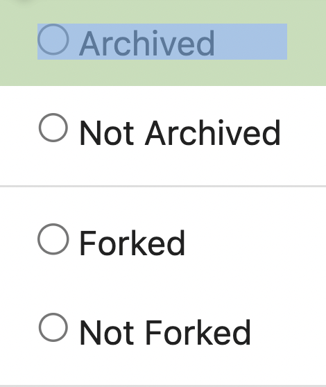
1. Introduce a special "flex-items-block" for menu items, to align the dropdown menu items 2. Simplify the "repo search" form 3. Add missing "TopicOnly" search option Screenshots: The old UI items don't align: <details>  </details> New UI (doesn't change much, but the items align) <details>   </details> --------- Co-authored-by: silverwind <me@silverwind.io> |
||
|---|---|---|
| .. | ||
| applications | ||
| auth | ||
| emails | ||
| org | ||
| packages | ||
| repo | ||
| runners | ||
| user | ||
| actions.tmpl | ||
| config.tmpl | ||
| config_settings.tmpl | ||
| cron.tmpl | ||
| dashboard.tmpl | ||
| hook_new.tmpl | ||
| hooks.tmpl | ||
| layout_footer.tmpl | ||
| layout_head.tmpl | ||
| navbar.tmpl | ||
| notice.tmpl | ||
| queue.tmpl | ||
| queue_manage.tmpl | ||
| self_check.tmpl | ||
| stacktrace-row.tmpl | ||
| stacktrace.tmpl | ||
| stats.tmpl | ||
| system_status.tmpl | ||