| .. | ||
| common | ||
| public | ||
| server | ||
| config.ts | ||
| kibana.json | ||
| layout.png | ||
| readme.md | ||
Lens
Testing
Run all tests from the x-pack root directory
- Unit tests:
node scripts/jest --watch lens - Functional tests:
- Run
node scripts/functional_tests_server - Run
node ../scripts/functional_test_runner.js --config ./test/functional/config.js --grep="lens app" - You may want to comment out all imports except for Lens in the config file.
- Run
- API Functional tests:
- Run
node scripts/functional_tests_server - Run
node ../scripts/functional_test_runner.js --config ./test/api_integration/config.ts --grep=Lens
- Run
UI Terminology
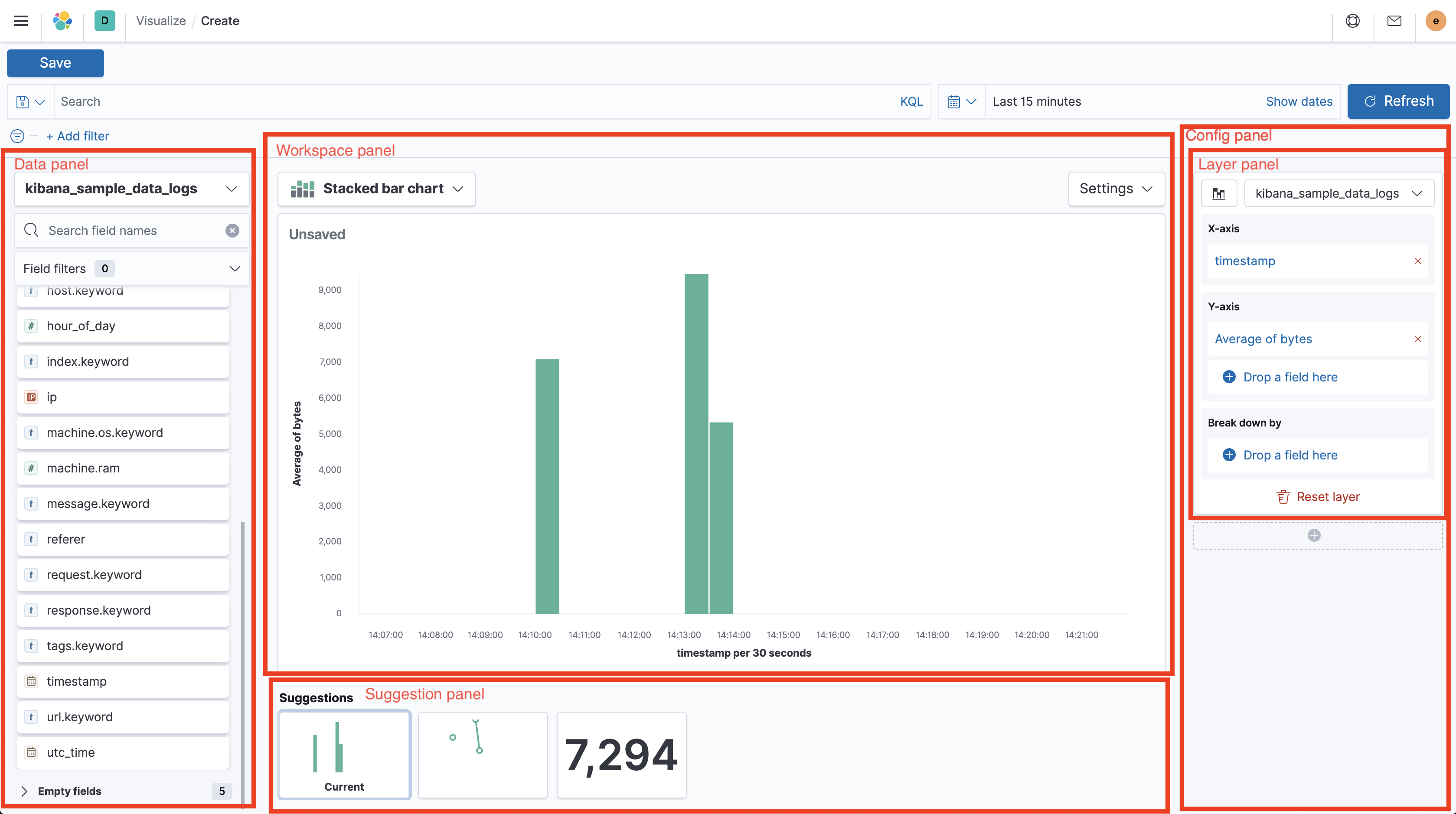
Lens has a lot of UI elements – to make it easier to refer to them in issues or bugs, this is a hopefully complete list:
- Top nav Navigation menu on top of the app (contains Save button)
- Query bar Input to enter KQL or Lucene query below the top nav
- Filter bar Row of filter pills below the query bar
- Time picker Global time range configurator right to the query bar
- Data panel Panel to the left showing the field list
- Field list List of fields separated by available and empty fields in the data panel
- Index pattern chooser Select element switching between index patterns
- Field filter Search and dropdown to filter down the field list
- Field information popover Popover showing data distribution; opening when clicking a field in the field list
- Config panel Panel to the right showing configuration of the current chart, separated by layers
- Layer panel One of multiple panels in the config panel, holding configuration for separate layers
- Dimension trigger Chart dimension like "X axis", "Break down by" or "Slice by" in the config panel
- Dimension container Container shown when clicking a dimension trigger and contains the dimension settints
- Layer settings popover Popover shown when clicking the button in the top left of a layer panel
- Layer panel One of multiple panels in the config panel, holding configuration for separate layers
- Workspace panel Center panel containing the chart preview, title and toolbar
- Chart preview Full-sized rendered chart in the center of the screen
- Toolbar Bar on top of the chart preview, containing the chart switcher to the left with chart specific settings right to it
- Chart switch Select to change the chart type in the top left above the chart preview
- Chart settings popover Popover shown when clicking the "Settings" button above the chart preview
- Suggestion panel Panel to the bottom showing previews for suggestions on how to change the current chart
