 c66910b685
## Summary of the Pull Request This PR lays the foundation for a new Actions page in the Settings UI as designed in #6900. The Actions page now leverages the `ActionMap` to display all of the key bindings and allow the user to modify the associated key chord or delete the key binding entirely. ## References #9621 - ActionMap #9926 - ActionMap serialization #9428 - ActionMap Spec #6900 - Actions page #9427 - Actions page design doc ## Detailed Description of the Pull Request / Additional comments ### Settings Model Changes - `Command::Copy()` now copies the `ActionAndArgs` - `ActionMap::RebindKeys()` handles changing the key chord of a key binding. If a conflict occurs, the conflicting key chord is overwritten. - `ActionMap::DeleteKeyBinding()` "deletes" a key binding by binding "unbound" to the given key chord. - `ActionMap::KeyBindings()` presents another view (similar to `NameMap`) of the `ActionMap`. It specifically presents a map of key chords to commands. It is generated similar to how `NameMap` is generated. ### Editor Changes - `Actions.xaml` is mainly split into two parts: - `ListView` (as before) holds the list of key bindings. We _could_ explore the idea of an items repeater, but the `ListView` seems to provide some niceties with regards to navigating the list via the key board (though none are selectable). - `DataTemplate` is used to represent each key binding inside the `ListView`. This is tricky because it is bound to a `KeyBindingViewModel` which must provide _all_ context necessary to modify the UI and the settings model. We cannot use names to target UI elements inside this template, so we must make the view model smart and force updates to the UI via changes in the view model. - `KeyBindingViewModel` is a view model object that controls the UI and the settings model. There are a number of TODOs in Actions.cpp will be long-term follow-ups and would be nice to have. This includes... - a binary search by name on `Actions::KeyBindingList` - presenting an error when the provided key chord is invalid. ## Demo 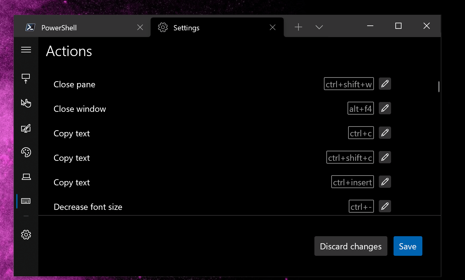
391 lines
24 KiB
XML
391 lines
24 KiB
XML
<!--
|
|
Copyright (c) Microsoft Corporation. All rights reserved. Licensed under
|
|
the MIT License. See LICENSE in the project root for license information.
|
|
-->
|
|
<Page x:Class="Microsoft.Terminal.Settings.Editor.Actions"
|
|
xmlns="http://schemas.microsoft.com/winfx/2006/xaml/presentation"
|
|
xmlns:x="http://schemas.microsoft.com/winfx/2006/xaml"
|
|
xmlns:d="http://schemas.microsoft.com/expression/blend/2008"
|
|
xmlns:local="using:Microsoft.Terminal.Settings.Editor"
|
|
xmlns:mc="http://schemas.openxmlformats.org/markup-compatibility/2006"
|
|
xmlns:model="using:Microsoft.Terminal.Settings.Model"
|
|
xmlns:muxc="using:Microsoft.UI.Xaml.Controls"
|
|
mc:Ignorable="d">
|
|
|
|
<Page.Resources>
|
|
<ResourceDictionary>
|
|
<ResourceDictionary.MergedDictionaries>
|
|
<ResourceDictionary Source="CommonResources.xaml" />
|
|
</ResourceDictionary.MergedDictionaries>
|
|
|
|
<!-- Theme Dictionary -->
|
|
<ResourceDictionary.ThemeDictionaries>
|
|
<ResourceDictionary x:Key="Dark">
|
|
<!-- TextBox colors ! -->
|
|
<SolidColorBrush x:Key="TextControlBackground"
|
|
Color="#333333" />
|
|
<SolidColorBrush x:Key="TextBoxPlaceholderTextThemeBrush"
|
|
Color="#B5B5B5" />
|
|
<SolidColorBrush x:Key="TextControlForeground"
|
|
Color="#B5B5B5" />
|
|
<SolidColorBrush x:Key="TextControlBorderBrush"
|
|
Color="#404040" />
|
|
<SolidColorBrush x:Key="TextControlButtonForeground"
|
|
Color="#B5B5B5" />
|
|
|
|
<SolidColorBrush x:Key="TextControlBackgroundPointerOver"
|
|
Color="#404040" />
|
|
<SolidColorBrush x:Key="TextControlForegroundPointerOver"
|
|
Color="#FFFFFF" />
|
|
<SolidColorBrush x:Key="TextControlBorderBrushPointerOver"
|
|
Color="#404040" />
|
|
<SolidColorBrush x:Key="TextControlButtonForegroundPointerOver"
|
|
Color="#FF4343" />
|
|
|
|
<SolidColorBrush x:Key="TextControlBackgroundFocused"
|
|
Color="#333333" />
|
|
<SolidColorBrush x:Key="TextControlForegroundFocused"
|
|
Color="#FFFFFF" />
|
|
<SolidColorBrush x:Key="TextControlBorderBrushFocused"
|
|
Color="#404040" />
|
|
<SolidColorBrush x:Key="TextControlButtonForegroundPressed"
|
|
Color="#FFFFFF" />
|
|
<SolidColorBrush x:Key="TextControlButtonBackgroundPressed"
|
|
Color="#FF4343" />
|
|
|
|
<!-- KeyChordText styles -->
|
|
<Style x:Key="KeyChordBorderStyle"
|
|
TargetType="Border">
|
|
<Setter Property="BorderThickness" Value="1" />
|
|
<Setter Property="CornerRadius" Value="1" />
|
|
<Setter Property="Background" Value="{ThemeResource SystemAltMediumLowColor}" />
|
|
<Setter Property="BorderBrush" Value="{ThemeResource SystemControlForegroundBaseMediumBrush}" />
|
|
</Style>
|
|
<Style x:Key="KeyChordTextBlockStyle"
|
|
TargetType="TextBlock">
|
|
<Setter Property="Foreground" Value="{ThemeResource SystemControlForegroundBaseMediumBrush}" />
|
|
</Style>
|
|
|
|
</ResourceDictionary>
|
|
<ResourceDictionary x:Key="Light">
|
|
<!-- TextBox colors ! -->
|
|
<SolidColorBrush x:Key="TextControlBackground"
|
|
Color="#CCCCCC" />
|
|
<SolidColorBrush x:Key="TextBoxPlaceholderTextThemeBrush"
|
|
Color="#636363" />
|
|
<SolidColorBrush x:Key="TextControlBorderBrush"
|
|
Color="#636363" />
|
|
<SolidColorBrush x:Key="TextControlButtonForeground"
|
|
Color="#636363" />
|
|
|
|
<SolidColorBrush x:Key="TextControlBackgroundPointerOver"
|
|
Color="#DADADA" />
|
|
<SolidColorBrush x:Key="TextControlBorderBrushPointerOver"
|
|
Color="#636363" />
|
|
<SolidColorBrush x:Key="TextControlButtonForegroundPointerOver"
|
|
Color="#FF4343" />
|
|
|
|
<SolidColorBrush x:Key="TextControlBackgroundFocused"
|
|
Color="#CCCCCC" />
|
|
<SolidColorBrush x:Key="TextControlBorderBrushFocused"
|
|
Color="#636363" />
|
|
<SolidColorBrush x:Key="TextControlButtonForegroundPressed"
|
|
Color="#FFFFFF" />
|
|
<SolidColorBrush x:Key="TextControlButtonBackgroundPressed"
|
|
Color="#FF4343" />
|
|
|
|
<!-- KeyChordText styles -->
|
|
<Style x:Key="KeyChordBorderStyle"
|
|
TargetType="Border">
|
|
<Setter Property="BorderThickness" Value="1" />
|
|
<Setter Property="CornerRadius" Value="1" />
|
|
<Setter Property="Background" Value="{ThemeResource SystemAltMediumLowColor}" />
|
|
<Setter Property="BorderBrush" Value="{ThemeResource SystemControlForegroundBaseMediumBrush}" />
|
|
</Style>
|
|
<Style x:Key="KeyChordTextBlockStyle"
|
|
TargetType="TextBlock">
|
|
<Setter Property="Foreground" Value="{ThemeResource SystemControlForegroundBaseMediumBrush}" />
|
|
</Style>
|
|
|
|
</ResourceDictionary>
|
|
<ResourceDictionary x:Key="HighContrast">
|
|
|
|
<!-- KeyChordText styles (use XAML defaults for High Contrast theme) -->
|
|
<Style x:Key="KeyChordBorderStyle"
|
|
TargetType="Border" />
|
|
<Style x:Key="KeyChordTextBlockStyle"
|
|
TargetType="TextBlock" />
|
|
|
|
</ResourceDictionary>
|
|
</ResourceDictionary.ThemeDictionaries>
|
|
|
|
<!-- Styles -->
|
|
<Style x:Key="KeyBindingContainerStyle"
|
|
BasedOn="{StaticResource DefaultListViewItemStyle}"
|
|
TargetType="ListViewItem">
|
|
<Setter Property="Padding" Value="4" />
|
|
<Setter Property="HorizontalContentAlignment" Value="Stretch" />
|
|
<Setter Property="XYFocusKeyboardNavigation" Value="Enabled" />
|
|
</Style>
|
|
<Style x:Key="KeyBindingNameTextBlockStyle"
|
|
BasedOn="{StaticResource BaseTextBlockStyle}"
|
|
TargetType="TextBlock">
|
|
<Setter Property="VerticalAlignment" Value="Center" />
|
|
<Setter Property="TextWrapping" Value="WrapWholeWords" />
|
|
</Style>
|
|
<Style x:Key="KeyChordEditorStyle"
|
|
BasedOn="{StaticResource DefaultTextBoxStyle}"
|
|
TargetType="TextBox">
|
|
<Setter Property="HorizontalAlignment" Value="Right" />
|
|
<Setter Property="VerticalAlignment" Value="Center" />
|
|
<Setter Property="TextAlignment" Value="Right" />
|
|
<Setter Property="TextWrapping" Value="Wrap" />
|
|
<Setter Property="IsSpellCheckEnabled" Value="False" />
|
|
</Style>
|
|
<x:Int32 x:Key="EditButtonSize">32</x:Int32>
|
|
<x:Double x:Key="EditButtonIconSize">15</x:Double>
|
|
<Style x:Key="EditButtonStyle"
|
|
BasedOn="{StaticResource DefaultButtonStyle}"
|
|
TargetType="Button">
|
|
<Setter Property="Padding" Value="0" />
|
|
<Setter Property="VerticalAlignment" Value="Center" />
|
|
<Setter Property="Height" Value="{StaticResource EditButtonSize}" />
|
|
<Setter Property="Width" Value="{StaticResource EditButtonSize}" />
|
|
</Style>
|
|
<Style x:Key="AccentEditButtonStyle"
|
|
BasedOn="{StaticResource AccentButtonStyle}"
|
|
TargetType="Button">
|
|
<Setter Property="Padding" Value="3" />
|
|
<Setter Property="VerticalAlignment" Value="Center" />
|
|
<Setter Property="Height" Value="{StaticResource EditButtonSize}" />
|
|
<Setter Property="Width" Value="{StaticResource EditButtonSize}" />
|
|
</Style>
|
|
|
|
<!-- Converters & Misc. -->
|
|
<model:IconPathConverter x:Key="IconSourceConverter" />
|
|
<local:InvertedBooleanToVisibilityConverter x:Key="InvertedBooleanToVisibilityConverter" />
|
|
<SolidColorBrush x:Key="EditModeContainerBackground"
|
|
Color="{ThemeResource SystemListMediumColor}" />
|
|
<SolidColorBrush x:Key="NonEditModeContainerBackground"
|
|
Color="Transparent" />
|
|
|
|
<!-- Templates -->
|
|
<DataTemplate x:Key="KeyBindingTemplate"
|
|
x:DataType="local:KeyBindingViewModel">
|
|
<ListViewItem AutomationProperties.AcceleratorKey="{x:Bind KeyChordText, Mode=OneWay}"
|
|
AutomationProperties.Name="{x:Bind Name, Mode=OneWay}"
|
|
Background="{x:Bind ContainerBackground, Mode=OneWay}"
|
|
GotFocus="{x:Bind FocusContainer}"
|
|
LostFocus="{x:Bind UnfocusContainer}"
|
|
PointerEntered="{x:Bind EnterHoverMode}"
|
|
PointerExited="{x:Bind ExitHoverMode}"
|
|
Style="{StaticResource KeyBindingContainerStyle}">
|
|
<Grid ColumnSpacing="8">
|
|
<Grid.ColumnDefinitions>
|
|
<!-- command name -->
|
|
<ColumnDefinition Width="*" />
|
|
<!-- key chord -->
|
|
<ColumnDefinition Width="150" />
|
|
<!-- edit buttons -->
|
|
<!--
|
|
This needs to be 112 because that is the width of the row of buttons in edit mode + padding.
|
|
3 buttons: 32+32+32
|
|
Padding: 8+ 8
|
|
This allows the "edit" button to align with the "cancel" button seamlessly
|
|
-->
|
|
<ColumnDefinition Width="112" />
|
|
</Grid.ColumnDefinitions>
|
|
|
|
<!-- Command Name -->
|
|
<TextBlock Grid.Column="0"
|
|
Style="{StaticResource KeyBindingNameTextBlockStyle}"
|
|
Text="{x:Bind Name, Mode=OneWay}" />
|
|
|
|
<!-- Key Chord Text -->
|
|
<Border Grid.Column="1"
|
|
Padding="2,0,2,0"
|
|
HorizontalAlignment="Right"
|
|
VerticalAlignment="Center"
|
|
Style="{ThemeResource KeyChordBorderStyle}"
|
|
Visibility="{x:Bind IsInEditMode, Mode=OneWay, Converter={StaticResource InvertedBooleanToVisibilityConverter}}">
|
|
|
|
<TextBlock FontSize="14"
|
|
Style="{ThemeResource KeyChordTextBlockStyle}"
|
|
Text="{x:Bind KeyChordText, Mode=OneWay}"
|
|
TextWrapping="WrapWholeWords" />
|
|
</Border>
|
|
|
|
<!-- Edit Mode: Key Chord Text Box -->
|
|
<TextBox Grid.Column="1"
|
|
DataContext="{x:Bind Mode=OneWay}"
|
|
PreviewKeyDown="KeyChordEditor_PreviewKeyDown"
|
|
Style="{StaticResource KeyChordEditorStyle}"
|
|
Text="{x:Bind ProposedKeys, Mode=TwoWay}"
|
|
Visibility="{x:Bind IsInEditMode, Mode=OneWay}" />
|
|
|
|
<!-- Edit Button -->
|
|
<Button x:Uid="Actions_EditButton"
|
|
Grid.Column="2"
|
|
AutomationProperties.Name="{x:Bind EditButtonName}"
|
|
Background="Transparent"
|
|
Click="{x:Bind ToggleEditMode}"
|
|
GettingFocus="{x:Bind FocusEditButton}"
|
|
LosingFocus="{x:Bind UnfocusEditButton}"
|
|
Style="{StaticResource EditButtonStyle}"
|
|
Visibility="{x:Bind ShowEditButton, Mode=OneWay}">
|
|
<Button.Content>
|
|
<FontIcon FontSize="{StaticResource EditButtonIconSize}"
|
|
Glyph="" />
|
|
</Button.Content>
|
|
<Button.Resources>
|
|
<ResourceDictionary>
|
|
<ResourceDictionary.ThemeDictionaries>
|
|
<ResourceDictionary x:Key="Light">
|
|
<SolidColorBrush x:Key="ButtonForeground"
|
|
Color="White" />
|
|
<SolidColorBrush x:Key="ButtonForegroundPointerOver"
|
|
Color="{StaticResource SystemAccentColor}" />
|
|
<SolidColorBrush x:Key="ButtonForegroundPressed"
|
|
Color="{StaticResource SystemAccentColor}" />
|
|
</ResourceDictionary>
|
|
<ResourceDictionary x:Key="Dark">
|
|
<SolidColorBrush x:Key="ButtonForeground"
|
|
Color="White" />
|
|
<SolidColorBrush x:Key="ButtonForegroundPointerOver"
|
|
Color="{StaticResource SystemAccentColor}" />
|
|
<SolidColorBrush x:Key="ButtonForegroundPressed"
|
|
Color="{StaticResource SystemAccentColor}" />
|
|
</ResourceDictionary>
|
|
<ResourceDictionary x:Key="HighContrast">
|
|
<SolidColorBrush x:Key="ButtonBackground"
|
|
Color="{ThemeResource SystemColorButtonFaceColor}" />
|
|
<SolidColorBrush x:Key="ButtonBackgroundPointerOver"
|
|
Color="{ThemeResource SystemColorHighlightColor}" />
|
|
<SolidColorBrush x:Key="ButtonBackgroundPressed"
|
|
Color="{ThemeResource SystemColorHighlightColor}" />
|
|
<SolidColorBrush x:Key="ButtonForeground"
|
|
Color="{ThemeResource SystemColorButtonTextColor}" />
|
|
<SolidColorBrush x:Key="ButtonForegroundPointerOver"
|
|
Color="{ThemeResource SystemColorHighlightTextColor}" />
|
|
<SolidColorBrush x:Key="ButtonForegroundPressed"
|
|
Color="{ThemeResource SystemColorHighlightTextColor}" />
|
|
</ResourceDictionary>
|
|
</ResourceDictionary.ThemeDictionaries>
|
|
</ResourceDictionary>
|
|
</Button.Resources>
|
|
</Button>
|
|
|
|
<!-- Edit Mode: Buttons -->
|
|
<StackPanel Grid.Column="2"
|
|
Orientation="Horizontal"
|
|
Visibility="{x:Bind IsInEditMode, Mode=OneWay}">
|
|
|
|
<!-- Cancel editing the action -->
|
|
<Button x:Uid="Actions_CancelButton"
|
|
AutomationProperties.Name="{x:Bind CancelButtonName}"
|
|
Click="{x:Bind ToggleEditMode}"
|
|
Style="{StaticResource EditButtonStyle}">
|
|
<FontIcon FontSize="{StaticResource EditButtonIconSize}"
|
|
Glyph="" />
|
|
</Button>
|
|
|
|
<!-- Accept changes -->
|
|
<Button x:Uid="Actions_AcceptButton"
|
|
Margin="8,0,0,0"
|
|
AutomationProperties.Name="{x:Bind AcceptButtonName}"
|
|
Click="{x:Bind AttemptAcceptChanges}"
|
|
Flyout="{x:Bind AcceptChangesFlyout, Mode=OneWay}"
|
|
Style="{StaticResource AccentEditButtonStyle}">
|
|
<FontIcon FontSize="{StaticResource EditButtonIconSize}"
|
|
Glyph="" />
|
|
</Button>
|
|
|
|
<!-- Delete the current key binding -->
|
|
<Button x:Uid="Actions_DeleteButton"
|
|
Margin="8,0,0,0"
|
|
AutomationProperties.Name="{x:Bind DeleteButtonName}"
|
|
Style="{StaticResource EditButtonStyle}">
|
|
<Button.Content>
|
|
<FontIcon FontSize="{StaticResource EditButtonIconSize}"
|
|
Glyph="" />
|
|
</Button.Content>
|
|
<Button.Flyout>
|
|
<Flyout>
|
|
<StackPanel>
|
|
<TextBlock x:Uid="Actions_DeleteConfirmationMessage"
|
|
Style="{StaticResource CustomFlyoutTextStyle}" />
|
|
<Button x:Uid="Actions_DeleteConfirmationButton"
|
|
Click="{x:Bind DeleteKeyBinding}" />
|
|
</StackPanel>
|
|
</Flyout>
|
|
</Button.Flyout>
|
|
<Button.Resources>
|
|
<ResourceDictionary>
|
|
<ResourceDictionary.ThemeDictionaries>
|
|
<ResourceDictionary x:Key="Light">
|
|
<SolidColorBrush x:Key="ButtonBackground"
|
|
Color="Firebrick" />
|
|
<SolidColorBrush x:Key="ButtonBackgroundPointerOver"
|
|
Color="#C23232" />
|
|
<SolidColorBrush x:Key="ButtonBackgroundPressed"
|
|
Color="#A21212" />
|
|
<SolidColorBrush x:Key="ButtonForeground"
|
|
Color="White" />
|
|
<SolidColorBrush x:Key="ButtonForegroundPointerOver"
|
|
Color="White" />
|
|
<SolidColorBrush x:Key="ButtonForegroundPressed"
|
|
Color="White" />
|
|
</ResourceDictionary>
|
|
<ResourceDictionary x:Key="Dark">
|
|
<SolidColorBrush x:Key="ButtonBackground"
|
|
Color="Firebrick" />
|
|
<SolidColorBrush x:Key="ButtonBackgroundPointerOver"
|
|
Color="#C23232" />
|
|
<SolidColorBrush x:Key="ButtonBackgroundPressed"
|
|
Color="#A21212" />
|
|
<SolidColorBrush x:Key="ButtonForeground"
|
|
Color="White" />
|
|
<SolidColorBrush x:Key="ButtonForegroundPointerOver"
|
|
Color="White" />
|
|
<SolidColorBrush x:Key="ButtonForegroundPressed"
|
|
Color="White" />
|
|
</ResourceDictionary>
|
|
<ResourceDictionary x:Key="HighContrast">
|
|
<SolidColorBrush x:Key="ButtonBackground"
|
|
Color="{ThemeResource SystemColorButtonFaceColor}" />
|
|
<SolidColorBrush x:Key="ButtonBackgroundPointerOver"
|
|
Color="{ThemeResource SystemColorHighlightColor}" />
|
|
<SolidColorBrush x:Key="ButtonBackgroundPressed"
|
|
Color="{ThemeResource SystemColorHighlightColor}" />
|
|
<SolidColorBrush x:Key="ButtonForeground"
|
|
Color="{ThemeResource SystemColorButtonTextColor}" />
|
|
<SolidColorBrush x:Key="ButtonForegroundPointerOver"
|
|
Color="{ThemeResource SystemColorHighlightTextColor}" />
|
|
<SolidColorBrush x:Key="ButtonForegroundPressed"
|
|
Color="{ThemeResource SystemColorHighlightTextColor}" />
|
|
</ResourceDictionary>
|
|
</ResourceDictionary.ThemeDictionaries>
|
|
</ResourceDictionary>
|
|
</Button.Resources>
|
|
</Button>
|
|
|
|
</StackPanel>
|
|
</Grid>
|
|
</ListViewItem>
|
|
</DataTemplate>
|
|
</ResourceDictionary>
|
|
</Page.Resources>
|
|
|
|
<ScrollViewer>
|
|
<StackPanel MaxWidth="600"
|
|
Style="{StaticResource SettingsStackStyle}">
|
|
<!-- Keybindings -->
|
|
<ListView x:Name="KeyBindingsListView"
|
|
ItemTemplate="{StaticResource KeyBindingTemplate}"
|
|
ItemsSource="{x:Bind KeyBindingList, Mode=OneWay}"
|
|
SelectionMode="None" />
|
|
</StackPanel>
|
|
|
|
</ScrollViewer>
|
|
</Page>
|