 d0d3cc6a75
The flyout wasn't very polished, so I did some adjustments. It's all visual changes, functionality should be the same. * made the flyout use OverlayCornerRadius and 16px padding (to match WinUI 2.6) * changed ColorPicker to muxc:ColorPicker for new styles (the color schemes picker too) * changed "Custom" Button into a ToggleButton * no longer needs ellipsis - localization files should be updated * OK button was moved to the right and uses accent color * adjusted margins and padding * tweaked the color boxes to _look_ like the ones in color schemes 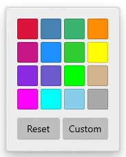 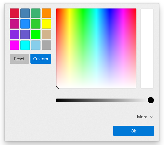 ## Validation Steps Performed * Color picker in settings UI still works ✔️ * Color picker for tabs still works ✔️
75 lines
3.6 KiB
XML
75 lines
3.6 KiB
XML
<!--
|
|
Copyright (c) Microsoft Corporation. All rights reserved. Licensed under
|
|
the MIT License. See LICENSE in the project root for license information.
|
|
-->
|
|
<Toolkit:XamlApplication x:Class="TerminalApp.App"
|
|
xmlns="http://schemas.microsoft.com/winfx/2006/xaml/presentation"
|
|
xmlns:x="http://schemas.microsoft.com/winfx/2006/xaml"
|
|
xmlns:TA="using:TerminalApp"
|
|
xmlns:Toolkit="using:Microsoft.Toolkit.Win32.UI.XamlHost"
|
|
xmlns:d="http://schemas.microsoft.com/expression/blend/2008"
|
|
xmlns:local="using:TerminalApp"
|
|
xmlns:mc="http://schemas.openxmlformats.org/markup-compatibility/2006"
|
|
mc:Ignorable="d">
|
|
<!--
|
|
If you want to prove this works, then add `RequestedTheme="Light"` to
|
|
the properties on the XamlApplication
|
|
-->
|
|
<Toolkit:XamlApplication.Resources>
|
|
|
|
<ResourceDictionary>
|
|
<ResourceDictionary.MergedDictionaries>
|
|
<!-- Include the MUX Controls resources -->
|
|
<XamlControlsResources xmlns="using:Microsoft.UI.Xaml.Controls" />
|
|
<ResourceDictionary>
|
|
|
|
<!--
|
|
We're going to apply this style to the root Grid acting
|
|
as the tab row, because we need to be able to set its
|
|
`Background` property to "{ThemeResource
|
|
ApplicationPageBackgroundThemeBrush}" so it will be colored
|
|
appropriately for the theme, regardless of what we set the
|
|
RequestedTheme to
|
|
-->
|
|
<Style x:Name="BackgroundGridThemeStyle"
|
|
TargetType="Grid">
|
|
<Setter Property="Background" Value="{ThemeResource ApplicationPageBackgroundThemeBrush}" />
|
|
</Style>
|
|
|
|
<!--
|
|
We need to manually create the error text brush as a
|
|
theme-dependent brush. SystemControlErrorTextForegroundBrush
|
|
is unfortunately static.
|
|
-->
|
|
<SolidColorBrush x:Name="ErrorTextBrush"
|
|
Color="{ThemeResource SystemErrorTextColor}" />
|
|
|
|
<!-- Suppress top padding -->
|
|
<Thickness x:Key="TabViewHeaderPadding">8,0,8,0</Thickness>
|
|
|
|
<!-- Remove when implementing WinUI 2.6 -->
|
|
<Thickness x:Key="FlyoutContentPadding">12</Thickness>
|
|
|
|
<ResourceDictionary.ThemeDictionaries>
|
|
<ResourceDictionary x:Key="Dark">
|
|
<!-- Define resources for Dark mode here -->
|
|
<SolidColorBrush x:Key="TabViewBackground"
|
|
Color="#FF333333" />
|
|
</ResourceDictionary>
|
|
|
|
<ResourceDictionary x:Key="Light">
|
|
<!-- Define resources for Light mode here -->
|
|
<SolidColorBrush x:Key="TabViewBackground"
|
|
Color="#FFCCCCCC" />
|
|
</ResourceDictionary>
|
|
|
|
</ResourceDictionary.ThemeDictionaries>
|
|
|
|
</ResourceDictionary>
|
|
</ResourceDictionary.MergedDictionaries>
|
|
</ResourceDictionary>
|
|
|
|
|
|
</Toolkit:XamlApplication.Resources>
|
|
</Toolkit:XamlApplication>
|