 d0d3cc6a75
The flyout wasn't very polished, so I did some adjustments. It's all visual changes, functionality should be the same. * made the flyout use OverlayCornerRadius and 16px padding (to match WinUI 2.6) * changed ColorPicker to muxc:ColorPicker for new styles (the color schemes picker too) * changed "Custom" Button into a ToggleButton * no longer needs ellipsis - localization files should be updated * OK button was moved to the right and uses accent color * adjusted margins and padding * tweaked the color boxes to _look_ like the ones in color schemes 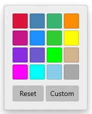 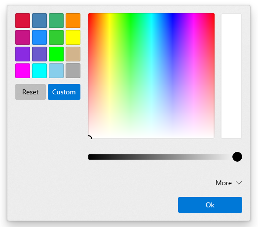 ## Validation Steps Performed * Color picker in settings UI still works ✔️ * Color picker for tabs still works ✔️
204 lines
10 KiB
XML
204 lines
10 KiB
XML
<Flyout x:Class="TerminalApp.ColorPickupFlyout"
|
|
xmlns="http://schemas.microsoft.com/winfx/2006/xaml/presentation"
|
|
xmlns:x="http://schemas.microsoft.com/winfx/2006/xaml"
|
|
xmlns:d="http://schemas.microsoft.com/expression/blend/2008"
|
|
xmlns:local="using:TerminalApp"
|
|
xmlns:mc="http://schemas.openxmlformats.org/markup-compatibility/2006"
|
|
xmlns:muxc="using:Microsoft.UI.Xaml.Controls"
|
|
mc:Ignorable="d">
|
|
<Flyout.FlyoutPresenterStyle>
|
|
<Style TargetType="FlyoutPresenter">
|
|
<Setter Property="MinWidth" Value="0" />
|
|
<Setter Property="MaxWidth" Value="9999" />
|
|
<Setter Property="Padding" Value="{StaticResource FlyoutContentPadding}" />
|
|
<Setter Property="Margin" Value="8,4,8,8" />
|
|
<Setter Property="CornerRadius" Value="{ThemeResource OverlayCornerRadius}" />
|
|
</Style>
|
|
</Flyout.FlyoutPresenterStyle>
|
|
<StackPanel Orientation="Horizontal">
|
|
<StackPanel XYFocusKeyboardNavigation="Enabled">
|
|
<Grid Padding="-2">
|
|
<VariableSizedWrapGrid Margin="0"
|
|
HorizontalAlignment="Center"
|
|
MaximumRowsOrColumns="4"
|
|
Orientation="Horizontal">
|
|
<VariableSizedWrapGrid.Resources>
|
|
<Style TargetType="Rectangle">
|
|
<Setter Property="Width" Value="30" />
|
|
<Setter Property="Height" Value="30" />
|
|
</Style>
|
|
<Style TargetType="Button">
|
|
<Setter Property="Padding" Value="-1" />
|
|
<Setter Property="Margin" Value="2" />
|
|
<Setter Property="CornerRadius" Value="{ThemeResource ControlCornerRadius}" />
|
|
<Setter Property="BorderBrush" Value="{StaticResource SystemBaseLowColor}" />
|
|
</Style>
|
|
</VariableSizedWrapGrid.Resources>
|
|
<Button x:Uid="CrimsonColorButton"
|
|
AutomationProperties.Name="Crimson"
|
|
Click="ColorButton_Click">
|
|
<Button.Content>
|
|
<Rectangle Fill="Crimson" />
|
|
</Button.Content>
|
|
</Button>
|
|
<Button x:Uid="SteelBlueColorButton"
|
|
AutomationProperties.Name="SteelBlue"
|
|
Click="ColorButton_Click">
|
|
<Button.Content>
|
|
<Rectangle Fill="SteelBlue" />
|
|
</Button.Content>
|
|
</Button>
|
|
<Button x:Uid="MediumSeaGreenColorButton"
|
|
AutomationProperties.Name="MediumSeaGreen"
|
|
Click="ColorButton_Click">
|
|
<Button.Content>
|
|
<Rectangle Fill="MediumSeaGreen" />
|
|
</Button.Content>
|
|
</Button>
|
|
<Button x:Uid="DarkOrangeColorButton"
|
|
AutomationProperties.Name="DarkOrange"
|
|
Click="ColorButton_Click">
|
|
<Button.Content>
|
|
<Rectangle Fill="DarkOrange" />
|
|
</Button.Content>
|
|
</Button>
|
|
<Button x:Uid="MediumVioletRedColorButton"
|
|
AutomationProperties.Name="MediumVioletRed"
|
|
Click="ColorButton_Click">
|
|
<Button.Content>
|
|
<Rectangle Fill="MediumVioletRed" />
|
|
</Button.Content>
|
|
</Button>
|
|
<Button x:Uid="DodgerBlueColorButton"
|
|
AutomationProperties.Name="DodgerBlue"
|
|
Click="ColorButton_Click">
|
|
<Button.Content>
|
|
<Rectangle Fill="DodgerBlue" />
|
|
</Button.Content>
|
|
</Button>
|
|
<Button x:Uid="LimeGreenColorButton"
|
|
AutomationProperties.Name="LimeGreen"
|
|
Click="ColorButton_Click">
|
|
<Button.Content>
|
|
<Rectangle Fill="LimeGreen" />
|
|
</Button.Content>
|
|
</Button>
|
|
<Button x:Uid="YellowColorButton"
|
|
AutomationProperties.Name="Yellow"
|
|
Click="ColorButton_Click">
|
|
<Button.Content>
|
|
<Rectangle Fill="Yellow" />
|
|
</Button.Content>
|
|
</Button>
|
|
<Button x:Uid="BlueVioletColorButton"
|
|
AutomationProperties.Name="BlueViolet"
|
|
Click="ColorButton_Click">
|
|
<Button.Content>
|
|
<Rectangle Fill="BlueViolet" />
|
|
</Button.Content>
|
|
</Button>
|
|
<Button x:Uid="SlateBlueColorButton"
|
|
AutomationProperties.Name="SlateBlue"
|
|
Click="ColorButton_Click">
|
|
<Button.Content>
|
|
<Rectangle Fill="SlateBlue" />
|
|
</Button.Content>
|
|
</Button>
|
|
<Button x:Uid="LimeColorButton"
|
|
AutomationProperties.Name="Lime"
|
|
Click="ColorButton_Click">
|
|
<Button.Content>
|
|
<Rectangle Fill="Lime" />
|
|
</Button.Content>
|
|
</Button>
|
|
<Button x:Uid="TanColorButton"
|
|
AutomationProperties.Name="Tan"
|
|
Click="ColorButton_Click">
|
|
<Button.Content>
|
|
<Rectangle Fill="Tan" />
|
|
</Button.Content>
|
|
</Button>
|
|
<Button x:Uid="MagentaColorButton"
|
|
AutomationProperties.Name="Magenta"
|
|
Click="ColorButton_Click">
|
|
<Button.Content>
|
|
<Rectangle Fill="Magenta" />
|
|
</Button.Content>
|
|
</Button>
|
|
<Button x:Uid="CyanColorButton"
|
|
AutomationProperties.Name="Cyan"
|
|
Click="ColorButton_Click">
|
|
<Button.Content>
|
|
<Rectangle Fill="Cyan" />
|
|
</Button.Content>
|
|
</Button>
|
|
<Button x:Uid="SkyBlueColorButton"
|
|
AutomationProperties.Name="SkyBlue"
|
|
Click="ColorButton_Click">
|
|
<Button.Content>
|
|
<Rectangle Fill="SkyBlue" />
|
|
</Button.Content>
|
|
</Button>
|
|
<Button x:Uid="DarkGrayColorButton"
|
|
AutomationProperties.Name="DarkGray"
|
|
Click="ColorButton_Click">
|
|
<Button.Content>
|
|
<Rectangle Fill="DarkGray" />
|
|
</Button.Content>
|
|
</Button>
|
|
</VariableSizedWrapGrid>
|
|
</Grid>
|
|
<Grid Margin="0,12,0,0"
|
|
Padding="-2">
|
|
<Grid.ColumnDefinitions>
|
|
<ColumnDefinition Width="*" />
|
|
<ColumnDefinition Width="*" />
|
|
</Grid.ColumnDefinitions>
|
|
<Button x:Name="ClearColorButton"
|
|
x:Uid="TabColorClearButton"
|
|
Grid.Column="0"
|
|
Margin="2"
|
|
HorizontalAlignment="Stretch"
|
|
Click="ClearColorButton_Click"
|
|
Content="Reset" />
|
|
<ToggleButton x:Name="CustomColorButton"
|
|
x:Uid="TabColorCustomButton"
|
|
Grid.Column="1"
|
|
Margin="2"
|
|
HorizontalAlignment="Stretch"
|
|
Click="ShowColorPickerButton_Click"
|
|
Content="Custom"
|
|
IsChecked="False" />
|
|
</Grid>
|
|
</StackPanel>
|
|
<Grid x:Name="customColorPanel"
|
|
Margin="16,0,0,0"
|
|
Visibility="Collapsed">
|
|
<Grid.RowDefinitions>
|
|
<RowDefinition Height="Auto" />
|
|
<RowDefinition Height="Auto" />
|
|
</Grid.RowDefinitions>
|
|
<muxc:ColorPicker x:Name="customColorPicker"
|
|
Grid.Row="0"
|
|
Margin="0,0,0,12"
|
|
ColorChanged="ColorPicker_ColorChanged"
|
|
FontSize="10"
|
|
IsAlphaEnabled="False"
|
|
IsAlphaSliderVisible="False"
|
|
IsAlphaTextInputVisible="False"
|
|
IsColorChannelTextInputVisible="True"
|
|
IsColorSliderVisible="True"
|
|
IsHexInputVisible="True"
|
|
IsMoreButtonVisible="True" />
|
|
<Button x:Name="OkButton"
|
|
x:Uid="OkButton"
|
|
Grid.Row="1"
|
|
MinWidth="130"
|
|
HorizontalAlignment="Right"
|
|
Click="CustomColorButton_Click"
|
|
Content="OK"
|
|
Style="{ThemeResource AccentButtonStyle}" />
|
|
</Grid>
|
|
</StackPanel>
|
|
</Flyout>
|