2020-12-11 22:34:21 +01:00
<?xml version="1.0" encoding="utf-8"?>
<root>
2021-03-08 17:45:12 +01:00
<!--
Microsoft ResX Schema
2020-12-11 22:34:21 +01:00
Version 2.0
2021-03-08 17:45:12 +01:00
The primary goals of this format is to allow a simple XML format
that is mostly human readable. The generation and parsing of the
various data types are done through the TypeConverter classes
2020-12-11 22:34:21 +01:00
associated with the data types.
2021-03-08 17:45:12 +01:00
2020-12-11 22:34:21 +01:00
Example:
2021-03-08 17:45:12 +01:00
2020-12-11 22:34:21 +01:00
... ado.net/XML headers & schema ...
<resheader name="resmimetype">text/microsoft-resx</resheader>
<resheader name="version">2.0</resheader>
<resheader name="reader">System.Resources.ResXResourceReader, System.Windows.Forms, ...</resheader>
<resheader name="writer">System.Resources.ResXResourceWriter, System.Windows.Forms, ...</resheader>
<data name="Name1"><value>this is my long string</value><comment>this is a comment</comment></data>
<data name="Color1" type="System.Drawing.Color, System.Drawing">Blue</data>
<data name="Bitmap1" mimetype="application/x-microsoft.net.object.binary.base64">
<value>[base64 mime encoded serialized .NET Framework object]</value>
</data>
<data name="Icon1" type="System.Drawing.Icon, System.Drawing" mimetype="application/x-microsoft.net.object.bytearray.base64">
<value>[base64 mime encoded string representing a byte array form of the .NET Framework object]</value>
<comment>This is a comment</comment>
</data>
2021-03-08 17:45:12 +01:00
There are any number of "resheader" rows that contain simple
2020-12-11 22:34:21 +01:00
name/value pairs.
2021-03-08 17:45:12 +01:00
Each data row contains a name, and value. The row also contains a
type or mimetype. Type corresponds to a .NET class that support
text/value conversion through the TypeConverter architecture.
Classes that don't support this are serialized and stored with the
2020-12-11 22:34:21 +01:00
mimetype set.
2021-03-08 17:45:12 +01:00
The mimetype is used for serialized objects, and tells the
ResXResourceReader how to depersist the object. This is currently not
2020-12-11 22:34:21 +01:00
extensible. For a given mimetype the value must be set accordingly:
2021-03-08 17:45:12 +01:00
Note - application/x-microsoft.net.object.binary.base64 is the format
that the ResXResourceWriter will generate, however the reader can
2020-12-11 22:34:21 +01:00
read any of the formats listed below.
2021-03-08 17:45:12 +01:00
2020-12-11 22:34:21 +01:00
mimetype: application/x-microsoft.net.object.binary.base64
2021-03-08 17:45:12 +01:00
value : The object must be serialized with
2020-12-11 22:34:21 +01:00
: System.Runtime.Serialization.Formatters.Binary.BinaryFormatter
: and then encoded with base64 encoding.
2021-03-08 17:45:12 +01:00
2020-12-11 22:34:21 +01:00
mimetype: application/x-microsoft.net.object.soap.base64
2021-03-08 17:45:12 +01:00
value : The object must be serialized with
2020-12-11 22:34:21 +01:00
: System.Runtime.Serialization.Formatters.Soap.SoapFormatter
: and then encoded with base64 encoding.
mimetype: application/x-microsoft.net.object.bytearray.base64
2021-03-08 17:45:12 +01:00
value : The object must be serialized into a byte array
2020-12-11 22:34:21 +01:00
: using a System.ComponentModel.TypeConverter
: and then encoded with base64 encoding.
-->
<xsd:schema id="root" xmlns="" xmlns:xsd="http://www.w3.org/2001/XMLSchema" xmlns:msdata="urn:schemas-microsoft-com:xml-msdata">
<xsd:import namespace="http://www.w3.org/XML/1998/namespace" />
<xsd:element name="root" msdata:IsDataSet="true">
<xsd:complexType>
<xsd:choice maxOccurs="unbounded">
<xsd:element name="metadata">
<xsd:complexType>
<xsd:sequence>
<xsd:element name="value" type="xsd:string" minOccurs="0" />
</xsd:sequence>
<xsd:attribute name="name" use="required" type="xsd:string" />
<xsd:attribute name="type" type="xsd:string" />
<xsd:attribute name="mimetype" type="xsd:string" />
<xsd:attribute ref="xml:space" />
</xsd:complexType>
</xsd:element>
<xsd:element name="assembly">
<xsd:complexType>
<xsd:attribute name="alias" type="xsd:string" />
<xsd:attribute name="name" type="xsd:string" />
</xsd:complexType>
</xsd:element>
<xsd:element name="data">
<xsd:complexType>
<xsd:sequence>
<xsd:element name="value" type="xsd:string" minOccurs="0" msdata:Ordinal="1" />
<xsd:element name="comment" type="xsd:string" minOccurs="0" msdata:Ordinal="2" />
</xsd:sequence>
<xsd:attribute name="name" type="xsd:string" use="required" msdata:Ordinal="1" />
<xsd:attribute name="type" type="xsd:string" msdata:Ordinal="3" />
<xsd:attribute name="mimetype" type="xsd:string" msdata:Ordinal="4" />
<xsd:attribute ref="xml:space" />
</xsd:complexType>
</xsd:element>
<xsd:element name="resheader">
<xsd:complexType>
<xsd:sequence>
<xsd:element name="value" type="xsd:string" minOccurs="0" msdata:Ordinal="1" />
</xsd:sequence>
<xsd:attribute name="name" type="xsd:string" use="required" />
</xsd:complexType>
</xsd:element>
</xsd:choice>
</xsd:complexType>
</xsd:element>
</xsd:schema>
<resheader name="resmimetype">
<value>text/microsoft-resx</value>
</resheader>
<resheader name="version">
<value>2.0</value>
</resheader>
<resheader name="reader">
<value>System.Resources.ResXResourceReader, System.Windows.Forms, Version=4.0.0.0, Culture=neutral, PublicKeyToken=b77a5c561934e089</value>
</resheader>
<resheader name="writer">
<value>System.Resources.ResXResourceWriter, System.Windows.Forms, Version=4.0.0.0, Culture=neutral, PublicKeyToken=b77a5c561934e089</value>
</resheader>
2021-05-05 06:15:25 +02:00
<data name="AddProfile_AddNewButton.Tag" xml:space="preserve">
<value>Create New Button</value>
</data>
<data name="AddProfile_AddNewTextBlock.Text" xml:space="preserve">
<value>New empty profile</value>
<comment>Button label that creates a new profile with default settings.</comment>
</data>
<data name="AddProfile_Duplicate.Header" xml:space="preserve">
<value>Duplicate a profile</value>
<comment>This is the header for a control that lets the user duplicate one of their existing profiles.</comment>
</data>
<data name="AddProfile_DuplicateButton.Tag" xml:space="preserve">
<value>Duplicate Button</value>
</data>
<data name="AddProfile_DuplicateTextBlock.Text" xml:space="preserve">
<value>Duplicate</value>
<comment>Button label that duplicates the selected profile and navigates to the duplicate's page.</comment>
</data>
2020-12-11 22:34:21 +01:00
<data name="ColorScheme_Background.Text" xml:space="preserve">
<value>Background</value>
2021-03-04 01:28:48 +01:00
<comment>This is the header for a control that lets the user select the background color for text displayed on the screen.</comment>
2020-12-11 22:34:21 +01:00
</data>
<data name="ColorScheme_Black.Header" xml:space="preserve">
<value>Black</value>
2021-03-04 01:28:48 +01:00
<comment>This is the header for a control that lets the user select the black color for text displayed on the screen.</comment>
2020-12-11 22:34:21 +01:00
</data>
<data name="ColorScheme_Blue.Header" xml:space="preserve">
<value>Blue</value>
2021-03-04 01:28:48 +01:00
<comment>This is the header for a control that lets the user select the blue color for text displayed on the screen.</comment>
2020-12-11 22:34:21 +01:00
</data>
<data name="ColorScheme_BrightBlack.Header" xml:space="preserve">
<value>Bright black</value>
2021-03-04 01:28:48 +01:00
<comment>This is the header for a control that lets the user select the bright black color for text displayed on the screen.</comment>
2020-12-11 22:34:21 +01:00
</data>
<data name="ColorScheme_BrightBlue.Header" xml:space="preserve">
<value>Bright blue</value>
2021-03-04 01:28:48 +01:00
<comment>This is the header for a control that lets the user select the bright blue color for text displayed on the screen.</comment>
2020-12-11 22:34:21 +01:00
</data>
<data name="ColorScheme_BrightCyan.Header" xml:space="preserve">
<value>Bright cyan</value>
2021-03-04 01:28:48 +01:00
<comment>This is the header for a control that lets the user select the bright cyan color for text displayed on the screen.</comment>
2020-12-11 22:34:21 +01:00
</data>
<data name="ColorScheme_BrightGreen.Header" xml:space="preserve">
<value>Bright green</value>
2021-03-04 01:28:48 +01:00
<comment>This is the header for a control that lets the user select the bright green color for text displayed on the screen.</comment>
2020-12-11 22:34:21 +01:00
</data>
<data name="ColorScheme_BrightPurple.Header" xml:space="preserve">
<value>Bright purple</value>
2021-03-04 01:28:48 +01:00
<comment>This is the header for a control that lets the user select the bright purple color for text displayed on the screen.</comment>
2020-12-11 22:34:21 +01:00
</data>
<data name="ColorScheme_BrightRed.Header" xml:space="preserve">
<value>Bright red</value>
2021-03-04 01:28:48 +01:00
<comment>This is the header for a control that lets the user select the bright red color for text displayed on the screen.</comment>
2020-12-11 22:34:21 +01:00
</data>
<data name="ColorScheme_BrightWhite.Header" xml:space="preserve">
<value>Bright white</value>
2021-03-04 01:28:48 +01:00
<comment>This is the header for a control that lets the user select the bright white color for text displayed on the screen.</comment>
2020-12-11 22:34:21 +01:00
</data>
<data name="ColorScheme_BrightYellow.Header" xml:space="preserve">
<value>Bright yellow</value>
2021-03-04 01:28:48 +01:00
<comment>This is the header for a control that lets the user select the bright yellow color for text displayed on the screen.</comment>
2020-12-11 22:34:21 +01:00
</data>
<data name="ColorScheme_CursorColor.Text" xml:space="preserve">
<value>Cursor color</value>
2021-03-04 01:28:48 +01:00
<comment>This is the header for a control that lets the user select the text cursor's color displayed on the screen.</comment>
2020-12-11 22:34:21 +01:00
</data>
<data name="ColorScheme_Cyan.Header" xml:space="preserve">
<value>Cyan</value>
2021-03-04 01:28:48 +01:00
<comment>This is the header for a control that lets the user select the cyan color for text displayed on the screen.</comment>
2020-12-11 22:34:21 +01:00
</data>
<data name="ColorScheme_Foreground.Text" xml:space="preserve">
<value>Foreground</value>
2021-03-04 01:28:48 +01:00
<comment>This is the header for a control that lets the user select the foreground color for text displayed on the screen.</comment>
2020-12-11 22:34:21 +01:00
</data>
<data name="ColorScheme_Green.Header" xml:space="preserve">
<value>Green</value>
2021-03-04 01:28:48 +01:00
<comment>This is the header for a control that lets the user select the green color for text displayed on the screen.</comment>
2020-12-11 22:34:21 +01:00
</data>
<data name="ColorScheme_Purple.Header" xml:space="preserve">
<value>Purple</value>
2021-03-04 01:28:48 +01:00
<comment>This is the header for a control that lets the user select the purple color for text displayed on the screen.</comment>
2020-12-11 22:34:21 +01:00
</data>
<data name="ColorScheme_SelectionBackground.Text" xml:space="preserve">
<value>Selection background</value>
2021-03-04 01:28:48 +01:00
<comment>This is the header for a control that lets the user select the background color for selected text displayed on the screen.</comment>
2020-12-11 22:34:21 +01:00
</data>
<data name="ColorScheme_Red.Header" xml:space="preserve">
<value>Red</value>
2021-03-04 01:28:48 +01:00
<comment>This is the header for a control that lets the user select the red color for text displayed on the screen.</comment>
2020-12-11 22:34:21 +01:00
</data>
<data name="ColorScheme_White.Header" xml:space="preserve">
<value>White</value>
2021-03-04 01:28:48 +01:00
<comment>This is the header for a control that lets the user select the white color for text displayed on the screen.</comment>
2020-12-11 22:34:21 +01:00
</data>
<data name="ColorScheme_Yellow.Header" xml:space="preserve">
<value>Yellow</value>
2021-03-04 01:28:48 +01:00
<comment>This is the header for a control that lets the user select the yellow color for text displayed on the screen.</comment>
2020-12-11 22:34:21 +01:00
</data>
2021-06-11 01:24:21 +02:00
<data name="Globals_Language.Header" xml:space="preserve">
2021-07-01 00:31:56 +02:00
<value>Language (requires relaunch)</value>
2021-06-11 01:24:21 +02:00
<comment>The header for a control allowing users to choose the app's language.</comment>
</data>
<data name="Globals_Language.HelpText" xml:space="preserve">
<value>Sets an override for the app's preferred language.</value>
<comment>A description explaining how this control changes the app's language.</comment>
</data>
<data name="Globals_LanguageDefault" xml:space="preserve">
<value>Use system default</value>
<comment>The app contains a control allowing users to choose the app's language. If this value is chosen, the language preference list of the system settings is used instead.</comment>
</data>
Include UWP styling guidance in settings UI (#8831)
<!-- Enter a brief description/summary of your PR here. What does it fix/what does it change/how was it tested (even manually, if necessary)? -->
## Summary of the Pull Request
The settings UI was _close_ to looking just right, it just needed some tweaks to adhere to the proper guidance: https://docs.microsoft.com/en-us/windows/uwp/design/controls-and-patterns/forms
This PR changes the font sizes, spacing, and layout of all of the pages to align with guidance.
Some pics:


Min width:

<!-- Other than the issue solved, is this relevant to any other issues/existing PRs? -->
## References
<!-- Please review the items on the PR checklist before submitting-->
## PR Checklist
* [x] Closes #8816
* [x] CLA signed. If not, go over [here](https://cla.opensource.microsoft.com/microsoft/Terminal) and sign the CLA
* [ ] Tests added/passed
* [ ] Documentation updated. If checked, please file a pull request on [our docs repo](https://github.com/MicrosoftDocs/terminal) and link it here: #xxx
* [ ] Schema updated.
* [x] I've discussed this with core contributors already. If not checked, I'm ready to accept this work might be rejected in favor of a different grand plan. Issue number where discussion took place: #xxx
<!-- Provide a more detailed description of the PR, other things fixed or any additional comments/features here -->
## Detailed Description of the Pull Request / Additional comments
* Removed custom font sizing, WinUI adheres to guidance anyway
* 24px spacing between controls and 48px between groupings
* Controls shouldn't be next to each other (see Launch size)
* Technically Launch size is a grouping, so it gets upgraded to subtitle status
* Left margins for pages have been fixed to left align with the page titles
* Single checkboxes have been changed to toggle switches
<!-- Describe how you validated the behavior. Add automated tests wherever possible, but list manual validation steps taken as well -->
## Validation Steps Performed
2021-01-20 23:42:39 +01:00
<data name="Globals_AlwaysShowTabs.Header" xml:space="preserve">
2020-12-11 22:34:21 +01:00
<value>Always show tabs</value>
2021-03-04 01:28:48 +01:00
<comment>Header for a control to toggle if the app should always show the tabs (similar to a website browser).</comment>
2020-12-11 22:34:21 +01:00
</data>
2021-02-08 19:04:43 +01:00
<data name="Globals_AlwaysShowTabs.HelpText" xml:space="preserve">
2021-08-09 19:29:04 +02:00
<value>When disabled, the tab bar will appear when a new tab is created.</value>
2021-03-04 01:28:48 +01:00
<comment>A description for what the "always show tabs" setting does. Presented near "Globals_AlwaysShowTabs.Header".</comment>
2020-12-11 22:34:21 +01:00
</data>
Include UWP styling guidance in settings UI (#8831)
<!-- Enter a brief description/summary of your PR here. What does it fix/what does it change/how was it tested (even manually, if necessary)? -->
## Summary of the Pull Request
The settings UI was _close_ to looking just right, it just needed some tweaks to adhere to the proper guidance: https://docs.microsoft.com/en-us/windows/uwp/design/controls-and-patterns/forms
This PR changes the font sizes, spacing, and layout of all of the pages to align with guidance.
Some pics:


Min width:

<!-- Other than the issue solved, is this relevant to any other issues/existing PRs? -->
## References
<!-- Please review the items on the PR checklist before submitting-->
## PR Checklist
* [x] Closes #8816
* [x] CLA signed. If not, go over [here](https://cla.opensource.microsoft.com/microsoft/Terminal) and sign the CLA
* [ ] Tests added/passed
* [ ] Documentation updated. If checked, please file a pull request on [our docs repo](https://github.com/MicrosoftDocs/terminal) and link it here: #xxx
* [ ] Schema updated.
* [x] I've discussed this with core contributors already. If not checked, I'm ready to accept this work might be rejected in favor of a different grand plan. Issue number where discussion took place: #xxx
<!-- Provide a more detailed description of the PR, other things fixed or any additional comments/features here -->
## Detailed Description of the Pull Request / Additional comments
* Removed custom font sizing, WinUI adheres to guidance anyway
* 24px spacing between controls and 48px between groupings
* Controls shouldn't be next to each other (see Launch size)
* Technically Launch size is a grouping, so it gets upgraded to subtitle status
* Left margins for pages have been fixed to left align with the page titles
* Single checkboxes have been changed to toggle switches
<!-- Describe how you validated the behavior. Add automated tests wherever possible, but list manual validation steps taken as well -->
## Validation Steps Performed
2021-01-20 23:42:39 +01:00
<data name="Globals_CopyOnSelect.Header" xml:space="preserve">
2021-01-19 13:14:13 +01:00
<value>Automatically copy selection to clipboard</value>
2021-03-04 01:28:48 +01:00
<comment>Header for a control to toggle whether selected text should be copied to the clipboard automatically, or not.</comment>
2020-12-11 22:34:21 +01:00
</data>
2021-05-17 06:20:09 +02:00
<data name="Globals_DetectURLs.Header" xml:space="preserve">
<value>Automatically detect URLs and make them clickable</value>
<comment>Header for a control to toggle whether the terminal should automatically detect URLs and make them clickable, or not.</comment>
</data>
2021-04-24 00:36:51 +02:00
<data name="Globals_TrimBlockSelection.Header" xml:space="preserve">
<value>Remove trailing white-space in rectangular selection</value>
<comment>Header for a control to toggle whether a text selected with block selection should be trimmed of white spaces when copied to the clipboard, or not.</comment>
</data>
2021-02-24 00:37:23 +01:00
<data name="Globals_KeybindingsDisclaimer.Text" xml:space="preserve">
<value>Below are the currently bound keys, which can be modified by editing the JSON settings file.</value>
2021-03-04 01:28:48 +01:00
<comment>A disclaimer located at the top of the actions page that presents the list of keybindings.</comment>
2021-02-24 00:37:23 +01:00
</data>
2020-12-11 22:34:21 +01:00
<data name="Globals_DefaultProfile.Header" xml:space="preserve">
<value>Default profile</value>
2021-03-04 01:28:48 +01:00
<comment>Header for a control to select your default profile from the list of profiles you've created.</comment>
2020-12-11 22:34:21 +01:00
</data>
2021-02-08 19:04:43 +01:00
<data name="Globals_DefaultProfile.HelpText" xml:space="preserve">
2021-01-19 13:14:13 +01:00
<value>Profile that opens when clicking the '+' icon or by typing the new tab key binding.</value>
2021-03-04 01:28:48 +01:00
<comment>A description for what the default profile is and when it's used.</comment>
2020-12-11 22:34:21 +01:00
</data>
2021-03-26 23:09:49 +01:00
<data name="Globals_DefaultTerminal.Header" xml:space="preserve">
2021-04-28 12:43:30 +02:00
<value>Default terminal application</value>
2021-03-26 23:09:49 +01:00
<comment>Header for a drop down that permits the user to select which installed Terminal application will launch when command line tools like CMD are run from the Windows Explorer run box or start menu or anywhere else that they do not already have a graphical window assigned.</comment>
</data>
<data name="Globals_DefaultTerminal.HelpText" xml:space="preserve">
<value>The terminal application that launches when a command-line application is run without an existing session, like from the Start Menu or Run dialog.</value>
<comment>A description to clarify that the dropdown choice for default terminal will tell the operating system which Terminal application (Windows Terminal, the preview build, the legacy inbox window, or a 3rd party one) to use when starting a command line tool like CMD or Powershell that does not already have a window.</comment>
</data>
Include UWP styling guidance in settings UI (#8831)
<!-- Enter a brief description/summary of your PR here. What does it fix/what does it change/how was it tested (even manually, if necessary)? -->
## Summary of the Pull Request
The settings UI was _close_ to looking just right, it just needed some tweaks to adhere to the proper guidance: https://docs.microsoft.com/en-us/windows/uwp/design/controls-and-patterns/forms
This PR changes the font sizes, spacing, and layout of all of the pages to align with guidance.
Some pics:


Min width:

<!-- Other than the issue solved, is this relevant to any other issues/existing PRs? -->
## References
<!-- Please review the items on the PR checklist before submitting-->
## PR Checklist
* [x] Closes #8816
* [x] CLA signed. If not, go over [here](https://cla.opensource.microsoft.com/microsoft/Terminal) and sign the CLA
* [ ] Tests added/passed
* [ ] Documentation updated. If checked, please file a pull request on [our docs repo](https://github.com/MicrosoftDocs/terminal) and link it here: #xxx
* [ ] Schema updated.
* [x] I've discussed this with core contributors already. If not checked, I'm ready to accept this work might be rejected in favor of a different grand plan. Issue number where discussion took place: #xxx
<!-- Provide a more detailed description of the PR, other things fixed or any additional comments/features here -->
## Detailed Description of the Pull Request / Additional comments
* Removed custom font sizing, WinUI adheres to guidance anyway
* 24px spacing between controls and 48px between groupings
* Controls shouldn't be next to each other (see Launch size)
* Technically Launch size is a grouping, so it gets upgraded to subtitle status
* Left margins for pages have been fixed to left align with the page titles
* Single checkboxes have been changed to toggle switches
<!-- Describe how you validated the behavior. Add automated tests wherever possible, but list manual validation steps taken as well -->
## Validation Steps Performed
2021-01-20 23:42:39 +01:00
<data name="Globals_ForceFullRepaint.Header" xml:space="preserve">
2020-12-11 22:34:21 +01:00
<value>Redraw entire screen when display updates</value>
2021-03-04 01:28:48 +01:00
<comment>Header for a control to toggle the "force full repaint" setting. When enabled, the app renders new content between screen frames.</comment>
2020-12-11 22:34:21 +01:00
</data>
2021-02-08 19:04:43 +01:00
<data name="Globals_ForceFullRepaint.HelpText" xml:space="preserve">
2021-08-09 19:29:04 +02:00
<value>When disabled, the terminal will render only the updates to the screen between frames.</value>
2021-03-04 01:28:48 +01:00
<comment>A description for what the "force full repaint" setting does. Presented near "Globals_ForceFullRepaint.Header".</comment>
2020-12-11 22:34:21 +01:00
</data>
Include UWP styling guidance in settings UI (#8831)
<!-- Enter a brief description/summary of your PR here. What does it fix/what does it change/how was it tested (even manually, if necessary)? -->
## Summary of the Pull Request
The settings UI was _close_ to looking just right, it just needed some tweaks to adhere to the proper guidance: https://docs.microsoft.com/en-us/windows/uwp/design/controls-and-patterns/forms
This PR changes the font sizes, spacing, and layout of all of the pages to align with guidance.
Some pics:


Min width:

<!-- Other than the issue solved, is this relevant to any other issues/existing PRs? -->
## References
<!-- Please review the items on the PR checklist before submitting-->
## PR Checklist
* [x] Closes #8816
* [x] CLA signed. If not, go over [here](https://cla.opensource.microsoft.com/microsoft/Terminal) and sign the CLA
* [ ] Tests added/passed
* [ ] Documentation updated. If checked, please file a pull request on [our docs repo](https://github.com/MicrosoftDocs/terminal) and link it here: #xxx
* [ ] Schema updated.
* [x] I've discussed this with core contributors already. If not checked, I'm ready to accept this work might be rejected in favor of a different grand plan. Issue number where discussion took place: #xxx
<!-- Provide a more detailed description of the PR, other things fixed or any additional comments/features here -->
## Detailed Description of the Pull Request / Additional comments
* Removed custom font sizing, WinUI adheres to guidance anyway
* 24px spacing between controls and 48px between groupings
* Controls shouldn't be next to each other (see Launch size)
* Technically Launch size is a grouping, so it gets upgraded to subtitle status
* Left margins for pages have been fixed to left align with the page titles
* Single checkboxes have been changed to toggle switches
<!-- Describe how you validated the behavior. Add automated tests wherever possible, but list manual validation steps taken as well -->
## Validation Steps Performed
2021-01-20 23:42:39 +01:00
<data name="Globals_InitialCols.Header" xml:space="preserve">
<value>Columns</value>
2021-03-04 01:28:48 +01:00
<comment>Header for a control to choose the number of columns in the terminal's text grid.</comment>
2020-12-11 22:34:21 +01:00
</data>
2021-02-08 19:04:43 +01:00
<data name="Globals_InitialCols.HelpText" xml:space="preserve">
2020-12-11 22:34:21 +01:00
<value>The number of columns displayed in the window upon first load. Measured in characters.</value>
2021-03-04 01:28:48 +01:00
<comment>A description for what the "columns" setting does. Presented near "Globals_InitialCols.Header".</comment>
2020-12-11 22:34:21 +01:00
</data>
Include UWP styling guidance in settings UI (#8831)
<!-- Enter a brief description/summary of your PR here. What does it fix/what does it change/how was it tested (even manually, if necessary)? -->
## Summary of the Pull Request
The settings UI was _close_ to looking just right, it just needed some tweaks to adhere to the proper guidance: https://docs.microsoft.com/en-us/windows/uwp/design/controls-and-patterns/forms
This PR changes the font sizes, spacing, and layout of all of the pages to align with guidance.
Some pics:


Min width:

<!-- Other than the issue solved, is this relevant to any other issues/existing PRs? -->
## References
<!-- Please review the items on the PR checklist before submitting-->
## PR Checklist
* [x] Closes #8816
* [x] CLA signed. If not, go over [here](https://cla.opensource.microsoft.com/microsoft/Terminal) and sign the CLA
* [ ] Tests added/passed
* [ ] Documentation updated. If checked, please file a pull request on [our docs repo](https://github.com/MicrosoftDocs/terminal) and link it here: #xxx
* [ ] Schema updated.
* [x] I've discussed this with core contributors already. If not checked, I'm ready to accept this work might be rejected in favor of a different grand plan. Issue number where discussion took place: #xxx
<!-- Provide a more detailed description of the PR, other things fixed or any additional comments/features here -->
## Detailed Description of the Pull Request / Additional comments
* Removed custom font sizing, WinUI adheres to guidance anyway
* 24px spacing between controls and 48px between groupings
* Controls shouldn't be next to each other (see Launch size)
* Technically Launch size is a grouping, so it gets upgraded to subtitle status
* Left margins for pages have been fixed to left align with the page titles
* Single checkboxes have been changed to toggle switches
<!-- Describe how you validated the behavior. Add automated tests wherever possible, but list manual validation steps taken as well -->
## Validation Steps Performed
2021-01-20 23:42:39 +01:00
<data name="Globals_InitialRows.Header" xml:space="preserve">
<value>Rows</value>
2021-03-04 01:28:48 +01:00
<comment>Header for a control to choose the number of rows in the terminal's text grid.</comment>
2020-12-11 22:34:21 +01:00
</data>
2021-02-08 19:04:43 +01:00
<data name="Globals_InitialRows.HelpText" xml:space="preserve">
2020-12-11 22:34:21 +01:00
<value>The number of rows displayed in the window upon first load. Measured in characters.</value>
2021-03-04 01:28:48 +01:00
<comment>A description for what the "rows" setting does. Presented near "Globals_InitialRows.Header".</comment>
2020-12-11 22:34:21 +01:00
</data>
<data name="Globals_LaunchMode.Header" xml:space="preserve">
<value>Launch mode</value>
2021-03-04 01:28:48 +01:00
<comment>Header for a control to select what mode to launch the terminal in.</comment>
2020-12-11 22:34:21 +01:00
</data>
2021-02-08 19:04:43 +01:00
<data name="Globals_LaunchMode.HelpText" xml:space="preserve">
2021-01-19 13:14:13 +01:00
<value>How the terminal will appear on launch. Focus will hide the tabs and title bar.</value>
<comment>'Focus' must match <Globals_LaunchModeFocus.Content>.</comment>
2020-12-11 22:34:21 +01:00
</data>
<data name="Globals_LaunchModeDefault.Content" xml:space="preserve">
<value>Default</value>
2021-03-04 01:28:48 +01:00
<comment>An option to choose from for the "launch mode" setting. Default option.</comment>
2020-12-11 22:34:21 +01:00
</data>
<data name="Globals_LaunchModeFullscreen.Content" xml:space="preserve">
<value>Full screen</value>
2021-03-04 01:28:48 +01:00
<comment>An option to choose from for the "launch mode" setting. Opens the app in a full screen state.</comment>
2020-12-11 22:34:21 +01:00
</data>
<data name="Globals_LaunchModeMaximized.Content" xml:space="preserve">
<value>Maximized</value>
2021-03-04 01:28:48 +01:00
<comment>An option to choose from for the "launch mode" setting. Opens the app maximized (covers the whole screen).</comment>
2020-12-11 22:34:21 +01:00
</data>
2021-02-19 22:09:17 +01:00
<data name="Globals_WindowingBehavior.Header" xml:space="preserve">
<value>New instance behavior</value>
2021-03-04 01:28:48 +01:00
<comment>Header for a control to select how new app instances are handled.</comment>
2021-02-19 22:09:17 +01:00
</data>
<data name="Globals_WindowingBehavior.HelpText" xml:space="preserve">
<value>Controls how new terminal instances attach to existing windows.</value>
2021-03-04 01:28:48 +01:00
<comment>A description for what the "windowing behavior" setting does. Presented near "Globals_WindowingBehavior.Header".</comment>
2021-02-19 22:09:17 +01:00
</data>
<data name="Globals_WindowingBehaviorUseNew.Content" xml:space="preserve">
<value>Create a new window</value>
2021-03-04 01:28:48 +01:00
<comment>An option to choose from for the "windowing behavior" setting. When selected, new instances create a new window.</comment>
2021-02-19 22:09:17 +01:00
</data>
<data name="Globals_WindowingBehaviorUseAnyExisting.Content" xml:space="preserve">
<value>Attach to the most recently used window</value>
2021-03-04 01:28:48 +01:00
<comment>An option to choose from for the "windowing behavior" setting. When selected, new instances open in the most recently used window.</comment>
2021-02-19 22:09:17 +01:00
</data>
<data name="Globals_WindowingBehaviorUseExisting.Content" xml:space="preserve">
<value>Attach to the most recently used window on this desktop</value>
2021-03-04 01:28:48 +01:00
<comment>An option to choose from for the "windowing behavior" setting. When selected, new instances open in the most recently used window on this virtual desktop.</comment>
2021-02-19 22:09:17 +01:00
</data>
2020-12-11 22:34:21 +01:00
<data name="Globals_RenderingDisclaimer.Text" xml:space="preserve">
<value>These settings may be useful for troubleshooting an issue, however they will impact your performance.</value>
2021-03-04 01:28:48 +01:00
<comment>A disclaimer presented at the top of a page.</comment>
2020-12-11 22:34:21 +01:00
</data>
Include UWP styling guidance in settings UI (#8831)
<!-- Enter a brief description/summary of your PR here. What does it fix/what does it change/how was it tested (even manually, if necessary)? -->
## Summary of the Pull Request
The settings UI was _close_ to looking just right, it just needed some tweaks to adhere to the proper guidance: https://docs.microsoft.com/en-us/windows/uwp/design/controls-and-patterns/forms
This PR changes the font sizes, spacing, and layout of all of the pages to align with guidance.
Some pics:


Min width:

<!-- Other than the issue solved, is this relevant to any other issues/existing PRs? -->
## References
<!-- Please review the items on the PR checklist before submitting-->
## PR Checklist
* [x] Closes #8816
* [x] CLA signed. If not, go over [here](https://cla.opensource.microsoft.com/microsoft/Terminal) and sign the CLA
* [ ] Tests added/passed
* [ ] Documentation updated. If checked, please file a pull request on [our docs repo](https://github.com/MicrosoftDocs/terminal) and link it here: #xxx
* [ ] Schema updated.
* [x] I've discussed this with core contributors already. If not checked, I'm ready to accept this work might be rejected in favor of a different grand plan. Issue number where discussion took place: #xxx
<!-- Provide a more detailed description of the PR, other things fixed or any additional comments/features here -->
## Detailed Description of the Pull Request / Additional comments
* Removed custom font sizing, WinUI adheres to guidance anyway
* 24px spacing between controls and 48px between groupings
* Controls shouldn't be next to each other (see Launch size)
* Technically Launch size is a grouping, so it gets upgraded to subtitle status
* Left margins for pages have been fixed to left align with the page titles
* Single checkboxes have been changed to toggle switches
<!-- Describe how you validated the behavior. Add automated tests wherever possible, but list manual validation steps taken as well -->
## Validation Steps Performed
2021-01-20 23:42:39 +01:00
<data name="Globals_ShowTitlebar.Header" xml:space="preserve">
2021-01-19 13:14:13 +01:00
<value>Hide the title bar (requires relaunch)</value>
2021-03-04 01:28:48 +01:00
<comment>Header for a control to toggle whether the title bar should be shown or not. Changing this setting requires the user to relaunch the app.</comment>
2020-12-11 22:34:21 +01:00
</data>
2021-02-08 19:04:43 +01:00
<data name="Globals_ShowTitlebar.HelpText" xml:space="preserve">
2021-08-09 19:29:04 +02:00
<value>When disabled, the title bar will appear above the tabs.</value>
2021-03-04 01:28:48 +01:00
<comment>A description for what the "show titlebar" setting does. Presented near "Globals_ShowTitlebar.Header".</comment>
2020-12-11 22:34:21 +01:00
</data>
Include UWP styling guidance in settings UI (#8831)
<!-- Enter a brief description/summary of your PR here. What does it fix/what does it change/how was it tested (even manually, if necessary)? -->
## Summary of the Pull Request
The settings UI was _close_ to looking just right, it just needed some tweaks to adhere to the proper guidance: https://docs.microsoft.com/en-us/windows/uwp/design/controls-and-patterns/forms
This PR changes the font sizes, spacing, and layout of all of the pages to align with guidance.
Some pics:


Min width:

<!-- Other than the issue solved, is this relevant to any other issues/existing PRs? -->
## References
<!-- Please review the items on the PR checklist before submitting-->
## PR Checklist
* [x] Closes #8816
* [x] CLA signed. If not, go over [here](https://cla.opensource.microsoft.com/microsoft/Terminal) and sign the CLA
* [ ] Tests added/passed
* [ ] Documentation updated. If checked, please file a pull request on [our docs repo](https://github.com/MicrosoftDocs/terminal) and link it here: #xxx
* [ ] Schema updated.
* [x] I've discussed this with core contributors already. If not checked, I'm ready to accept this work might be rejected in favor of a different grand plan. Issue number where discussion took place: #xxx
<!-- Provide a more detailed description of the PR, other things fixed or any additional comments/features here -->
## Detailed Description of the Pull Request / Additional comments
* Removed custom font sizing, WinUI adheres to guidance anyway
* 24px spacing between controls and 48px between groupings
* Controls shouldn't be next to each other (see Launch size)
* Technically Launch size is a grouping, so it gets upgraded to subtitle status
* Left margins for pages have been fixed to left align with the page titles
* Single checkboxes have been changed to toggle switches
<!-- Describe how you validated the behavior. Add automated tests wherever possible, but list manual validation steps taken as well -->
## Validation Steps Performed
2021-01-20 23:42:39 +01:00
<data name="Globals_ShowTitleInTitlebar.Header" xml:space="preserve">
2021-01-19 13:14:13 +01:00
<value>Use active terminal title as application title</value>
2021-03-04 01:28:48 +01:00
<comment>Header for a control to toggle whether the terminal's title is shown as the application title, or not.</comment>
2020-12-11 22:34:21 +01:00
</data>
2021-02-08 19:04:43 +01:00
<data name="Globals_ShowTitleInTitlebar.HelpText" xml:space="preserve">
2021-08-09 19:29:04 +02:00
<value>When disabled, the title bar will be 'Windows Terminal'.</value>
2021-03-04 01:28:48 +01:00
<comment>A description for what the "show title in titlebar" setting does. Presented near "Globals_ShowTitleInTitlebar.Header".{Locked="Windows"}</comment>
2020-12-11 22:34:21 +01:00
</data>
Include UWP styling guidance in settings UI (#8831)
<!-- Enter a brief description/summary of your PR here. What does it fix/what does it change/how was it tested (even manually, if necessary)? -->
## Summary of the Pull Request
The settings UI was _close_ to looking just right, it just needed some tweaks to adhere to the proper guidance: https://docs.microsoft.com/en-us/windows/uwp/design/controls-and-patterns/forms
This PR changes the font sizes, spacing, and layout of all of the pages to align with guidance.
Some pics:


Min width:

<!-- Other than the issue solved, is this relevant to any other issues/existing PRs? -->
## References
<!-- Please review the items on the PR checklist before submitting-->
## PR Checklist
* [x] Closes #8816
* [x] CLA signed. If not, go over [here](https://cla.opensource.microsoft.com/microsoft/Terminal) and sign the CLA
* [ ] Tests added/passed
* [ ] Documentation updated. If checked, please file a pull request on [our docs repo](https://github.com/MicrosoftDocs/terminal) and link it here: #xxx
* [ ] Schema updated.
* [x] I've discussed this with core contributors already. If not checked, I'm ready to accept this work might be rejected in favor of a different grand plan. Issue number where discussion took place: #xxx
<!-- Provide a more detailed description of the PR, other things fixed or any additional comments/features here -->
## Detailed Description of the Pull Request / Additional comments
* Removed custom font sizing, WinUI adheres to guidance anyway
* 24px spacing between controls and 48px between groupings
* Controls shouldn't be next to each other (see Launch size)
* Technically Launch size is a grouping, so it gets upgraded to subtitle status
* Left margins for pages have been fixed to left align with the page titles
* Single checkboxes have been changed to toggle switches
<!-- Describe how you validated the behavior. Add automated tests wherever possible, but list manual validation steps taken as well -->
## Validation Steps Performed
2021-01-20 23:42:39 +01:00
<data name="Globals_SnapToGridOnResize.Header" xml:space="preserve">
2020-12-11 22:34:21 +01:00
<value>Snap window resizing to character grid</value>
2021-03-04 01:28:48 +01:00
<comment>Header for a control to toggle whether the terminal snaps the window to the character grid when resizing, or not.</comment>
2020-12-11 22:34:21 +01:00
</data>
2021-02-08 19:04:43 +01:00
<data name="Globals_SnapToGridOnResize.HelpText" xml:space="preserve">
2021-08-09 19:29:04 +02:00
<value>When disabled, the window will resize smoothly.</value>
2021-03-04 01:28:48 +01:00
<comment>A description for what the "snap to grid on resize" setting does. Presented near "Globals_SnapToGridOnResize.Header".</comment>
2020-12-11 22:34:21 +01:00
</data>
Include UWP styling guidance in settings UI (#8831)
<!-- Enter a brief description/summary of your PR here. What does it fix/what does it change/how was it tested (even manually, if necessary)? -->
## Summary of the Pull Request
The settings UI was _close_ to looking just right, it just needed some tweaks to adhere to the proper guidance: https://docs.microsoft.com/en-us/windows/uwp/design/controls-and-patterns/forms
This PR changes the font sizes, spacing, and layout of all of the pages to align with guidance.
Some pics:


Min width:

<!-- Other than the issue solved, is this relevant to any other issues/existing PRs? -->
## References
<!-- Please review the items on the PR checklist before submitting-->
## PR Checklist
* [x] Closes #8816
* [x] CLA signed. If not, go over [here](https://cla.opensource.microsoft.com/microsoft/Terminal) and sign the CLA
* [ ] Tests added/passed
* [ ] Documentation updated. If checked, please file a pull request on [our docs repo](https://github.com/MicrosoftDocs/terminal) and link it here: #xxx
* [ ] Schema updated.
* [x] I've discussed this with core contributors already. If not checked, I'm ready to accept this work might be rejected in favor of a different grand plan. Issue number where discussion took place: #xxx
<!-- Provide a more detailed description of the PR, other things fixed or any additional comments/features here -->
## Detailed Description of the Pull Request / Additional comments
* Removed custom font sizing, WinUI adheres to guidance anyway
* 24px spacing between controls and 48px between groupings
* Controls shouldn't be next to each other (see Launch size)
* Technically Launch size is a grouping, so it gets upgraded to subtitle status
* Left margins for pages have been fixed to left align with the page titles
* Single checkboxes have been changed to toggle switches
<!-- Describe how you validated the behavior. Add automated tests wherever possible, but list manual validation steps taken as well -->
## Validation Steps Performed
2021-01-20 23:42:39 +01:00
<data name="Globals_SoftwareRendering.Header" xml:space="preserve">
2020-12-11 22:34:21 +01:00
<value>Use software rendering</value>
2021-03-04 01:28:48 +01:00
<comment>Header for a control to toggle whether the terminal should use software to render content instead of the hardware.</comment>
2020-12-11 22:34:21 +01:00
</data>
2021-02-08 19:04:43 +01:00
<data name="Globals_SoftwareRendering.HelpText" xml:space="preserve">
2021-08-09 19:29:04 +02:00
<value>When enabled, the terminal will use the software renderer (a.k.a. WARP) instead of the hardware one.</value>
2021-03-04 01:28:48 +01:00
<comment>A description for what the "software rendering" setting does. Presented near "Globals_SoftwareRendering.Header".</comment>
2020-12-11 22:34:21 +01:00
</data>
Include UWP styling guidance in settings UI (#8831)
<!-- Enter a brief description/summary of your PR here. What does it fix/what does it change/how was it tested (even manually, if necessary)? -->
## Summary of the Pull Request
The settings UI was _close_ to looking just right, it just needed some tweaks to adhere to the proper guidance: https://docs.microsoft.com/en-us/windows/uwp/design/controls-and-patterns/forms
This PR changes the font sizes, spacing, and layout of all of the pages to align with guidance.
Some pics:


Min width:

<!-- Other than the issue solved, is this relevant to any other issues/existing PRs? -->
## References
<!-- Please review the items on the PR checklist before submitting-->
## PR Checklist
* [x] Closes #8816
* [x] CLA signed. If not, go over [here](https://cla.opensource.microsoft.com/microsoft/Terminal) and sign the CLA
* [ ] Tests added/passed
* [ ] Documentation updated. If checked, please file a pull request on [our docs repo](https://github.com/MicrosoftDocs/terminal) and link it here: #xxx
* [ ] Schema updated.
* [x] I've discussed this with core contributors already. If not checked, I'm ready to accept this work might be rejected in favor of a different grand plan. Issue number where discussion took place: #xxx
<!-- Provide a more detailed description of the PR, other things fixed or any additional comments/features here -->
## Detailed Description of the Pull Request / Additional comments
* Removed custom font sizing, WinUI adheres to guidance anyway
* 24px spacing between controls and 48px between groupings
* Controls shouldn't be next to each other (see Launch size)
* Technically Launch size is a grouping, so it gets upgraded to subtitle status
* Left margins for pages have been fixed to left align with the page titles
* Single checkboxes have been changed to toggle switches
<!-- Describe how you validated the behavior. Add automated tests wherever possible, but list manual validation steps taken as well -->
## Validation Steps Performed
2021-01-20 23:42:39 +01:00
<data name="Globals_StartOnUserLogin.Header" xml:space="preserve">
2020-12-11 22:34:21 +01:00
<value>Launch on machine startup</value>
2021-03-04 01:28:48 +01:00
<comment>Header for a control to toggle whether the app should launch when the user's machine starts up, or not.</comment>
2020-12-11 22:34:21 +01:00
</data>
2021-02-08 19:04:43 +01:00
<data name="Globals_StartOnUserLogin.HelpText" xml:space="preserve">
2021-08-09 19:29:04 +02:00
<value>When enabled, this enables the launch of Windows Terminal at machine startup.</value>
2021-03-04 01:28:48 +01:00
<comment>A description for what the "start on user login" setting does. Presented near "Globals_StartOnUserLogin.Header".</comment>
2020-12-11 22:34:21 +01:00
</data>
Include UWP styling guidance in settings UI (#8831)
<!-- Enter a brief description/summary of your PR here. What does it fix/what does it change/how was it tested (even manually, if necessary)? -->
## Summary of the Pull Request
The settings UI was _close_ to looking just right, it just needed some tweaks to adhere to the proper guidance: https://docs.microsoft.com/en-us/windows/uwp/design/controls-and-patterns/forms
This PR changes the font sizes, spacing, and layout of all of the pages to align with guidance.
Some pics:


Min width:

<!-- Other than the issue solved, is this relevant to any other issues/existing PRs? -->
## References
<!-- Please review the items on the PR checklist before submitting-->
## PR Checklist
* [x] Closes #8816
* [x] CLA signed. If not, go over [here](https://cla.opensource.microsoft.com/microsoft/Terminal) and sign the CLA
* [ ] Tests added/passed
* [ ] Documentation updated. If checked, please file a pull request on [our docs repo](https://github.com/MicrosoftDocs/terminal) and link it here: #xxx
* [ ] Schema updated.
* [x] I've discussed this with core contributors already. If not checked, I'm ready to accept this work might be rejected in favor of a different grand plan. Issue number where discussion took place: #xxx
<!-- Provide a more detailed description of the PR, other things fixed or any additional comments/features here -->
## Detailed Description of the Pull Request / Additional comments
* Removed custom font sizing, WinUI adheres to guidance anyway
* 24px spacing between controls and 48px between groupings
* Controls shouldn't be next to each other (see Launch size)
* Technically Launch size is a grouping, so it gets upgraded to subtitle status
* Left margins for pages have been fixed to left align with the page titles
* Single checkboxes have been changed to toggle switches
<!-- Describe how you validated the behavior. Add automated tests wherever possible, but list manual validation steps taken as well -->
## Validation Steps Performed
2021-01-20 23:42:39 +01:00
<data name="Globals_AlwaysOnTop.Header" xml:space="preserve">
2021-01-15 00:57:59 +01:00
<value>Always on top</value>
2021-03-04 01:28:48 +01:00
<comment>Header for a control to toggle if the app will always be presented on top of other windows, or is treated normally (when disabled).</comment>
2021-01-15 00:57:59 +01:00
</data>
2021-02-08 19:04:43 +01:00
<data name="Globals_AlwaysOnTop.HelpText" xml:space="preserve">
2021-01-15 00:57:59 +01:00
<value>Windows Terminal will always be the topmost window on the desktop.</value>
2021-03-04 01:28:48 +01:00
<comment>A description for what the "always on top" setting does. Presented near "Globals_AlwaysOnTop.Header".</comment>
2021-01-15 00:57:59 +01:00
</data>
2020-12-11 22:34:21 +01:00
<data name="Globals_TabWidthMode.Header" xml:space="preserve">
<value>Tab width mode</value>
2021-03-04 01:28:48 +01:00
<comment>Header for a control to choose how wide the tabs are.</comment>
2020-12-11 22:34:21 +01:00
</data>
2021-02-08 19:04:43 +01:00
<data name="Globals_TabWidthMode.HelpText" xml:space="preserve">
2021-01-19 13:14:13 +01:00
<value>Compact will shrink unfocused tabs to the size of the icon.</value>
2021-03-04 01:28:48 +01:00
<comment>A description for what the "tab width mode" setting does. Presented near "Globals_TabWidthMode.Header". 'Compact' must match the value for <Globals_TabWidthModeCompact.Content>.</comment>
2020-12-11 22:34:21 +01:00
</data>
<data name="Globals_TabWidthModeCompact.Content" xml:space="preserve">
<value>Compact</value>
2021-03-04 01:28:48 +01:00
<comment>An option to choose from for the "tab width mode" setting. When selected, unselected tabs collapse to show only their icon. The selected tab adjusts to display the content within the tab.</comment>
2020-12-11 22:34:21 +01:00
</data>
<data name="Globals_TabWidthModeEqual.Content" xml:space="preserve">
<value>Equal</value>
2021-03-04 01:28:48 +01:00
<comment>An option to choose from for the "tab width mode" setting. When selected, each tab has the same width.</comment>
2020-12-11 22:34:21 +01:00
</data>
<data name="Globals_TabWidthModeTitleLength.Content" xml:space="preserve">
<value>Title length</value>
2021-03-04 01:28:48 +01:00
<comment>An option to choose from for the "tab width mode" setting. When selected, each tab adjusts its width to the content within the tab.</comment>
2020-12-11 22:34:21 +01:00
</data>
<data name="Globals_Theme.Header" xml:space="preserve">
<value>Theme</value>
2021-03-04 01:28:48 +01:00
<comment>Header for a control to choose the theme colors used in the app.</comment>
2020-12-11 22:34:21 +01:00
</data>
2021-02-08 19:04:43 +01:00
<data name="Globals_Theme.HelpText" xml:space="preserve">
2021-01-19 13:14:13 +01:00
<value>Sets the theme of the application.</value>
2021-03-04 01:28:48 +01:00
<comment>A description for what the "theme" setting does. Presented near "Globals_Theme.Header".</comment>
2020-12-11 22:34:21 +01:00
</data>
<data name="Globals_ThemeDark.Content" xml:space="preserve">
<value>Dark</value>
2021-03-04 01:28:48 +01:00
<comment>An option to choose from for the "tab width mode" setting. When selected, the app is in dark theme and darker colors are used throughout the app.</comment>
2020-12-11 22:34:21 +01:00
</data>
<data name="Globals_ThemeSystem.Content" xml:space="preserve">
2021-01-19 13:14:13 +01:00
<value>Use Windows theme</value>
2021-03-04 01:28:48 +01:00
<comment>An option to choose from for the "tab width mode" setting. When selected, the app uses the theme selected in the Windows operating system.</comment>
2020-12-11 22:34:21 +01:00
</data>
<data name="Globals_ThemeLight.Content" xml:space="preserve">
<value>Light</value>
2021-03-04 01:28:48 +01:00
<comment>An option to choose from for the "tab width mode" setting. When selected, the app is in light theme and lighter colors are used throughout the app.</comment>
2020-12-11 22:34:21 +01:00
</data>
<data name="Globals_WordDelimiters.Header" xml:space="preserve">
<value>Word delimiters</value>
2021-03-04 01:28:48 +01:00
<comment>Header for a control to determine what delimiters to use to identify separate words during word selection.</comment>
2020-12-11 22:34:21 +01:00
</data>
2021-02-08 19:04:43 +01:00
<data name="Globals_WordDelimiters.HelpText" xml:space="preserve">
2021-01-19 13:14:13 +01:00
<value>Symbols used to define boundaries between words.</value>
2021-03-04 01:28:48 +01:00
<comment>A description for what the "word delimiters" setting does. Presented near "Globals_WordDelimiters.Header".</comment>
2020-12-11 22:34:21 +01:00
</data>
<data name="Nav_Appearance.Content" xml:space="preserve">
<value>Appearance</value>
2021-03-04 01:28:48 +01:00
<comment>Header for the "appearance" menu item. This navigates to a page that lets you see and modify settings related to the app's appearance.</comment>
2020-12-11 22:34:21 +01:00
</data>
<data name="Nav_ColorSchemes.Content" xml:space="preserve">
<value>Color schemes</value>
2021-03-04 01:28:48 +01:00
<comment>Header for the "color schemes" menu item. This navigates to a page that lets you see and modify schemes of colors that can be used by the terminal.</comment>
2020-12-11 22:34:21 +01:00
</data>
<data name="Nav_Interaction.Content" xml:space="preserve">
<value>Interaction</value>
2021-03-04 01:28:48 +01:00
<comment>Header for the "interaction" menu item. This navigates to a page that lets you see and modify settings related to the user's mouse and touch interactions with the app.</comment>
2020-12-11 22:34:21 +01:00
</data>
<data name="Nav_Launch.Content" xml:space="preserve">
<value>Startup</value>
2021-03-04 01:28:48 +01:00
<comment>Header for the "startup" menu item. This navigates to a page that lets you see and modify settings related to the app's launch experience (i.e. screen position, mode, etc.)</comment>
2020-12-11 22:34:21 +01:00
</data>
<data name="Nav_OpenJSON.Content" xml:space="preserve">
<value>Open JSON file</value>
2021-03-04 01:28:48 +01:00
<comment>Header for a menu item. This opens the JSON file that is used to log the app's settings.</comment>
2020-12-11 22:34:21 +01:00
</data>
<data name="Nav_ProfileDefaults.Content" xml:space="preserve">
Reintroduce the Defaults page and the Reset buttons (#10588)
This pull request brings back the "Base Layer" page, now renamed to
"Defaults", and the "Reset to inherited value" buttons. The scope of
inheritance for which buttons will display has been widened.
The button will be visible in the following cases:
The user has set a setting for the current profile, and it overrides...
1. ... something in profiles.defaults.
2. ... something in a Fragment Extension profile.
3. ... something from a Dynamic Profile Generator.
4. ... something from the compiled-in defaults.
Compared to the original implementation of reset arrows, cases (1), (3)
and (4) are new. Rationale:
(1) The user can see a setting on the Defaults page, and they need a way
to reset back to it.
(3) Dynamic profiles are not meaningfully different from fragments, and
users may need a way to reset back to the default value generated
for WSL or PowerShell.
(4) The user can see a setting on the Defaults page, **BUT** they are
not the one who created it. They *still* need a way to get back to
it.
To support this, I've introduced another origin tag, "User", and renamed
"Custom" to "None". Due to the way origin/override detection works¹, we
cannot otherwise disambiguate between settings that came from the user
and settings that came from the compiled-in defaults.
Changes were required in TerminalSettings such that we could construct a
settings object with a profile that does not have a GUID. In making this
change, I fixed a bit of silliness where we took a profile, extracted
its guid, and used that guid to look up the same profile object. Oops.
I also fixed the PropertyChanged notifier to include the
XxxOverrideSource property.
The presence of the page and the reset arrows is restricted to
Preview- or Dev-branded builds. Stable builds will retain their current
behavior.
¹ `XxxOverrideSource` returns the profile *above* the current profile
that holds a value for setting `Xxx`. When the value is the
compiled-in value, `XxxOverrideSource` will be `null`. Since it's
supposed to be the profile above the current profile, it will also be
`null` if the profile contains a setting at this layer.
In short, `null` means "user specified" *or* "compiled in". Oops.
Fixes #10430
Validation
----------
* [x] Tested Release build to make sure it's mostly arrow-free (apart from fragments)
2021-07-10 00:03:41 +02:00
<value>Defaults</value>
<comment>Header for the "defaults" menu item. This navigates to a page that lets you see and modify settings that affect profiles. This is the lowest layer of profile settings that all other profile settings are based on. If a profile doesn't define a setting, this page is responsible for figuring out what that setting is supposed to be.</comment>
2020-12-11 22:34:21 +01:00
</data>
<data name="Nav_Rendering.Content" xml:space="preserve">
<value>Rendering</value>
2021-03-04 01:28:48 +01:00
<comment>Header for the "rendering" menu item. This navigates to a page that lets you see and modify settings related to the app's rendering of text in the terminal.</comment>
2020-12-11 22:34:21 +01:00
</data>
2021-02-24 00:37:23 +01:00
<data name="Nav_Actions.Content" xml:space="preserve">
<value>Actions</value>
2021-03-04 01:28:48 +01:00
<comment>Header for the "actions" menu item. This navigates to a page that lets you see and modify commands, key bindings, and actions that can be done in the app.</comment>
2021-02-24 00:37:23 +01:00
</data>
2021-02-08 19:04:43 +01:00
<data name="Profile_AcrylicOpacity.Header" xml:space="preserve">
2020-12-11 22:34:21 +01:00
<value>Acrylic opacity</value>
2021-03-04 01:28:48 +01:00
<comment>Header for a control to determine the level of opacity for the acrylic rendering material. The user can choose to make the acrylic background of the app more or less opaque.</comment>
2020-12-11 22:34:21 +01:00
</data>
2021-02-08 19:04:43 +01:00
<data name="Profile_AcrylicOpacity.HelpText" xml:space="preserve">
2021-01-19 13:14:13 +01:00
<value>Sets the transparency of the window.</value>
2021-03-04 01:28:48 +01:00
<comment>A description for what the "acrylic opacity" setting does. Presented near "Profile_AcrylicOpacity.Header".</comment>
2020-12-11 22:34:21 +01:00
</data>
<data name="Profile_Advanced.Header" xml:space="preserve">
<value>Advanced</value>
2021-03-04 01:28:48 +01:00
<comment>Header for a sub-page of profile settings focused on more advanced scenarios.</comment>
2020-12-11 22:34:21 +01:00
</data>
Include UWP styling guidance in settings UI (#8831)
<!-- Enter a brief description/summary of your PR here. What does it fix/what does it change/how was it tested (even manually, if necessary)? -->
## Summary of the Pull Request
The settings UI was _close_ to looking just right, it just needed some tweaks to adhere to the proper guidance: https://docs.microsoft.com/en-us/windows/uwp/design/controls-and-patterns/forms
This PR changes the font sizes, spacing, and layout of all of the pages to align with guidance.
Some pics:


Min width:

<!-- Other than the issue solved, is this relevant to any other issues/existing PRs? -->
## References
<!-- Please review the items on the PR checklist before submitting-->
## PR Checklist
* [x] Closes #8816
* [x] CLA signed. If not, go over [here](https://cla.opensource.microsoft.com/microsoft/Terminal) and sign the CLA
* [ ] Tests added/passed
* [ ] Documentation updated. If checked, please file a pull request on [our docs repo](https://github.com/MicrosoftDocs/terminal) and link it here: #xxx
* [ ] Schema updated.
* [x] I've discussed this with core contributors already. If not checked, I'm ready to accept this work might be rejected in favor of a different grand plan. Issue number where discussion took place: #xxx
<!-- Provide a more detailed description of the PR, other things fixed or any additional comments/features here -->
## Detailed Description of the Pull Request / Additional comments
* Removed custom font sizing, WinUI adheres to guidance anyway
* 24px spacing between controls and 48px between groupings
* Controls shouldn't be next to each other (see Launch size)
* Technically Launch size is a grouping, so it gets upgraded to subtitle status
* Left margins for pages have been fixed to left align with the page titles
* Single checkboxes have been changed to toggle switches
<!-- Describe how you validated the behavior. Add automated tests wherever possible, but list manual validation steps taken as well -->
## Validation Steps Performed
2021-01-20 23:42:39 +01:00
<data name="Profile_AltGrAliasing.Header" xml:space="preserve">
2020-12-11 22:34:21 +01:00
<value>AltGr aliasing</value>
2021-03-04 01:28:48 +01:00
<comment>Header for a control to toggle whether the app treats ctrl+alt as the AltGr (also known as the Alt Graph) modifier key found on keyboards. {Locked="AltGr"}</comment>
2020-12-11 22:34:21 +01:00
</data>
2021-02-08 19:04:43 +01:00
<data name="Profile_AltGrAliasing.HelpText" xml:space="preserve">
2021-08-09 19:29:04 +02:00
<value>By default Windows treats Ctrl+Alt as an alias for AltGr. When disabled, this behavior will be disabled.</value>
2021-03-04 01:28:48 +01:00
<comment>A description for what the "AltGr aliasing" setting does. Presented near "Profile_AltGrAliasing.Header".</comment>
2020-12-11 22:34:21 +01:00
</data>
<data name="Profile_AntialiasingMode.Header" xml:space="preserve">
2021-03-04 01:28:48 +01:00
<value>Text antialiasing</value>
<comment>Header for a control to select the graphical anti-aliasing format of text.</comment>
2020-12-11 22:34:21 +01:00
</data>
2021-02-08 19:04:43 +01:00
<data name="Profile_AntialiasingMode.HelpText" xml:space="preserve">
2021-01-19 13:14:13 +01:00
<value>Controls how text is antialiased in the renderer.</value>
2021-03-04 01:28:48 +01:00
<comment>A description for what the "antialiasing mode" setting does. Presented near "Profile_AntialiasingMode.Header".</comment>
2020-12-11 22:34:21 +01:00
</data>
<data name="Profile_AntialiasingModeAliased.Content" xml:space="preserve">
<value>Aliased</value>
2021-03-04 01:28:48 +01:00
<comment>An option to choose from for the "text antialiasing" setting. When selected, the app's text renderer does not use antialiasing techniques.</comment>
2020-12-11 22:34:21 +01:00
</data>
<data name="Profile_AntialiasingModeClearType.Content" xml:space="preserve">
<value>ClearType</value>
2021-03-04 01:28:48 +01:00
<comment>An option to choose from for the "text antialiasing" setting. When selected, the app's text renderer uses a "ClearType" antialiasing technique. {Locked="ClearType"}</comment>
2020-12-11 22:34:21 +01:00
</data>
<data name="Profile_AntialiasingModeGrayscale.Content" xml:space="preserve">
<value>Grayscale</value>
2021-03-04 01:28:48 +01:00
<comment>An option to choose from for the "text antialiasing" setting. When selected, the app's text renderer uses a grayscale antialiasing technique.</comment>
2020-12-11 22:34:21 +01:00
</data>
<data name="Profile_Appearance.Header" xml:space="preserve">
<value>Appearance</value>
2021-03-04 01:28:48 +01:00
<comment>Header for a sub-page of profile settings focused on customizing the appearance of the profile.</comment>
2020-12-11 22:34:21 +01:00
</data>
<data name="Profile_BackgroundImage.Header" xml:space="preserve">
2021-01-18 23:34:07 +01:00
<value>Background image path</value>
2021-03-04 01:28:48 +01:00
<comment>Header for a control to determine the image presented on the background of the app.</comment>
2020-12-11 22:34:21 +01:00
</data>
2021-02-08 19:04:43 +01:00
<data name="Profile_BackgroundImage.HelpText" xml:space="preserve">
2021-01-19 13:14:13 +01:00
<value>File location of the image used in the background of the window.</value>
2021-03-04 01:28:48 +01:00
<comment>A description for what the "background image path" setting does. Presented near "Profile_BackgroundImage".</comment>
2020-12-11 22:34:21 +01:00
</data>
2021-02-08 19:04:43 +01:00
<data name="Profile_BackgroundImageAlignment.Header" xml:space="preserve">
2020-12-11 22:34:21 +01:00
<value>Background image alignment</value>
2021-03-04 01:28:48 +01:00
<comment>Header for a control to choose the visual alignment of the image presented on the background of the app.</comment>
2020-12-11 22:34:21 +01:00
</data>
2021-02-08 19:04:43 +01:00
<data name="Profile_BackgroundImageAlignment.HelpText" xml:space="preserve">
2020-12-11 22:34:21 +01:00
<value>Sets how the background image aligns to the boundaries of the window.</value>
2021-03-04 01:28:48 +01:00
<comment>A description for what the "background image alignment" setting does. Presented near "Profile_BackgroundImageAlignment".</comment>
2020-12-11 22:34:21 +01:00
</data>
<data name="Profile_BackgroundImageAlignmentBottom.[using:Windows.UI.Xaml.Controls]ToolTipService.ToolTip" xml:space="preserve">
<value>Bottom</value>
<comment>This is the formal name for a visual alignment.</comment>
</data>
<data name="Profile_BackgroundImageAlignmentBottomLeft.[using:Windows.UI.Xaml.Controls]ToolTipService.ToolTip" xml:space="preserve">
<value>Bottom left</value>
<comment>This is the formal name for a visual alignment.</comment>
</data>
<data name="Profile_BackgroundImageAlignmentBottomRight.[using:Windows.UI.Xaml.Controls]ToolTipService.ToolTip" xml:space="preserve">
<value>Bottom right</value>
<comment>This is the formal name for a visual alignment.</comment>
</data>
<data name="Profile_BackgroundImageAlignmentCenter.[using:Windows.UI.Xaml.Controls]ToolTipService.ToolTip" xml:space="preserve">
<value>Center</value>
<comment>This is the formal name for a visual alignment.</comment>
</data>
<data name="Profile_BackgroundImageAlignmentLeft.[using:Windows.UI.Xaml.Controls]ToolTipService.ToolTip" xml:space="preserve">
<value>Left</value>
<comment>This is the formal name for a visual alignment.</comment>
</data>
<data name="Profile_BackgroundImageAlignmentRight.[using:Windows.UI.Xaml.Controls]ToolTipService.ToolTip" xml:space="preserve">
<value>Right</value>
<comment>This is the formal name for a visual alignment.</comment>
</data>
<data name="Profile_BackgroundImageAlignmentTop.[using:Windows.UI.Xaml.Controls]ToolTipService.ToolTip" xml:space="preserve">
<value>Top</value>
<comment>This is the formal name for a visual alignment.</comment>
</data>
<data name="Profile_BackgroundImageAlignmentTopLeft.[using:Windows.UI.Xaml.Controls]ToolTipService.ToolTip" xml:space="preserve">
<value>Top left</value>
<comment>This is the formal name for a visual alignment.</comment>
</data>
<data name="Profile_BackgroundImageAlignmentTopRight.[using:Windows.UI.Xaml.Controls]ToolTipService.ToolTip" xml:space="preserve">
<value>Top right</value>
<comment>This is the formal name for a visual alignment.</comment>
</data>
<data name="Profile_BackgroundImageBrowse.Content" xml:space="preserve">
<value>Browse...</value>
2021-03-04 01:28:48 +01:00
<comment>Button label that opens a file picker in a new window. The "..." is standard to mean it will open a new window.</comment>
2020-12-11 22:34:21 +01:00
</data>
2021-02-08 19:04:43 +01:00
<data name="Profile_BackgroundImageOpacity.Header" xml:space="preserve">
2020-12-11 22:34:21 +01:00
<value>Background image opacity</value>
2021-03-04 01:28:48 +01:00
<comment>Header for a control to choose the opacity of the image presented on the background of the app.</comment>
2020-12-11 22:34:21 +01:00
</data>
2021-02-08 19:04:43 +01:00
<data name="Profile_BackgroundImageOpacity.HelpText" xml:space="preserve">
2020-12-11 22:34:21 +01:00
<value>Sets the transparency of the background image.</value>
2021-03-04 01:28:48 +01:00
<comment>A description for what the "background image opacity" setting does. Presented near "Profile_BackgroundImageOpacity".</comment>
2020-12-11 22:34:21 +01:00
</data>
<data name="Profile_BackgroundImageStretchMode.Header" xml:space="preserve">
<value>Background image stretch mode</value>
2021-03-04 01:28:48 +01:00
<comment>Header for a control to choose the stretch mode of the image presented on the background of the app. Stretch mode is how the image is resized to fill its allocated space.</comment>
2020-12-11 22:34:21 +01:00
</data>
2021-02-08 19:04:43 +01:00
<data name="Profile_BackgroundImageStretchMode.HelpText" xml:space="preserve">
2020-12-11 22:34:21 +01:00
<value>Sets how the background image is resized to fill the window.</value>
2021-03-04 01:28:48 +01:00
<comment>A description for what the "background image stretch mode" setting does. Presented near "Profile_BackgroundImageStretchMode".</comment>
2020-12-11 22:34:21 +01:00
</data>
<data name="Profile_BackgroundImageStretchModeFill.Content" xml:space="preserve">
<value>Fill</value>
2021-03-04 01:28:48 +01:00
<comment>An option to choose from for the "background image stretch mode" setting. When selected, the image is resized to fill the destination dimensions. The aspect ratio is not preserved.</comment>
2020-12-11 22:34:21 +01:00
</data>
<data name="Profile_BackgroundImageStretchModeNone.Content" xml:space="preserve">
<value>None</value>
2021-03-04 01:28:48 +01:00
<comment>An option to choose from for the "background image stretch mode" setting. When selected, the image preserves its original size.</comment>
2020-12-11 22:34:21 +01:00
</data>
<data name="Profile_BackgroundImageStretchModeUniform.Content" xml:space="preserve">
<value>Uniform</value>
2021-03-04 01:28:48 +01:00
<comment>An option to choose from for the "background image stretch mode" setting. When selected,the image is resized to fit in the destination dimensions while it preserves its native aspect ratio.</comment>
2020-12-11 22:34:21 +01:00
</data>
<data name="Profile_BackgroundImageStretchModeUniformToFill.Content" xml:space="preserve">
<value>Uniform to fill</value>
2021-03-04 01:28:48 +01:00
<comment>An option to choose from for the "background image stretch mode" setting. When selected, the content is resized to fill the destination dimensions while it preserves its native aspect ratio. But if the aspect ratio of the destination differs, the image is clipped to fit in the space (to fill the space)</comment>
2020-12-11 22:34:21 +01:00
</data>
<data name="Profile_CloseOnExit.Header" xml:space="preserve">
2021-01-19 13:14:13 +01:00
<value>Profile termination behavior</value>
2021-03-04 01:28:48 +01:00
<comment>Header for a control to select the behavior of a terminal session (a profile) when it closes.</comment>
2020-12-11 22:34:21 +01:00
</data>
<data name="Profile_CloseOnExitAlways.Content" xml:space="preserve">
2021-01-19 13:14:13 +01:00
<value>Close when process exits, fails, or crashes</value>
2021-03-04 01:28:48 +01:00
<comment>An option to choose from for the "profile termination behavior" (or "close on exit") setting. When selected, the terminal closes if the process exits in a controlled (exit) or uncontrolled (fail or crash) scenario.</comment>
2020-12-11 22:34:21 +01:00
</data>
<data name="Profile_CloseOnExitGraceful.Content" xml:space="preserve">
2021-01-19 13:14:13 +01:00
<value>Close only when process exits successfully</value>
2021-03-04 01:28:48 +01:00
<comment>An option to choose from for the "profile termination behavior" (or "close on exit") setting. When selected, the terminal closes if the process exits in a controlled scenario successfully.</comment>
2020-12-11 22:34:21 +01:00
</data>
<data name="Profile_CloseOnExitNever.Content" xml:space="preserve">
2021-01-19 13:14:13 +01:00
<value>Never close automatically</value>
2021-03-04 01:28:48 +01:00
<comment>An option to choose from for the "profile termination behavior" (or "close on exit") setting. When selected, the terminal never closes, even if the process exits in a controlled or uncontrolled scenario. The user would have to manually close the terminal.</comment>
2020-12-11 22:34:21 +01:00
</data>
<data name="Profile_ColorScheme.Header" xml:space="preserve">
<value>Color scheme</value>
2021-03-04 01:28:48 +01:00
<comment>Header for a control to select the scheme (or set) of colors used in the session. This is selected from a list of options managed by the user.</comment>
2020-12-11 22:34:21 +01:00
</data>
2021-02-08 19:04:43 +01:00
<data name="Profile_ColorScheme.HelpText" xml:space="preserve">
2020-12-11 22:34:21 +01:00
<value>Name of the color scheme to use.</value>
2021-03-04 01:28:48 +01:00
<comment>A description for what the "color scheme" setting does. Presented near "Profile_ColorScheme".</comment>
2020-12-11 22:34:21 +01:00
</data>
<data name="Profile_Commandline.Header" xml:space="preserve">
<value>Command line</value>
2021-03-04 01:28:48 +01:00
<comment>Header for a control to determine commandline executable (i.e. a .exe file) to run when a terminal session of this profile is launched.</comment>
2020-12-11 22:34:21 +01:00
</data>
2021-02-08 19:04:43 +01:00
<data name="Profile_Commandline.HelpText" xml:space="preserve">
2020-12-11 22:34:21 +01:00
<value>Executable used in the profile.</value>
2021-03-04 01:28:48 +01:00
<comment>A description for what the "command line" setting does. Presented near "Profile_Commandline".</comment>
2020-12-11 22:34:21 +01:00
</data>
<data name="Profile_CommandlineBrowse.Content" xml:space="preserve">
<value>Browse...</value>
2021-03-04 01:28:48 +01:00
<comment>Button label that opens a file picker in a new window. The "..." is standard to mean it will open a new window.</comment>
2020-12-11 22:34:21 +01:00
</data>
<data name="Profile_CursorHeight.Header" xml:space="preserve">
<value>Cursor height</value>
2021-03-04 01:28:48 +01:00
<comment>Header for a control to determine the height of the text cursor.</comment>
2020-12-11 22:34:21 +01:00
</data>
2021-02-08 19:04:43 +01:00
<data name="Profile_CursorHeight.HelpText" xml:space="preserve">
2020-12-11 22:34:21 +01:00
<value>Sets the percentage height of the cursor starting from the bottom. Only works with the vintage cursor shape.</value>
2021-03-04 01:28:48 +01:00
<comment>A description for what the "cursor height" setting does. Presented near "Profile_CursorHeight".</comment>
2020-12-11 22:34:21 +01:00
</data>
<data name="Profile_CursorShape.Header" xml:space="preserve">
<value>Cursor shape</value>
2021-03-04 01:28:48 +01:00
<comment>Header for a control to select the shape of the text cursor.</comment>
2020-12-11 22:34:21 +01:00
</data>
<data name="Profile_CursorShapeBar.Content" xml:space="preserve">
2021-01-14 14:34:52 +01:00
<value>Bar ( ┃ )</value>
2021-03-04 01:28:48 +01:00
<comment>{Locked="┃"} An option to choose from for the "cursor shape" setting. When selected, the cursor will look like a vertical bar. The character in the parentheses is used to show what it looks like.</comment>
2020-12-11 22:34:21 +01:00
</data>
<data name="Profile_CursorShapeEmptyBox.Content" xml:space="preserve">
2021-01-14 14:34:52 +01:00
<value>Empty box ( ▯ )</value>
2021-03-04 01:28:48 +01:00
<comment>{Locked="▯"} An option to choose from for the "cursor shape" setting. When selected, the cursor will look like an empty box. The character in the parentheses is used to show what it looks like.</comment>
2020-12-11 22:34:21 +01:00
</data>
<data name="Profile_CursorShapeFilledBox.Content" xml:space="preserve">
2021-01-14 14:34:52 +01:00
<value>Filled box ( █ )</value>
2021-03-04 01:28:48 +01:00
<comment>{Locked="█"} An option to choose from for the "cursor shape" setting. When selected, the cursor will look like a filled box. The character in the parentheses is used to show what it looks like.</comment>
2020-12-11 22:34:21 +01:00
</data>
<data name="Profile_CursorShapeUnderscore.Content" xml:space="preserve">
2021-01-14 14:34:52 +01:00
<value>Underscore ( ▁ )</value>
2021-03-04 01:28:48 +01:00
<comment>{Locked="▁"} An option to choose from for the "cursor shape" setting. When selected, the cursor will look like an underscore. The character in the parentheses is used to show what it looks like.</comment>
2020-12-11 22:34:21 +01:00
</data>
<data name="Profile_CursorShapeVintage.Content" xml:space="preserve">
2021-01-14 14:34:52 +01:00
<value>Vintage ( ▃ )</value>
2021-03-04 01:28:48 +01:00
<comment>{Locked="▃"} An option to choose from for the "cursor shape" setting. When selected, the cursor will look like a thick underscore. This is the vintage and classic look of a cursor for terminals. The character in the parentheses is used to show what it looks like.</comment>
2020-12-11 22:34:21 +01:00
</data>
2021-01-20 20:36:07 +01:00
<data name="Profile_CursorShapeDoubleUnderscore.Content" xml:space="preserve">
2021-02-02 18:29:17 +01:00
<value>Double underscore ( ‗ )</value>
2021-03-04 01:28:48 +01:00
<comment>{Locked="‗"} An option to choose from for the "cursor shape" setting. When selected, the cursor will look like a stacked set of two underscores. The character in the parentheses is used to show what it looks like.</comment>
2021-01-20 20:36:07 +01:00
</data>
2020-12-11 22:34:21 +01:00
<data name="Profile_FontFace.Header" xml:space="preserve">
<value>Font face</value>
2021-03-04 01:28:48 +01:00
<comment>Header for a control to select the font for text in the app.</comment>
2020-12-11 22:34:21 +01:00
</data>
2021-02-08 19:04:43 +01:00
<data name="Profile_FontFace.HelpText" xml:space="preserve">
2020-12-11 22:34:21 +01:00
<value>Name of the font face used in the profile.</value>
2021-03-04 01:28:48 +01:00
<comment>A description for what the "font face" setting does. Presented near "Profile_FontFace".</comment>
2020-12-11 22:34:21 +01:00
</data>
<data name="Profile_FontSize.Header" xml:space="preserve">
<value>Font size</value>
2021-03-04 01:28:48 +01:00
<comment>Header for a control to determine the size of the text in the app.</comment>
2020-12-11 22:34:21 +01:00
</data>
2021-02-08 19:04:43 +01:00
<data name="Profile_FontSize.HelpText" xml:space="preserve">
2020-12-11 22:34:21 +01:00
<value>Size of the font in points.</value>
2021-03-04 01:28:48 +01:00
<comment>A description for what the "font size" setting does. Presented near "Profile_FontSize".</comment>
2020-12-11 22:34:21 +01:00
</data>
<data name="Profile_FontWeight.Header" xml:space="preserve">
<value>Font weight</value>
2021-03-04 01:28:48 +01:00
<comment>Header for a control to select the weight (i.e. bold, thin, etc.) of the text in the app.</comment>
2020-12-11 22:34:21 +01:00
</data>
2021-02-08 19:04:43 +01:00
<data name="Profile_FontWeight.HelpText" xml:space="preserve">
2020-12-11 22:34:21 +01:00
<value>Sets the weight (lightness or heaviness of the strokes) for the given font.</value>
2021-03-04 01:28:48 +01:00
<comment>A description for what the "font weight" setting does. Presented near "Profile_FontWeight".</comment>
2020-12-11 22:34:21 +01:00
</data>
<data name="Profile_General.Header" xml:space="preserve">
<value>General</value>
2021-03-04 01:28:48 +01:00
<comment>Header for a sub-page of profile settings focused on more general scenarios.</comment>
2020-12-11 22:34:21 +01:00
</data>
Include UWP styling guidance in settings UI (#8831)
<!-- Enter a brief description/summary of your PR here. What does it fix/what does it change/how was it tested (even manually, if necessary)? -->
## Summary of the Pull Request
The settings UI was _close_ to looking just right, it just needed some tweaks to adhere to the proper guidance: https://docs.microsoft.com/en-us/windows/uwp/design/controls-and-patterns/forms
This PR changes the font sizes, spacing, and layout of all of the pages to align with guidance.
Some pics:


Min width:

<!-- Other than the issue solved, is this relevant to any other issues/existing PRs? -->
## References
<!-- Please review the items on the PR checklist before submitting-->
## PR Checklist
* [x] Closes #8816
* [x] CLA signed. If not, go over [here](https://cla.opensource.microsoft.com/microsoft/Terminal) and sign the CLA
* [ ] Tests added/passed
* [ ] Documentation updated. If checked, please file a pull request on [our docs repo](https://github.com/MicrosoftDocs/terminal) and link it here: #xxx
* [ ] Schema updated.
* [x] I've discussed this with core contributors already. If not checked, I'm ready to accept this work might be rejected in favor of a different grand plan. Issue number where discussion took place: #xxx
<!-- Provide a more detailed description of the PR, other things fixed or any additional comments/features here -->
## Detailed Description of the Pull Request / Additional comments
* Removed custom font sizing, WinUI adheres to guidance anyway
* 24px spacing between controls and 48px between groupings
* Controls shouldn't be next to each other (see Launch size)
* Technically Launch size is a grouping, so it gets upgraded to subtitle status
* Left margins for pages have been fixed to left align with the page titles
* Single checkboxes have been changed to toggle switches
<!-- Describe how you validated the behavior. Add automated tests wherever possible, but list manual validation steps taken as well -->
## Validation Steps Performed
2021-01-20 23:42:39 +01:00
<data name="Profile_Hidden.Header" xml:space="preserve">
2020-12-11 22:34:21 +01:00
<value>Hide profile from dropdown</value>
2021-03-04 01:28:48 +01:00
<comment>Header for a control to toggle whether the profile is shown in a dropdown menu, or not.</comment>
2020-12-11 22:34:21 +01:00
</data>
2021-02-08 19:04:43 +01:00
<data name="Profile_Hidden.HelpText" xml:space="preserve">
2021-08-09 19:29:04 +02:00
<value>If enabled, the profile will not appear in the list of profiles. This can be used to hide default profiles and dynamically generated profiles, while leaving them in your settings file.</value>
2021-03-04 01:28:48 +01:00
<comment>A description for what the "hidden" setting does. Presented near "Profile_Hidden".</comment>
2020-12-11 22:34:21 +01:00
</data>
<data name="Profile_HistorySize.Header" xml:space="preserve">
<value>History size</value>
2021-03-04 01:28:48 +01:00
<comment>Header for a control to determine how many lines of text can be saved in a session. In terminals, the "history" is the output generated within your session.</comment>
2020-12-11 22:34:21 +01:00
</data>
2021-02-08 19:04:43 +01:00
<data name="Profile_HistorySize.HelpText" xml:space="preserve">
2020-12-11 22:34:21 +01:00
<value>The number of lines above the ones displayed in the window you can scroll back to.</value>
2021-03-04 01:28:48 +01:00
<comment>A description for what the "history size" setting does. Presented near "Profile_HistorySize".</comment>
2020-12-11 22:34:21 +01:00
</data>
<data name="Profile_Icon.Header" xml:space="preserve">
<value>Icon</value>
2021-03-04 01:28:48 +01:00
<comment>Header for a control to determine what icon can be used to represent this profile. This is not necessarily a file path, but can be one.</comment>
2020-12-11 22:34:21 +01:00
</data>
2021-02-08 19:04:43 +01:00
<data name="Profile_Icon.HelpText" xml:space="preserve">
2021-01-19 13:14:13 +01:00
<value>Emoji or image file location of the icon used in the profile.</value>
2021-03-04 01:28:48 +01:00
<comment>A description for what the "icon" setting does. Presented near "Profile_Icon".</comment>
2020-12-11 22:34:21 +01:00
</data>
<data name="Profile_IconBrowse.Content" xml:space="preserve">
<value>Browse...</value>
2021-03-04 01:28:48 +01:00
<comment>Button label that opens a file picker in a new window. The "..." is standard to mean it will open a new window.</comment>
2020-12-11 22:34:21 +01:00
</data>
<data name="Profile_Padding.Header" xml:space="preserve">
<value>Padding</value>
2021-03-04 01:28:48 +01:00
<comment>Header for a control to determine the amount of space between text in a terminal and the edge of the window. The space can be any combination of the top, bottom, left, and right side of the window.</comment>
2020-12-11 22:34:21 +01:00
</data>
2021-02-08 19:04:43 +01:00
<data name="Profile_Padding.HelpText" xml:space="preserve">
2021-01-19 13:14:13 +01:00
<value>Sets the padding around the text within the window.</value>
2021-03-04 01:28:48 +01:00
<comment>A description for what the "padding" setting does. Presented near "Profile_Padding".</comment>
2020-12-11 22:34:21 +01:00
</data>
Include UWP styling guidance in settings UI (#8831)
<!-- Enter a brief description/summary of your PR here. What does it fix/what does it change/how was it tested (even manually, if necessary)? -->
## Summary of the Pull Request
The settings UI was _close_ to looking just right, it just needed some tweaks to adhere to the proper guidance: https://docs.microsoft.com/en-us/windows/uwp/design/controls-and-patterns/forms
This PR changes the font sizes, spacing, and layout of all of the pages to align with guidance.
Some pics:


Min width:

<!-- Other than the issue solved, is this relevant to any other issues/existing PRs? -->
## References
<!-- Please review the items on the PR checklist before submitting-->
## PR Checklist
* [x] Closes #8816
* [x] CLA signed. If not, go over [here](https://cla.opensource.microsoft.com/microsoft/Terminal) and sign the CLA
* [ ] Tests added/passed
* [ ] Documentation updated. If checked, please file a pull request on [our docs repo](https://github.com/MicrosoftDocs/terminal) and link it here: #xxx
* [ ] Schema updated.
* [x] I've discussed this with core contributors already. If not checked, I'm ready to accept this work might be rejected in favor of a different grand plan. Issue number where discussion took place: #xxx
<!-- Provide a more detailed description of the PR, other things fixed or any additional comments/features here -->
## Detailed Description of the Pull Request / Additional comments
* Removed custom font sizing, WinUI adheres to guidance anyway
* 24px spacing between controls and 48px between groupings
* Controls shouldn't be next to each other (see Launch size)
* Technically Launch size is a grouping, so it gets upgraded to subtitle status
* Left margins for pages have been fixed to left align with the page titles
* Single checkboxes have been changed to toggle switches
<!-- Describe how you validated the behavior. Add automated tests wherever possible, but list manual validation steps taken as well -->
## Validation Steps Performed
2021-01-20 23:42:39 +01:00
<data name="Profile_RetroTerminalEffect.Header" xml:space="preserve">
2020-12-11 22:34:21 +01:00
<value>Retro terminal effects</value>
2021-03-04 01:28:48 +01:00
<comment>Header for a control to toggle classic CRT display effects, which gives the terminal a retro look.</comment>
2020-12-11 22:34:21 +01:00
</data>
2021-02-08 19:04:43 +01:00
<data name="Profile_RetroTerminalEffect.HelpText" xml:space="preserve">
2021-08-09 19:29:04 +02:00
<value>When enabled, enables retro terminal effects such as glowing text and scan lines.</value>
2021-03-04 01:28:48 +01:00
<comment>A description for what the "retro terminal effects" setting does. Presented near "Profile_RetroTerminalEffect".</comment>
2020-12-11 22:34:21 +01:00
</data>
<data name="Profile_ScrollbarVisibility.Header" xml:space="preserve">
<value>Scrollbar visibility</value>
2021-03-04 01:28:48 +01:00
<comment>Header for a control to select the visibility of the scrollbar in a session.</comment>
2020-12-11 22:34:21 +01:00
</data>
<data name="Profile_ScrollbarVisibilityHidden.Content" xml:space="preserve">
<value>Hidden</value>
2021-03-04 01:28:48 +01:00
<comment>An option to choose from for the "scrollbar visibility" setting. When selected, the scrollbar is hidden.</comment>
2020-12-11 22:34:21 +01:00
</data>
<data name="Profile_ScrollbarVisibilityVisible.Content" xml:space="preserve">
<value>Visible</value>
2021-03-04 01:28:48 +01:00
<comment>An option to choose from for the "scrollbar visibility" setting. When selected, the scrollbar is visible.</comment>
2020-12-11 22:34:21 +01:00
</data>
Include UWP styling guidance in settings UI (#8831)
<!-- Enter a brief description/summary of your PR here. What does it fix/what does it change/how was it tested (even manually, if necessary)? -->
## Summary of the Pull Request
The settings UI was _close_ to looking just right, it just needed some tweaks to adhere to the proper guidance: https://docs.microsoft.com/en-us/windows/uwp/design/controls-and-patterns/forms
This PR changes the font sizes, spacing, and layout of all of the pages to align with guidance.
Some pics:


Min width:

<!-- Other than the issue solved, is this relevant to any other issues/existing PRs? -->
## References
<!-- Please review the items on the PR checklist before submitting-->
## PR Checklist
* [x] Closes #8816
* [x] CLA signed. If not, go over [here](https://cla.opensource.microsoft.com/microsoft/Terminal) and sign the CLA
* [ ] Tests added/passed
* [ ] Documentation updated. If checked, please file a pull request on [our docs repo](https://github.com/MicrosoftDocs/terminal) and link it here: #xxx
* [ ] Schema updated.
* [x] I've discussed this with core contributors already. If not checked, I'm ready to accept this work might be rejected in favor of a different grand plan. Issue number where discussion took place: #xxx
<!-- Provide a more detailed description of the PR, other things fixed or any additional comments/features here -->
## Detailed Description of the Pull Request / Additional comments
* Removed custom font sizing, WinUI adheres to guidance anyway
* 24px spacing between controls and 48px between groupings
* Controls shouldn't be next to each other (see Launch size)
* Technically Launch size is a grouping, so it gets upgraded to subtitle status
* Left margins for pages have been fixed to left align with the page titles
* Single checkboxes have been changed to toggle switches
<!-- Describe how you validated the behavior. Add automated tests wherever possible, but list manual validation steps taken as well -->
## Validation Steps Performed
2021-01-20 23:42:39 +01:00
<data name="Profile_SnapOnInput.Header" xml:space="preserve">
2020-12-11 22:34:21 +01:00
<value>Scroll to input when typing</value>
2021-03-04 01:28:48 +01:00
<comment>Header for a control to toggle if keyboard input should automatically scroll to where the input was placed.</comment>
2020-12-11 22:34:21 +01:00
</data>
<data name="Profile_StartingDirectory.Header" xml:space="preserve">
<value>Starting directory</value>
2021-03-04 01:28:48 +01:00
<comment>Header for a control to determine the directory the session opens it at launch. This is on a text box that accepts folder paths.</comment>
2020-12-11 22:34:21 +01:00
</data>
2021-02-08 19:04:43 +01:00
<data name="Profile_StartingDirectory.HelpText" xml:space="preserve">
2021-01-19 13:14:13 +01:00
<value>The directory the profile starts in when it is loaded.</value>
2021-03-04 01:28:48 +01:00
<comment>A description for what the "starting directory" setting does. Presented near "Profile_StartingDirectory".</comment>
2020-12-11 22:34:21 +01:00
</data>
<data name="Profile_StartingDirectoryBrowse.Content" xml:space="preserve">
<value>Browse...</value>
2021-03-04 01:28:48 +01:00
<comment>Button label that opens a file picker in a new window. The "..." is standard to mean it will open a new window.</comment>
2020-12-11 22:34:21 +01:00
</data>
2021-01-14 20:06:10 +01:00
<data name="Profile_StartingDirectoryUseParentCheckbox.Content" xml:space="preserve">
<value>Use parent process directory</value>
2021-03-04 01:28:48 +01:00
<comment>A supplementary setting to the "starting directory" setting. "Parent" refers to the parent process of the current process.</comment>
2021-01-14 20:06:10 +01:00
</data>
<data name="Profile_StartingDirectoryUseParentCheckbox.[using:Windows.UI.Xaml.Controls]ToolTipService.ToolTip" xml:space="preserve">
2021-08-09 19:29:04 +02:00
<value>If enabled, this profile will spawn in the directory from which Windows Terminal was launched.</value>
2021-03-04 01:28:48 +01:00
<comment>A description for what the supplementary "use parent process directory" setting does. Presented near "Profile_StartingDirectoryUseParentCheckbox".</comment>
2021-01-14 20:06:10 +01:00
</data>
Include UWP styling guidance in settings UI (#8831)
<!-- Enter a brief description/summary of your PR here. What does it fix/what does it change/how was it tested (even manually, if necessary)? -->
## Summary of the Pull Request
The settings UI was _close_ to looking just right, it just needed some tweaks to adhere to the proper guidance: https://docs.microsoft.com/en-us/windows/uwp/design/controls-and-patterns/forms
This PR changes the font sizes, spacing, and layout of all of the pages to align with guidance.
Some pics:


Min width:

<!-- Other than the issue solved, is this relevant to any other issues/existing PRs? -->
## References
<!-- Please review the items on the PR checklist before submitting-->
## PR Checklist
* [x] Closes #8816
* [x] CLA signed. If not, go over [here](https://cla.opensource.microsoft.com/microsoft/Terminal) and sign the CLA
* [ ] Tests added/passed
* [ ] Documentation updated. If checked, please file a pull request on [our docs repo](https://github.com/MicrosoftDocs/terminal) and link it here: #xxx
* [ ] Schema updated.
* [x] I've discussed this with core contributors already. If not checked, I'm ready to accept this work might be rejected in favor of a different grand plan. Issue number where discussion took place: #xxx
<!-- Provide a more detailed description of the PR, other things fixed or any additional comments/features here -->
## Detailed Description of the Pull Request / Additional comments
* Removed custom font sizing, WinUI adheres to guidance anyway
* 24px spacing between controls and 48px between groupings
* Controls shouldn't be next to each other (see Launch size)
* Technically Launch size is a grouping, so it gets upgraded to subtitle status
* Left margins for pages have been fixed to left align with the page titles
* Single checkboxes have been changed to toggle switches
<!-- Describe how you validated the behavior. Add automated tests wherever possible, but list manual validation steps taken as well -->
## Validation Steps Performed
2021-01-20 23:42:39 +01:00
<data name="Profile_SuppressApplicationTitle.Header" xml:space="preserve">
2020-12-11 22:34:21 +01:00
<value>Suppress title changes</value>
2021-03-04 01:28:48 +01:00
<comment>Header for a control to toggle changes in the app title.</comment>
2020-12-11 22:34:21 +01:00
</data>
2021-02-08 19:04:43 +01:00
<data name="Profile_SuppressApplicationTitle.HelpText" xml:space="preserve">
2021-01-19 13:14:13 +01:00
<value>Use the tab title to override the default title of the tab and suppress any title change messages from the application.</value>
2021-03-04 01:28:48 +01:00
<comment>A description for what the "suppress application title" setting does. Presented near "Profile_SuppressApplicationTitle".</comment>
2020-12-11 22:34:21 +01:00
</data>
<data name="Profile_TabTitle.Header" xml:space="preserve">
<value>Tab title</value>
2021-03-04 01:28:48 +01:00
<comment>Header for a control to determine the title of the tab. This is represented using a text box.</comment>
2020-12-11 22:34:21 +01:00
</data>
2021-02-08 19:04:43 +01:00
<data name="Profile_TabTitle.HelpText" xml:space="preserve">
2021-01-19 13:14:13 +01:00
<value>Replaces the profile name as the title to pass to the shell on startup.</value>
2021-03-04 01:28:48 +01:00
<comment>A description for what the "tab title" setting does. Presented near "Profile_TabTitle".</comment>
2020-12-11 22:34:21 +01:00
</data>
2021-07-14 01:33:22 +02:00
<data name="Profile_UnfocusedAppearanceTextBlock.Text" xml:space="preserve">
<value>Unfocused Appearance</value>
<comment>The header for the section where the unfocused appearance settings can be changed.</comment>
</data>
Include UWP styling guidance in settings UI (#8831)
<!-- Enter a brief description/summary of your PR here. What does it fix/what does it change/how was it tested (even manually, if necessary)? -->
## Summary of the Pull Request
The settings UI was _close_ to looking just right, it just needed some tweaks to adhere to the proper guidance: https://docs.microsoft.com/en-us/windows/uwp/design/controls-and-patterns/forms
This PR changes the font sizes, spacing, and layout of all of the pages to align with guidance.
Some pics:


Min width:

<!-- Other than the issue solved, is this relevant to any other issues/existing PRs? -->
## References
<!-- Please review the items on the PR checklist before submitting-->
## PR Checklist
* [x] Closes #8816
* [x] CLA signed. If not, go over [here](https://cla.opensource.microsoft.com/microsoft/Terminal) and sign the CLA
* [ ] Tests added/passed
* [ ] Documentation updated. If checked, please file a pull request on [our docs repo](https://github.com/MicrosoftDocs/terminal) and link it here: #xxx
* [ ] Schema updated.
* [x] I've discussed this with core contributors already. If not checked, I'm ready to accept this work might be rejected in favor of a different grand plan. Issue number where discussion took place: #xxx
<!-- Provide a more detailed description of the PR, other things fixed or any additional comments/features here -->
## Detailed Description of the Pull Request / Additional comments
* Removed custom font sizing, WinUI adheres to guidance anyway
* 24px spacing between controls and 48px between groupings
* Controls shouldn't be next to each other (see Launch size)
* Technically Launch size is a grouping, so it gets upgraded to subtitle status
* Left margins for pages have been fixed to left align with the page titles
* Single checkboxes have been changed to toggle switches
<!-- Describe how you validated the behavior. Add automated tests wherever possible, but list manual validation steps taken as well -->
## Validation Steps Performed
2021-01-20 23:42:39 +01:00
<data name="Profile_UseAcrylic.Header" xml:space="preserve">
2020-12-11 22:34:21 +01:00
<value>Enable acrylic</value>
2021-03-04 01:28:48 +01:00
<comment>Header for a control to toggle the acrylic-like rendering of the background. The acrylic material creates a translucent texture.</comment>
2020-12-11 22:34:21 +01:00
</data>
2021-02-08 19:04:43 +01:00
<data name="Profile_UseAcrylic.HelpText" xml:space="preserve">
2021-01-19 13:14:13 +01:00
<value>Applies a translucent texture to the background of the window.</value>
2021-03-04 01:28:48 +01:00
<comment>A description for what the "enable acrylic" setting does. Presented near "Profile_UseAcrylic".</comment>
2020-12-11 22:34:21 +01:00
</data>
2021-01-18 23:34:07 +01:00
<data name="Profile_UseDesktopImage.Content" xml:space="preserve">
<value>Use desktop wallpaper</value>
2021-03-04 01:28:48 +01:00
<comment>A supplementary setting to the "background image" setting. When enabled, the OS desktop wallpaper is used as the background image. Presented near "Profile_BackgroundImage".</comment>
2021-01-18 23:34:07 +01:00
</data>
<data name="Profile_UseDesktopImage.[using:Windows.UI.Xaml.Controls]ToolTipService.ToolTip" xml:space="preserve">
2021-08-09 19:29:04 +02:00
<value>When enabled, use the desktop wallpaper image as the background image for the terminal.</value>
2021-03-04 01:28:48 +01:00
<comment>A description for what the supplementary "use desktop image" setting does. Presented near "Profile_UseDesktopImage".</comment>
2021-01-18 23:34:07 +01:00
</data>
2020-12-11 22:34:21 +01:00
<data name="Settings_ResetSettingsButton.Content" xml:space="preserve">
<value>Discard changes</value>
2021-03-04 01:28:48 +01:00
<comment>Text label for a destructive button that discards the changes made to the settings.</comment>
2020-12-11 22:34:21 +01:00
</data>
<data name="Settings_ResetSettingsButton.[using:Windows.UI.Xaml.Controls]ToolTipService.ToolTip" xml:space="preserve">
2021-01-19 13:14:13 +01:00
<value>Discard all unsaved settings.</value>
2021-03-04 01:28:48 +01:00
<comment>A description for what the "discard changes" button does. Presented near "Settings_ResetSettingsButton".</comment>
2020-12-11 22:34:21 +01:00
</data>
<data name="Settings_SaveSettingsButton.Content" xml:space="preserve">
2021-01-19 13:14:13 +01:00
<value>Save</value>
2021-03-04 01:28:48 +01:00
<comment>Text label for the confirmation button that saves the changes made to the settings.</comment>
2020-12-11 22:34:21 +01:00
</data>
<data name="Settings_UnsavedSettingsWarning.Text" xml:space="preserve">
<value>⚠ You have unsaved changes.</value>
2021-03-04 01:28:48 +01:00
<comment>{Locked="⚠"} A disclaimer that appears when the unsaved changes to the settings are present.</comment>
2020-12-11 22:34:21 +01:00
</data>
<data name="Nav_AddNewProfile.Content" xml:space="preserve">
2021-05-05 06:15:25 +02:00
<value>Add a new profile</value>
<comment>Header for the "add new" menu item. This navigates to the page where users can add a new profile.</comment>
2020-12-11 22:34:21 +01:00
</data>
<data name="Nav_Profiles.Content" xml:space="preserve">
<value>Profiles</value>
2021-03-04 01:28:48 +01:00
<comment>Header for the "profiles" menu items. This acts as a divider to introduce profile-related menu items.</comment>
2020-12-11 22:34:21 +01:00
</data>
<data name="Globals_LaunchModeFocus.Content" xml:space="preserve">
<value>Focus</value>
2021-03-04 01:28:48 +01:00
<comment>An option to choose from for the "launch mode" setting. Focus mode is a mode designed to help you focus.</comment>
2020-12-11 22:34:21 +01:00
</data>
<data name="Globals_LaunchModeMaximizedFocus.Content" xml:space="preserve">
<value>Maximized focus</value>
2021-03-04 01:28:48 +01:00
<comment>An option to choose from for the "launch mode" setting. Opens the app maximized and in focus mode.</comment>
2020-12-11 22:34:21 +01:00
</data>
<data name="Profile_BellStyle.Header" xml:space="preserve">
<value>Bell notification style</value>
2021-03-04 01:28:48 +01:00
<comment>Header for a control to select the how the app notifies the user. "Bell" is the common term in terminals for the BEL character (like the metal device used to chime).</comment>
2020-12-11 22:34:21 +01:00
</data>
2021-02-08 19:04:43 +01:00
<data name="Profile_BellStyle.HelpText" xml:space="preserve">
2020-12-11 22:34:21 +01:00
<value>Controls what happens when the application emits a BEL character.</value>
2021-03-04 01:28:48 +01:00
<comment>A description for what the "bell style" setting does. Presented near "Profile_BellStyle".{Locked="BEL"}</comment>
2020-12-11 22:34:21 +01:00
</data>
<data name="Profile_BellStyleAudible.Content" xml:space="preserve">
<value>Audible</value>
2021-03-04 01:28:48 +01:00
<comment>An option to choose from for the "bell style" setting. When selected, an audible cue is used to notify the user.</comment>
2020-12-11 22:34:21 +01:00
</data>
<data name="Profile_BellStyleNone.Content" xml:space="preserve">
<value>None</value>
2021-03-04 01:28:48 +01:00
<comment>An option to choose from for the "bell style" setting. When selected, notifications are silenced.</comment>
2020-12-11 22:34:21 +01:00
</data>
Include UWP styling guidance in settings UI (#8831)
<!-- Enter a brief description/summary of your PR here. What does it fix/what does it change/how was it tested (even manually, if necessary)? -->
## Summary of the Pull Request
The settings UI was _close_ to looking just right, it just needed some tweaks to adhere to the proper guidance: https://docs.microsoft.com/en-us/windows/uwp/design/controls-and-patterns/forms
This PR changes the font sizes, spacing, and layout of all of the pages to align with guidance.
Some pics:


Min width:

<!-- Other than the issue solved, is this relevant to any other issues/existing PRs? -->
## References
<!-- Please review the items on the PR checklist before submitting-->
## PR Checklist
* [x] Closes #8816
* [x] CLA signed. If not, go over [here](https://cla.opensource.microsoft.com/microsoft/Terminal) and sign the CLA
* [ ] Tests added/passed
* [ ] Documentation updated. If checked, please file a pull request on [our docs repo](https://github.com/MicrosoftDocs/terminal) and link it here: #xxx
* [ ] Schema updated.
* [x] I've discussed this with core contributors already. If not checked, I'm ready to accept this work might be rejected in favor of a different grand plan. Issue number where discussion took place: #xxx
<!-- Provide a more detailed description of the PR, other things fixed or any additional comments/features here -->
## Detailed Description of the Pull Request / Additional comments
* Removed custom font sizing, WinUI adheres to guidance anyway
* 24px spacing between controls and 48px between groupings
* Controls shouldn't be next to each other (see Launch size)
* Technically Launch size is a grouping, so it gets upgraded to subtitle status
* Left margins for pages have been fixed to left align with the page titles
* Single checkboxes have been changed to toggle switches
<!-- Describe how you validated the behavior. Add automated tests wherever possible, but list manual validation steps taken as well -->
## Validation Steps Performed
2021-01-20 23:42:39 +01:00
<data name="Globals_DisableAnimations.Header" xml:space="preserve">
2021-01-19 13:14:13 +01:00
<value>Disable pane animations</value>
2021-03-04 01:28:48 +01:00
<comment>Header for a control to toggle animations on panes. "Enabled" value disables the animations.</comment>
2020-12-11 22:34:21 +01:00
</data>
<data name="Profile_FontWeightBlack.Content" xml:space="preserve">
<value>Black</value>
<comment>This is the formal name for a font weight.</comment>
</data>
<data name="Profile_FontWeightBold.Content" xml:space="preserve">
<value>Bold</value>
<comment>This is the formal name for a font weight.</comment>
</data>
<data name="Profile_FontWeightCustom.Content" xml:space="preserve">
<value>Custom</value>
2021-03-04 01:28:48 +01:00
<comment>This is an entry that allows the user to select their own font weight value outside of the simplified list of options.</comment>
2020-12-11 22:34:21 +01:00
</data>
<data name="Profile_FontWeightExtra-black.Content" xml:space="preserve">
<value>Extra-Black</value>
<comment>This is the formal name for a font weight.</comment>
</data>
<data name="Profile_FontWeightExtra-bold.Content" xml:space="preserve">
<value>Extra-Bold</value>
<comment>This is the formal name for a font weight.</comment>
</data>
<data name="Profile_FontWeightExtra-light.Content" xml:space="preserve">
<value>Extra-Light</value>
<comment>This is the formal name for a font weight.</comment>
</data>
<data name="Profile_FontWeightLight.Content" xml:space="preserve">
<value>Light</value>
<comment>This is the formal name for a font weight.</comment>
</data>
<data name="Profile_FontWeightMedium.Content" xml:space="preserve">
<value>Medium</value>
<comment>This is the formal name for a font weight.</comment>
</data>
<data name="Profile_FontWeightNormal.Content" xml:space="preserve">
<value>Normal</value>
<comment>This is the formal name for a font weight.</comment>
</data>
<data name="Profile_FontWeightSemi-bold.Content" xml:space="preserve">
<value>Semi-Bold</value>
<comment>This is the formal name for a font weight.</comment>
</data>
<data name="Profile_FontWeightSemi-light.Content" xml:space="preserve">
<value>Semi-Light</value>
<comment>This is the formal name for a font weight.</comment>
</data>
<data name="Profile_FontWeightThin.Content" xml:space="preserve">
<value>Thin</value>
<comment>This is the formal name for a font weight.</comment>
</data>
<data name="Globals_LaunchSize.Text" xml:space="preserve">
<value>Launch size</value>
2021-03-04 01:28:48 +01:00
<comment>Header for a group of settings that control the size of the app. Presented near "Globals_InitialCols" and "Globals_InitialRows".</comment>
2020-12-11 22:34:21 +01:00
</data>
<data name="Profile_BellStyleAll.Content" xml:space="preserve">
<value>All</value>
2021-03-04 01:28:48 +01:00
<comment>An option to choose from for the "bell style" setting. When selected, a combination of the other bell styles is used to notify the user.</comment>
2020-12-11 22:34:21 +01:00
</data>
<data name="Profile_BellStyleVisual.Content" xml:space="preserve">
2021-01-19 13:14:13 +01:00
<value>Visual (flash taskbar)</value>
2021-05-25 00:51:03 +02:00
</data>
<data name="Profile_BellStyleTaskbar.Content" xml:space="preserve">
<value>Flash taskbar</value>
2021-03-04 01:28:48 +01:00
<comment>An option to choose from for the "bell style" setting. When selected, a visual notification is used to notify the user. In this case, the taskbar is flashed.</comment>
2020-12-11 22:34:21 +01:00
</data>
2021-05-25 00:51:03 +02:00
<data name="Profile_BellStyleWindow.Content" xml:space="preserve">
<value>Flash window</value>
<comment>An option to choose from for the "bell style" setting. When selected, a visual notification is used to notify the user. In this case, the window is flashed.</comment>
</data>
2020-12-18 00:14:07 +01:00
<data name="ColorScheme_AddNewButton.Text" xml:space="preserve">
<value>Add new</value>
2021-03-04 01:28:48 +01:00
<comment>Button label that creates a new color scheme.</comment>
2020-12-18 00:14:07 +01:00
</data>
<data name="ColorScheme_DeleteButton.Text" xml:space="preserve">
<value>Delete color scheme</value>
2021-03-04 01:28:48 +01:00
<comment>Button label that deletes the selected color scheme.</comment>
2020-12-18 00:14:07 +01:00
</data>
<data name="ColorScheme_Name.Header" xml:space="preserve">
<value>Name</value>
2021-03-04 01:28:48 +01:00
<comment>The name of the color scheme. Used as a label on the name control.</comment>
2020-12-18 00:14:07 +01:00
</data>
<data name="ColorScheme_Name.[using:Windows.UI.Xaml.Controls]ToolTipService.ToolTip" xml:space="preserve">
<value>The name of the color scheme.</value>
2021-03-04 01:28:48 +01:00
<comment>Supplementary text (tooltip) for the control used to select a color scheme that is under view.</comment>
2020-12-18 00:14:07 +01:00
</data>
<data name="Profile_DeleteButton.Text" xml:space="preserve">
<value>Delete profile</value>
2021-03-04 01:28:48 +01:00
<comment>Button label that deletes the current profile that is being viewed.</comment>
2020-12-18 00:14:07 +01:00
</data>
2021-02-08 19:04:43 +01:00
<data name="Profile_Name.HelpText" xml:space="preserve">
2020-12-18 00:14:07 +01:00
<value>The name of the profile that appears in the dropdown.</value>
2021-03-04 01:28:48 +01:00
<comment>A description for what the "name" setting does. Presented near "Profile_Name".</comment>
2020-12-18 00:14:07 +01:00
</data>
<data name="Profile_Name.Header" xml:space="preserve">
<value>Name</value>
2021-03-04 01:28:48 +01:00
<comment>Header for a control to determine the name of the profile. This is a text box.</comment>
2020-12-18 00:14:07 +01:00
</data>
2020-12-11 22:34:21 +01:00
<data name="Profile_AcrylicHeader.Text" xml:space="preserve">
<value>Acrylic</value>
2021-03-04 01:28:48 +01:00
<comment>Header for a group of settings related to the acrylic texture rendering on the background of the app.</comment>
2020-12-11 22:34:21 +01:00
</data>
<data name="Profile_BackgroundHeader.Text" xml:space="preserve">
<value>Background image</value>
2021-03-04 01:28:48 +01:00
<comment>Header for a group of settings that control the image presented on the background of the app. Presented near "Profile_BackgroundImage" and other keys starting with "Profile_BackgroundImage".</comment>
2020-12-11 22:34:21 +01:00
</data>
<data name="Profile_CursorHeader.Text" xml:space="preserve">
<value>Cursor</value>
2021-03-04 01:28:48 +01:00
<comment>Header for a group of settings that control the appearance of the cursor. Presented near "Profile_CursorHeight" and other keys starting with "Profile_Cursor".</comment>
2020-12-11 22:34:21 +01:00
</data>
<data name="Profile_TextHeader.Text" xml:space="preserve">
<value>Text</value>
2021-03-04 01:28:48 +01:00
<comment>Header for a group of settings that control the appearance of text in the app.</comment>
2020-12-11 22:34:21 +01:00
</data>
<data name="Profile_WindowHeader.Text" xml:space="preserve">
<value>Window</value>
2021-03-04 01:28:48 +01:00
<comment>Header for a group of settings that control the appearance of the window frame of the app.</comment>
2020-12-11 22:34:21 +01:00
</data>
<data name="Nav_OpenJSON.[using:Windows.UI.Xaml.Controls]ToolTipService.ToolTip" xml:space="preserve">
<value>Open your settings.json file. Alt+Click to open your defaults.json file.</value>
<comment>{Locked="settings.json"}, {Locked="defaults.json"}</comment>
</data>
2020-12-18 00:14:07 +01:00
<data name="Rename.[using:Windows.UI.Xaml.Controls]ToolTipService.ToolTip" xml:space="preserve">
<value>Rename</value>
2021-03-04 01:28:48 +01:00
<comment>Text label for a button that can be used to begin the renaming process.</comment>
2020-12-18 00:14:07 +01:00
</data>
<data name="Profile_DeleteButtonDisclaimerInBox" xml:space="preserve">
<value>This profile cannot be deleted because it is included by default.</value>
2021-03-04 01:28:48 +01:00
<comment>Disclaimer presented next to the delete button when it is disabled. Some profiles are included in the app by default and cannot be deleted.</comment>
2020-12-18 00:14:07 +01:00
</data>
<data name="Profile_DeleteButtonDisclaimerDynamic" xml:space="preserve">
<value>This profile cannot be deleted because it is automatically generated.</value>
2021-03-04 01:28:48 +01:00
<comment>Disclaimer presented next to the delete button when it is disabled. Some profiles are automatically generated by the app and cannot be deleted.</comment>
2020-12-18 00:14:07 +01:00
</data>
<data name="ColorScheme_DeleteButtonDisclaimerInBox" xml:space="preserve">
<value>This color scheme cannot be deleted or renamed because it is included by default.</value>
2021-03-04 01:28:48 +01:00
<comment>Disclaimer presented next to the delete button when it is disabled.</comment>
2020-12-18 00:14:07 +01:00
</data>
<data name="ColorScheme_DeleteConfirmationButton.Content" xml:space="preserve">
<value>Yes, delete color scheme</value>
2021-03-04 01:28:48 +01:00
<comment>Button label for positive confirmation of deleting a color scheme (presented with "ColorScheme_DeleteConfirmationMessage")</comment>
2020-12-18 00:14:07 +01:00
</data>
<data name="ColorScheme_DeleteConfirmationMessage.Text" xml:space="preserve">
<value>Are you sure you want to delete this color scheme?</value>
2021-03-04 01:28:48 +01:00
<comment>A confirmation message displayed when the user intends to delete a color scheme.</comment>
2020-12-18 00:14:07 +01:00
</data>
<data name="RenameAccept.[using:Windows.UI.Xaml.Controls]ToolTipService.ToolTip" xml:space="preserve">
<value>Accept rename</value>
2021-03-04 01:28:48 +01:00
<comment>Text label for a button that can be used to confirm a rename operation during the renaming process.</comment>
2020-12-18 00:14:07 +01:00
</data>
<data name="RenameCancel.[using:Windows.UI.Xaml.Controls]ToolTipService.ToolTip" xml:space="preserve">
<value>Cancel rename</value>
2021-03-04 01:28:48 +01:00
<comment>Text label for a button that can be used to cancel a rename operation during the renaming process.</comment>
2020-12-18 00:14:07 +01:00
</data>
<data name="Profile_BaseLayerDisclaimer.Text" xml:space="preserve">
<value>Settings defined here will apply to all profiles unless they are overridden by a profile's settings.</value>
Reintroduce the Defaults page and the Reset buttons (#10588)
This pull request brings back the "Base Layer" page, now renamed to
"Defaults", and the "Reset to inherited value" buttons. The scope of
inheritance for which buttons will display has been widened.
The button will be visible in the following cases:
The user has set a setting for the current profile, and it overrides...
1. ... something in profiles.defaults.
2. ... something in a Fragment Extension profile.
3. ... something from a Dynamic Profile Generator.
4. ... something from the compiled-in defaults.
Compared to the original implementation of reset arrows, cases (1), (3)
and (4) are new. Rationale:
(1) The user can see a setting on the Defaults page, and they need a way
to reset back to it.
(3) Dynamic profiles are not meaningfully different from fragments, and
users may need a way to reset back to the default value generated
for WSL or PowerShell.
(4) The user can see a setting on the Defaults page, **BUT** they are
not the one who created it. They *still* need a way to get back to
it.
To support this, I've introduced another origin tag, "User", and renamed
"Custom" to "None". Due to the way origin/override detection works¹, we
cannot otherwise disambiguate between settings that came from the user
and settings that came from the compiled-in defaults.
Changes were required in TerminalSettings such that we could construct a
settings object with a profile that does not have a GUID. In making this
change, I fixed a bit of silliness where we took a profile, extracted
its guid, and used that guid to look up the same profile object. Oops.
I also fixed the PropertyChanged notifier to include the
XxxOverrideSource property.
The presence of the page and the reset arrows is restricted to
Preview- or Dev-branded builds. Stable builds will retain their current
behavior.
¹ `XxxOverrideSource` returns the profile *above* the current profile
that holds a value for setting `Xxx`. When the value is the
compiled-in value, `XxxOverrideSource` will be `null`. Since it's
supposed to be the profile above the current profile, it will also be
`null` if the profile contains a setting at this layer.
In short, `null` means "user specified" *or* "compiled in". Oops.
Fixes #10430
Validation
----------
* [x] Tested Release build to make sure it's mostly arrow-free (apart from fragments)
2021-07-10 00:03:41 +02:00
<comment>A disclaimer presented at the top of a page. See "Nav_ProfileDefaults.Content" for a description on what the defaults layer does in the app.</comment>
2020-12-18 00:14:07 +01:00
</data>
<data name="Profile_DeleteConfirmationButton.Content" xml:space="preserve">
<value>Yes, delete profile</value>
2021-03-04 01:28:48 +01:00
<comment>Button label for positive confirmation of deleting a profile (presented with "Profile_DeleteConfirmationMessage")</comment>
2020-12-18 00:14:07 +01:00
</data>
<data name="Profile_DeleteConfirmationMessage.Text" xml:space="preserve">
<value>Are you sure you want to delete this profile?</value>
2021-03-04 01:28:48 +01:00
<comment>A confirmation message displayed when the user intends to delete a profile.</comment>
2020-12-18 00:14:07 +01:00
</data>
2021-01-19 13:14:13 +01:00
<data name="Settings_SaveSettingsButton.[using:Windows.UI.Xaml.Controls]ToolTipService.ToolTip" xml:space="preserve">
<value>Save all unsaved settings.</value>
2021-03-04 01:28:48 +01:00
<comment>A description for what the "save" button does. Presented near "Settings_SaveSettingsButton".</comment>
2021-01-19 13:14:13 +01:00
</data>
2021-01-15 00:57:59 +01:00
<data name="Globals_TabSwitcherMode.Header" xml:space="preserve">
<value>Tab switcher interface style</value>
2021-03-04 01:28:48 +01:00
<comment>Header for a control to choose how the tab switcher operates.</comment>
2021-01-15 00:57:59 +01:00
</data>
2021-02-08 19:04:43 +01:00
<data name="Globals_TabSwitcherMode.HelpText" xml:space="preserve">
2021-01-15 00:57:59 +01:00
<value>Defines the terminal behavior when switching tabs with the keyboard.</value>
2021-03-04 01:28:48 +01:00
<comment>A description for what the "tab switcher mode" setting does. Presented near "Globals_TabSwitcherMode.Header".</comment>
2021-01-15 00:57:59 +01:00
</data>
<data name="Globals_TabSwitcherModeMru.Content" xml:space="preserve">
<value>Separate window, in most recently used order</value>
2021-03-04 01:28:48 +01:00
<comment>An option to choose from for the "tab switcher mode" setting. The tab switcher overlay is shown in most recently used order.</comment>
2021-01-15 00:57:59 +01:00
</data>
<data name="Globals_TabSwitcherModeInOrder.Content" xml:space="preserve">
<value>Separate window, in tab strip order</value>
2021-03-04 01:28:48 +01:00
<comment>An option to choose from for the "tab switcher mode" setting. The tab switcher overlay is shown in the order of the tabs at the top of the app.</comment>
2021-01-15 00:57:59 +01:00
</data>
<data name="Globals_TabSwitcherModeDisabled.Content" xml:space="preserve">
<value>Traditional navigation, no separate window</value>
2021-03-04 01:28:48 +01:00
<comment>An option to choose from for the "tab switcher mode" setting. The tab switcher overlay is hidden and does not appear in a separate window.</comment>
2021-01-15 00:57:59 +01:00
</data>
<data name="Globals_CopyFormat.Header" xml:space="preserve">
<value>Text format when copying</value>
2021-03-04 01:28:48 +01:00
<comment>Header for a control to select the format of copied text.</comment>
2021-01-15 00:57:59 +01:00
</data>
2021-02-08 19:04:43 +01:00
<data name="Globals_CopyFormat.HelpText" xml:space="preserve">
2021-01-15 00:57:59 +01:00
<value>Defines the type of formatting in which selected text is copied to your clipboard.</value>
2021-03-04 01:28:48 +01:00
<comment>A description for what the "copy formatting" setting does. Presented near "Globals_CopyFormat.Header".</comment>
2021-01-15 00:57:59 +01:00
</data>
<data name="Globals_CopyFormatNone.Content" xml:space="preserve">
<value>Plain text only</value>
2021-03-04 01:28:48 +01:00
<comment>An option to choose from for the "copy formatting" setting. Store only plain text data.</comment>
2021-01-15 00:57:59 +01:00
</data>
<data name="Globals_CopyFormatHtml.Content" xml:space="preserve">
<value>HTML</value>
2021-03-04 01:28:48 +01:00
<comment>An option to choose from for the "copy formatting" setting. Store only HTML data.</comment>
2021-01-15 00:57:59 +01:00
</data>
<data name="Globals_CopyFormatRtf.Content" xml:space="preserve">
<value>RTF</value>
2021-03-04 01:28:48 +01:00
<comment>An option to choose from for the "copy formatting" setting. Store only RTF data.</comment>
2021-01-15 00:57:59 +01:00
</data>
<data name="Globals_CopyFormatAll.Content" xml:space="preserve">
<value>Both HTML and RTF</value>
2021-03-04 01:28:48 +01:00
<comment>An option to choose from for the "copy formatting" setting. Store both HTML and RTF data.</comment>
2021-01-15 00:57:59 +01:00
</data>
2021-01-22 19:21:18 +01:00
<data name="ColorScheme_RenameErrorTip.Subtitle" xml:space="preserve">
<value>Please choose a different name.</value>
2021-03-04 01:28:48 +01:00
<comment>An error message that appears when the user attempts to rename a color scheme to something invalid. This appears as the subtitle and provides guidance to fix the issue.</comment>
2021-01-22 19:21:18 +01:00
</data>
<data name="ColorScheme_RenameErrorTip.Title" xml:space="preserve">
<value>This color scheme name is already in use.</value>
2021-03-04 01:28:48 +01:00
<comment>An error message that appears when the user attempts to rename a color scheme to something invalid. This appears as the title, and explains the issue.</comment>
2021-01-22 19:21:18 +01:00
</data>
2021-02-09 23:18:20 +01:00
<data name="Globals_FocusFollowMouse.Header" xml:space="preserve">
2021-02-19 23:27:30 +01:00
<value>Automatically focus pane on mouse hover</value>
2021-03-04 01:28:48 +01:00
<comment>Header for a control to toggle the "focus follow mouse" setting. When enabled, hovering over a pane puts it in focus.</comment>
2021-02-09 23:18:20 +01:00
</data>
2021-02-19 23:27:30 +01:00
<data name="Globals_DisableAnimationsReversed.Header" xml:space="preserve">
<value>Pane animations</value>
2021-03-04 01:28:48 +01:00
<comment>Header for a control to toggle animations on panes. "Enabled" value enables the animations.</comment>
2021-02-09 23:18:20 +01:00
</data>
2021-02-20 00:50:52 +01:00
<data name="SettingContainer_OverrideMessageBaseLayer" xml:space="preserve">
Reintroduce the Defaults page and the Reset buttons (#10588)
This pull request brings back the "Base Layer" page, now renamed to
"Defaults", and the "Reset to inherited value" buttons. The scope of
inheritance for which buttons will display has been widened.
The button will be visible in the following cases:
The user has set a setting for the current profile, and it overrides...
1. ... something in profiles.defaults.
2. ... something in a Fragment Extension profile.
3. ... something from a Dynamic Profile Generator.
4. ... something from the compiled-in defaults.
Compared to the original implementation of reset arrows, cases (1), (3)
and (4) are new. Rationale:
(1) The user can see a setting on the Defaults page, and they need a way
to reset back to it.
(3) Dynamic profiles are not meaningfully different from fragments, and
users may need a way to reset back to the default value generated
for WSL or PowerShell.
(4) The user can see a setting on the Defaults page, **BUT** they are
not the one who created it. They *still* need a way to get back to
it.
To support this, I've introduced another origin tag, "User", and renamed
"Custom" to "None". Due to the way origin/override detection works¹, we
cannot otherwise disambiguate between settings that came from the user
and settings that came from the compiled-in defaults.
Changes were required in TerminalSettings such that we could construct a
settings object with a profile that does not have a GUID. In making this
change, I fixed a bit of silliness where we took a profile, extracted
its guid, and used that guid to look up the same profile object. Oops.
I also fixed the PropertyChanged notifier to include the
XxxOverrideSource property.
The presence of the page and the reset arrows is restricted to
Preview- or Dev-branded builds. Stable builds will retain their current
behavior.
¹ `XxxOverrideSource` returns the profile *above* the current profile
that holds a value for setting `Xxx`. When the value is the
compiled-in value, `XxxOverrideSource` will be `null`. Since it's
supposed to be the profile above the current profile, it will also be
`null` if the profile contains a setting at this layer.
In short, `null` means "user specified" *or* "compiled in". Oops.
Fixes #10430
Validation
----------
* [x] Tested Release build to make sure it's mostly arrow-free (apart from fragments)
2021-07-10 00:03:41 +02:00
<value>Reset to inherited value.</value>
<comment>This button will remove a user's customization from a given setting, restoring it to the value that the profile inherited. This is a text label on a button.</comment>
2021-02-20 00:50:52 +01:00
</data>
2021-02-19 19:20:04 +01:00
<data name="ColorScheme_TerminalColorsHeader.Text" xml:space="preserve">
<value>Terminal colors</value>
2021-03-04 01:28:48 +01:00
<comment>A header for a grouping of colors in the color scheme. These colors are used for basic parts of the terminal.</comment>
2021-02-19 19:20:04 +01:00
</data>
<data name="ColorScheme_SystemColorsHeader.Text" xml:space="preserve">
<value>System colors</value>
2021-03-04 01:28:48 +01:00
<comment>A header for a grouping of colors in the color scheme. These colors are used for functional parts of the terminal.</comment>
2021-02-19 19:20:04 +01:00
</data>
2021-02-20 00:50:52 +01:00
<data name="SettingContainer_OverrideMessageFragmentExtension" xml:space="preserve">
<value>Reset to value from: {}</value>
2021-03-04 01:28:48 +01:00
<comment>{} is replaced by the name of another profile or generator. This is a text label on a button that is dynamically generated and provides more context in the {}.</comment>
2021-02-20 00:50:52 +01:00
</data>
2021-03-08 17:45:12 +01:00
<data name="Profile_FontFaceShowAllFonts.Content" xml:space="preserve">
<value>Show all fonts</value>
<comment>A supplementary setting to the "font face" setting. Toggling this control updates the font face control to show all of the fonts installed.</comment>
</data>
<data name="Profile_FontFaceShowAllFonts.[using:Windows.UI.Xaml.Controls]ToolTipService.ToolTip" xml:space="preserve">
2021-08-09 19:29:04 +02:00
<value>If enabled, show all installed fonts in the list above. Otherwise, only show the list of monospace fonts.</value>
2021-03-08 17:45:12 +01:00
<comment>A description for what the supplementary "show all fonts" setting does. Presented near "Profile_FontFaceShowAllFonts".</comment>
</data>
2021-07-14 01:33:22 +02:00
<data name="Profile_CreateUnfocusedAppearanceButton.[using:Windows.UI.Xaml.Controls]ToolTipService.ToolTip" xml:space="preserve">
<value>Create an unfocused appearance for this profile. This will be the appearance of the profile when it is inactive.</value>
<comment>A description for what the create unfocused appearance button does.</comment>
</data>
<data name="Profile_DeleteUnfocusedAppearanceButton.[using:Windows.UI.Xaml.Controls]ToolTipService.ToolTip" xml:space="preserve">
<value>Delete the unfocused appearance for this profile.</value>
<comment>A description for what the delete unfocused appearance button does.</comment>
</data>
2021-05-18 23:37:16 +02:00
<data name="Actions_DeleteConfirmationButton.Content" xml:space="preserve">
<value>Yes, delete key binding</value>
<comment>Button label that confirms deletion of a key binding entry.</comment>
</data>
<data name="Actions_DeleteConfirmationMessage.Text" xml:space="preserve">
<value>Are you sure you want to delete this key binding?</value>
<comment>Confirmation message displayed when the user attempts to delete a key binding entry.</comment>
</data>
<data name="Actions_InvalidKeyChordMessage" xml:space="preserve">
<value>Invalid key chord. Please enter a valid key chord.</value>
<comment>Error message displayed when an invalid key chord is input by the user.</comment>
</data>
<data name="Actions_RenameConflictConfirmationAcceptButton" xml:space="preserve">
<value>Yes</value>
<comment>Button label that confirms the deletion of a conflicting key binding to allow the current key binding to be registered.</comment>
</data>
<data name="Actions_RenameConflictConfirmationMessage" xml:space="preserve">
<value>The provided key chord is already being used by the following action:</value>
<comment>Error message displayed when a key chord that is already in use is input by the user. The name of the conflicting key chord is displayed after this message.</comment>
</data>
<data name="Actions_RenameConflictConfirmationQuestion" xml:space="preserve">
2021-06-04 00:49:44 +02:00
<value>Would you like to overwrite it?</value>
<comment>Confirmation message displayed when a key chord that is already in use is input by the user. This is intended to ask the user if they wish to delete the conflicting key binding, and assign the current key chord (or binding) instead. This is presented in the context of Actions_RenameConflictConfirmationMessage. The subject of this sentence is the object of that one.</comment>
2021-05-18 23:37:16 +02:00
</data>
<data name="Actions_UnnamedCommandName" xml:space="preserve">
<value><unnamed command></value>
<comment>{Locked="<"} {Locked=">"} The text shown when referring to a command that is unnamed.</comment>
</data>
<data name="Actions_AcceptButton.[using:Windows.UI.Xaml.Controls]ToolTipService.ToolTip" xml:space="preserve">
<value>Accept</value>
<comment>Text label for a button that can be used to accept changes to a key binding entry.</comment>
</data>
<data name="Actions_CancelButton.[using:Windows.UI.Xaml.Controls]ToolTipService.ToolTip" xml:space="preserve">
<value>Cancel</value>
<comment>Text label for a button that can be used to cancel changes to a key binding entry</comment>
</data>
<data name="Actions_DeleteButton.[using:Windows.UI.Xaml.Controls]ToolTipService.ToolTip" xml:space="preserve">
<value>Delete</value>
<comment>Text label for a button that can be used to delete a key binding entry.</comment>
</data>
<data name="Actions_EditButton.[using:Windows.UI.Xaml.Controls]ToolTipService.ToolTip" xml:space="preserve">
<value>Edit</value>
<comment>Text label for a button that can be used to begin making changes to a key binding entry.</comment>
</data>
2021-07-08 01:43:40 +02:00
<data name="Actions_AddNewTextBlock.Text" xml:space="preserve">
<value>Add new</value>
<comment>Button label that creates a new action on the actions page.</comment>
</data>
2021-07-17 00:11:55 +02:00
<data name="Actions_ActionComboBox.[using:Windows.UI.Xaml.Automation]AutomationProperties.Name" xml:space="preserve">
<value>Action</value>
<comment>Label for a control that sets the action of a key binding.</comment>
</data>
<data name="KeyChordListener.[using:Windows.UI.Xaml.Automation]AutomationProperties.HelpText" xml:space="preserve">
<value>Input your desired keyboard shortcut.</value>
<comment>Help text directing users how to use the "KeyChordListener" control. Pressing a keyboard shortcut will be recorded by this control.</comment>
</data>
<data name="KeyChordListener.[using:Windows.UI.Xaml.Automation]AutomationProperties.LocalizedControlType" xml:space="preserve">
<value>shortcut listener</value>
<comment>The control type for a control that awaits keyboard input and records it.</comment>
</data>
<data name="KeyChordListener.[using:Windows.UI.Xaml.Automation]AutomationProperties.Name" xml:space="preserve">
<value>Shortcut</value>
<comment>The label for a "key chord listener" control that sets the keys a key binding is bound to.</comment>
</data>
Add an ENUM setting for disabling rendering "intense" text as bold (#10759)
## Summary of the Pull Request
This adds a new setting `intenseTextStyle`. It's a per-appearance, control setting, defaulting to `"all"`.
* When set to `"all"` or `["bold", "bright"]`, then we'll render text as both **bold** and bright (1.10 behavior)
* When set to `"bold"`, `["bold"]`, we'll render text formatted with `^[[1m` as **bold**, but not bright
* When set to `"bright"`, `["bright"]`, we'll render text formatted with `^[[1m` as bright, but not bold. This is the pre 1.10 behavior
* When set to `"none"`, we won't do anything special for it at all.
## references
* I last did this in #10648. This time it's an enum, so we can add bright in the future. It's got positive wording this time.
* ~We will want to add `"bright"` as a value in the future, to disable the auto intense->bright conversion.~ I just did that now.
* #5682 is related
## PR Checklist
* [x] Closes #10576
* [x] I seriously don't think we have an issue for "disable intense is bright", but I'm not crazy, people wanted that, right? https://github.com/microsoft/terminal/issues/2916#issuecomment-544880423 was the closest
* [x] I work here
* [x] Tests added/passed
* [x] https://github.com/MicrosoftDocs/terminal/pull/381
## Validation Steps Performed
<!-- 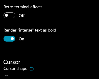 -->
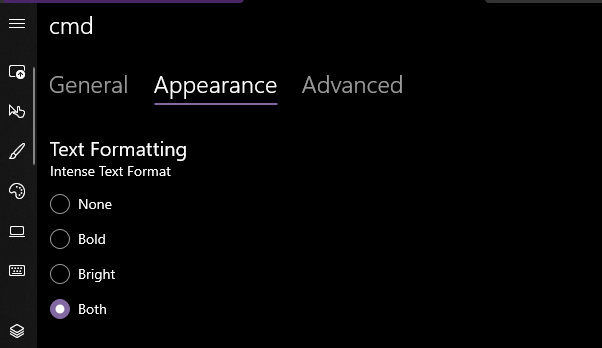
Yea that works. Printed some bold text, toggled it on, the text was no longer bold. hooray.
### EDIT, 10 Aug
```json
"intenseTextStyle": "none",
"intenseTextStyle": "bold",
"intenseTextStyle": "bright",
"intenseTextStyle": "all",
"intenseTextStyle": ["bold", "bright"],
```
all work now. Repro script:
```sh
printf "\e[1m[bold]\e[m[normal]\e[34m[blue]\e[1m[bold blue]\e[m\n"
```
2021-08-16 15:45:56 +02:00
<data name="Appearance_TextFormattingHeader.Text" xml:space="preserve">
<value>Text Formatting</value>
<comment>Header for a control to how text is formatted</comment>
</data>
<data name="Appearance_IntenseTextStyle.Header" xml:space="preserve">
2021-08-21 00:34:33 +02:00
<value>Intense Text Style</value>
Add an ENUM setting for disabling rendering "intense" text as bold (#10759)
## Summary of the Pull Request
This adds a new setting `intenseTextStyle`. It's a per-appearance, control setting, defaulting to `"all"`.
* When set to `"all"` or `["bold", "bright"]`, then we'll render text as both **bold** and bright (1.10 behavior)
* When set to `"bold"`, `["bold"]`, we'll render text formatted with `^[[1m` as **bold**, but not bright
* When set to `"bright"`, `["bright"]`, we'll render text formatted with `^[[1m` as bright, but not bold. This is the pre 1.10 behavior
* When set to `"none"`, we won't do anything special for it at all.
## references
* I last did this in #10648. This time it's an enum, so we can add bright in the future. It's got positive wording this time.
* ~We will want to add `"bright"` as a value in the future, to disable the auto intense->bright conversion.~ I just did that now.
* #5682 is related
## PR Checklist
* [x] Closes #10576
* [x] I seriously don't think we have an issue for "disable intense is bright", but I'm not crazy, people wanted that, right? https://github.com/microsoft/terminal/issues/2916#issuecomment-544880423 was the closest
* [x] I work here
* [x] Tests added/passed
* [x] https://github.com/MicrosoftDocs/terminal/pull/381
## Validation Steps Performed
<!--  -->

Yea that works. Printed some bold text, toggled it on, the text was no longer bold. hooray.
### EDIT, 10 Aug
```json
"intenseTextStyle": "none",
"intenseTextStyle": "bold",
"intenseTextStyle": "bright",
"intenseTextStyle": "all",
"intenseTextStyle": ["bold", "bright"],
```
all work now. Repro script:
```sh
printf "\e[1m[bold]\e[m[normal]\e[34m[blue]\e[1m[bold blue]\e[m\n"
```
2021-08-16 15:45:56 +02:00
<comment>Header for a control to select how "intense" text is formatted (bold, bright, both or none)</comment>
</data>
<data name="Appearance_IntenseTextStyleNone.Content" xml:space="preserve">
<value>None</value>
<comment>An option to choose from for the "intense text format" setting. When selected, "intense" text will not be rendered differently</comment>
</data>
<data name="Appearance_IntenseTextStyleBold.Content" xml:space="preserve">
2021-08-21 00:34:33 +02:00
<value>Bold font</value>
Add an ENUM setting for disabling rendering "intense" text as bold (#10759)
## Summary of the Pull Request
This adds a new setting `intenseTextStyle`. It's a per-appearance, control setting, defaulting to `"all"`.
* When set to `"all"` or `["bold", "bright"]`, then we'll render text as both **bold** and bright (1.10 behavior)
* When set to `"bold"`, `["bold"]`, we'll render text formatted with `^[[1m` as **bold**, but not bright
* When set to `"bright"`, `["bright"]`, we'll render text formatted with `^[[1m` as bright, but not bold. This is the pre 1.10 behavior
* When set to `"none"`, we won't do anything special for it at all.
## references
* I last did this in #10648. This time it's an enum, so we can add bright in the future. It's got positive wording this time.
* ~We will want to add `"bright"` as a value in the future, to disable the auto intense->bright conversion.~ I just did that now.
* #5682 is related
## PR Checklist
* [x] Closes #10576
* [x] I seriously don't think we have an issue for "disable intense is bright", but I'm not crazy, people wanted that, right? https://github.com/microsoft/terminal/issues/2916#issuecomment-544880423 was the closest
* [x] I work here
* [x] Tests added/passed
* [x] https://github.com/MicrosoftDocs/terminal/pull/381
## Validation Steps Performed
<!--  -->

Yea that works. Printed some bold text, toggled it on, the text was no longer bold. hooray.
### EDIT, 10 Aug
```json
"intenseTextStyle": "none",
"intenseTextStyle": "bold",
"intenseTextStyle": "bright",
"intenseTextStyle": "all",
"intenseTextStyle": ["bold", "bright"],
```
all work now. Repro script:
```sh
printf "\e[1m[bold]\e[m[normal]\e[34m[blue]\e[1m[bold blue]\e[m\n"
```
2021-08-16 15:45:56 +02:00
<comment>An option to choose from for the "intense text format" setting. When selected, "intense" text will be rendered as bold text</comment>
</data>
<data name="Appearance_IntenseTextStyleBright.Content" xml:space="preserve">
2021-08-21 00:34:33 +02:00
<value>Bright colors</value>
Add an ENUM setting for disabling rendering "intense" text as bold (#10759)
## Summary of the Pull Request
This adds a new setting `intenseTextStyle`. It's a per-appearance, control setting, defaulting to `"all"`.
* When set to `"all"` or `["bold", "bright"]`, then we'll render text as both **bold** and bright (1.10 behavior)
* When set to `"bold"`, `["bold"]`, we'll render text formatted with `^[[1m` as **bold**, but not bright
* When set to `"bright"`, `["bright"]`, we'll render text formatted with `^[[1m` as bright, but not bold. This is the pre 1.10 behavior
* When set to `"none"`, we won't do anything special for it at all.
## references
* I last did this in #10648. This time it's an enum, so we can add bright in the future. It's got positive wording this time.
* ~We will want to add `"bright"` as a value in the future, to disable the auto intense->bright conversion.~ I just did that now.
* #5682 is related
## PR Checklist
* [x] Closes #10576
* [x] I seriously don't think we have an issue for "disable intense is bright", but I'm not crazy, people wanted that, right? https://github.com/microsoft/terminal/issues/2916#issuecomment-544880423 was the closest
* [x] I work here
* [x] Tests added/passed
* [x] https://github.com/MicrosoftDocs/terminal/pull/381
## Validation Steps Performed
<!--  -->

Yea that works. Printed some bold text, toggled it on, the text was no longer bold. hooray.
### EDIT, 10 Aug
```json
"intenseTextStyle": "none",
"intenseTextStyle": "bold",
"intenseTextStyle": "bright",
"intenseTextStyle": "all",
"intenseTextStyle": ["bold", "bright"],
```
all work now. Repro script:
```sh
printf "\e[1m[bold]\e[m[normal]\e[34m[blue]\e[1m[bold blue]\e[m\n"
```
2021-08-16 15:45:56 +02:00
<comment>An option to choose from for the "intense text format" setting. When selected, "intense" text will be rendered in a brighter color</comment>
</data>
<data name="Appearance_IntenseTextStyleAll.Content" xml:space="preserve">
2021-08-21 00:34:33 +02:00
<value>Bold font with bright colors</value>
Add an ENUM setting for disabling rendering "intense" text as bold (#10759)
## Summary of the Pull Request
This adds a new setting `intenseTextStyle`. It's a per-appearance, control setting, defaulting to `"all"`.
* When set to `"all"` or `["bold", "bright"]`, then we'll render text as both **bold** and bright (1.10 behavior)
* When set to `"bold"`, `["bold"]`, we'll render text formatted with `^[[1m` as **bold**, but not bright
* When set to `"bright"`, `["bright"]`, we'll render text formatted with `^[[1m` as bright, but not bold. This is the pre 1.10 behavior
* When set to `"none"`, we won't do anything special for it at all.
## references
* I last did this in #10648. This time it's an enum, so we can add bright in the future. It's got positive wording this time.
* ~We will want to add `"bright"` as a value in the future, to disable the auto intense->bright conversion.~ I just did that now.
* #5682 is related
## PR Checklist
* [x] Closes #10576
* [x] I seriously don't think we have an issue for "disable intense is bright", but I'm not crazy, people wanted that, right? https://github.com/microsoft/terminal/issues/2916#issuecomment-544880423 was the closest
* [x] I work here
* [x] Tests added/passed
* [x] https://github.com/MicrosoftDocs/terminal/pull/381
## Validation Steps Performed
<!--  -->

Yea that works. Printed some bold text, toggled it on, the text was no longer bold. hooray.
### EDIT, 10 Aug
```json
"intenseTextStyle": "none",
"intenseTextStyle": "bold",
"intenseTextStyle": "bright",
"intenseTextStyle": "all",
"intenseTextStyle": ["bold", "bright"],
```
all work now. Repro script:
```sh
printf "\e[1m[bold]\e[m[normal]\e[34m[blue]\e[1m[bold blue]\e[m\n"
```
2021-08-16 15:45:56 +02:00
<comment>An option to choose from for the "intense text format" setting. When selected, "intense" text will be rendered as both bold text and in a brighter color</comment>
</data>
</root>